plugin-table-of-contents (a README Experience)

A plugin for Micro.blog for generating a slide-over table of contents. Its code lives here.
Let's see … where to start this time…
Well, I mean … what does the plugin do?
What the Plugin Does
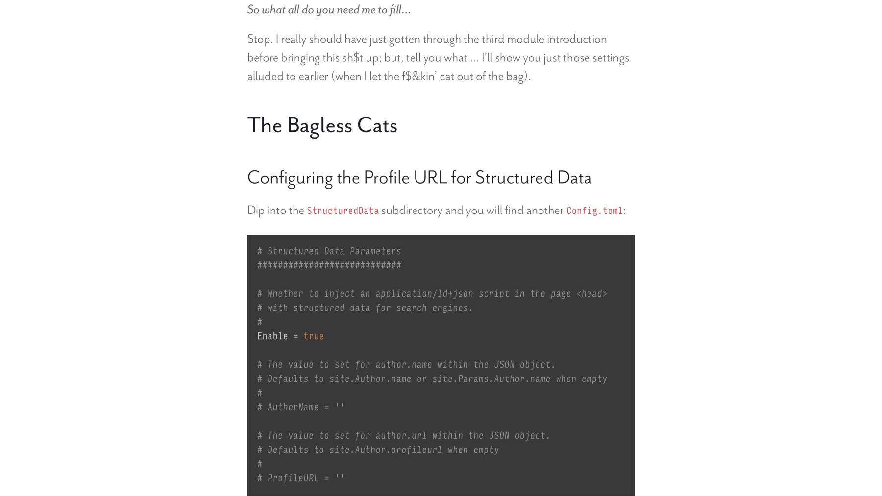
This plugin takes a post, within which someone has stuck themselves one of these…
{{< toc >}}
not unlike the one pictured here…

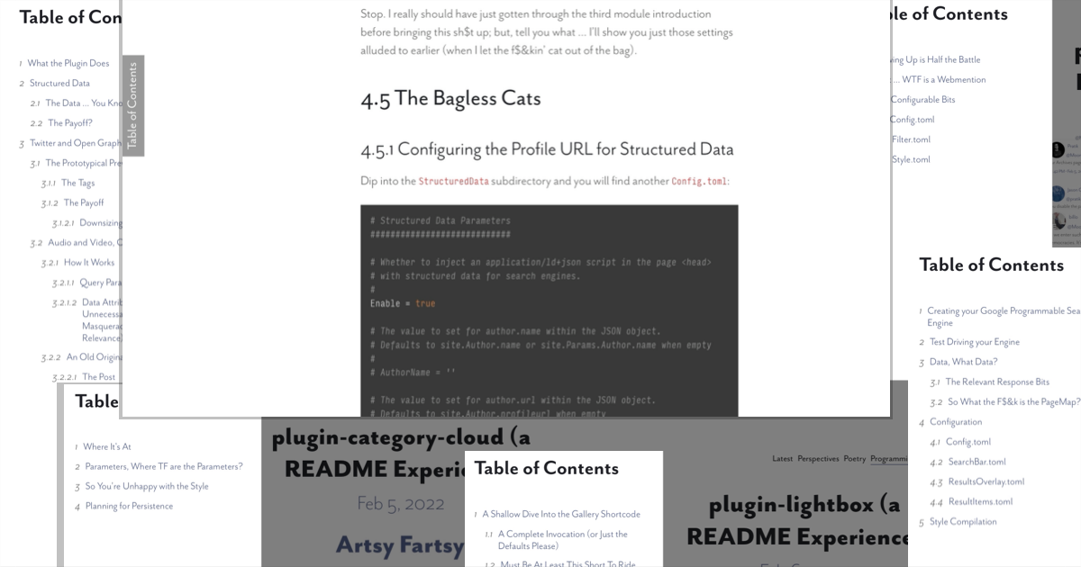
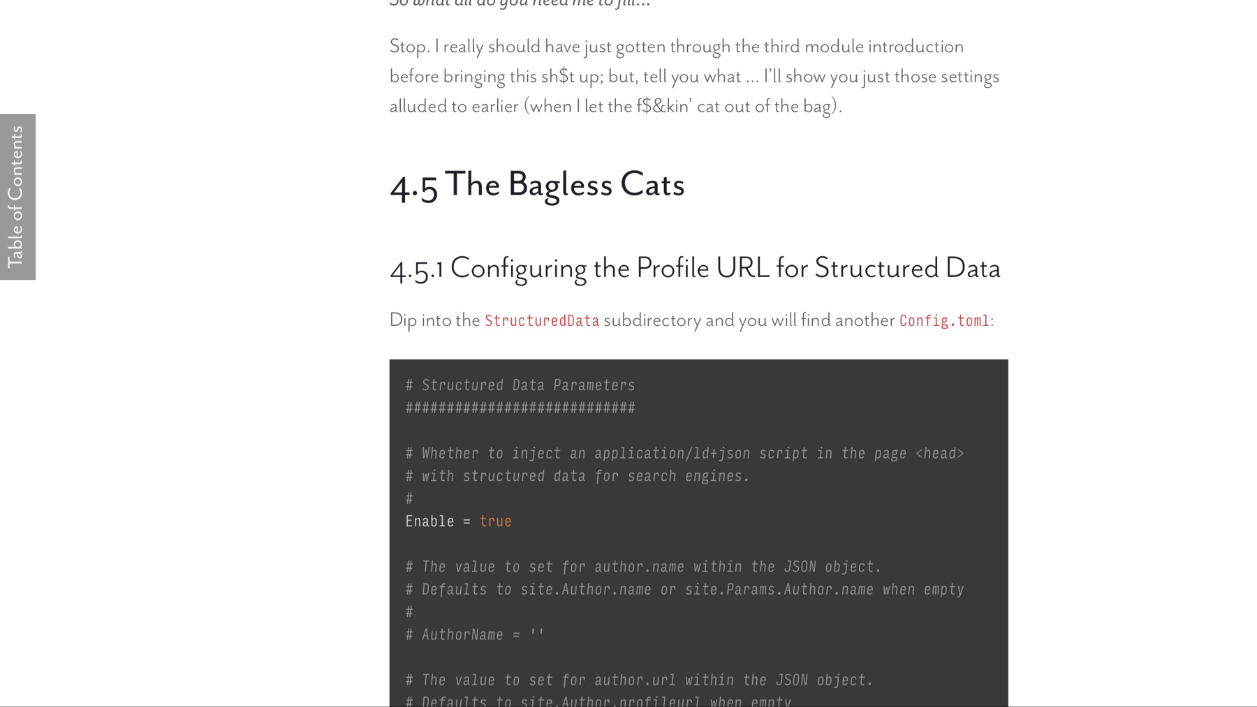
devours its <h2> through <h6> tags in order to generate section numbers, which it injects into said headers kinda like…

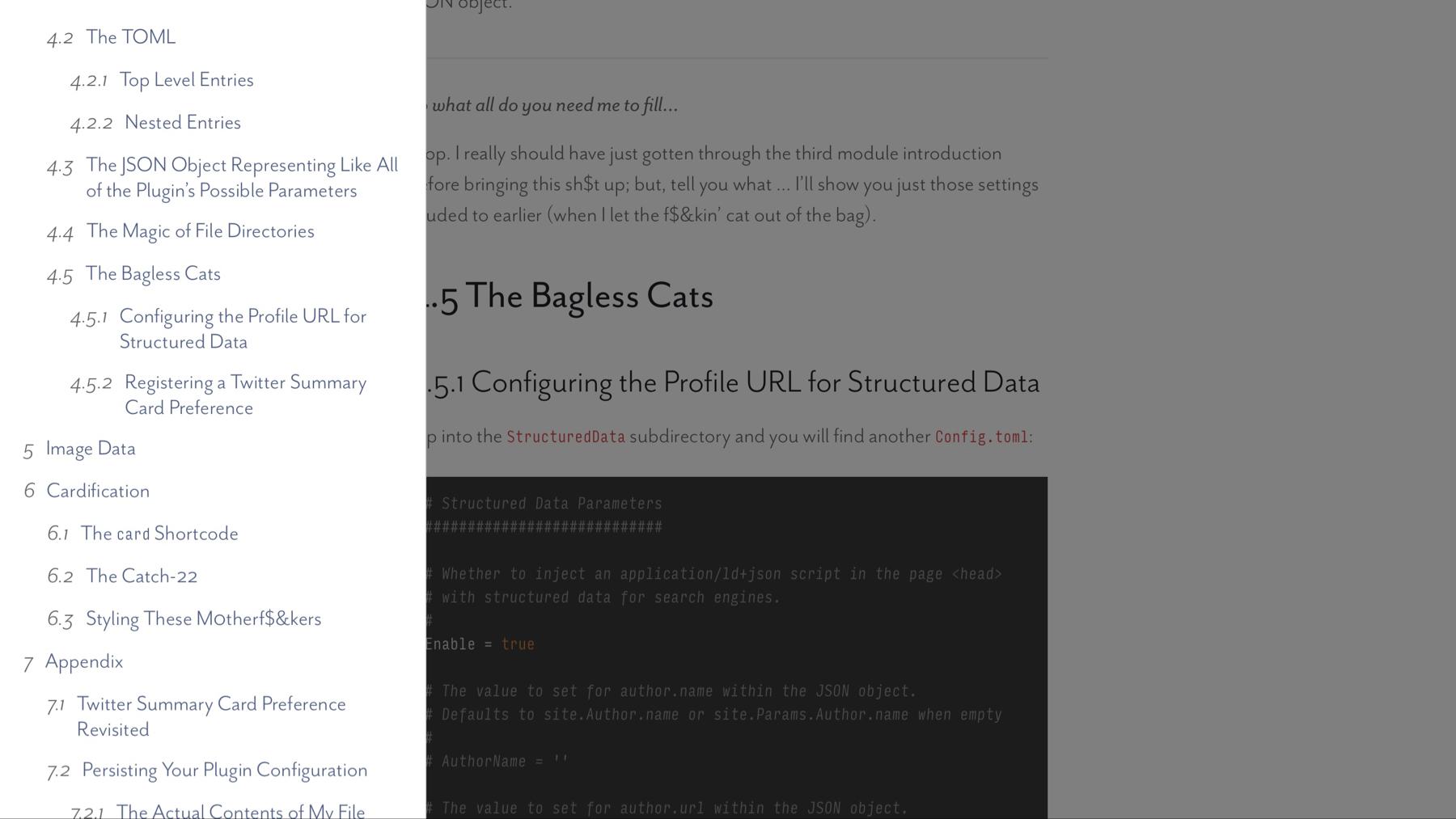
throwing the whole lot of them into a table of contents that slides onto the screen when activated kinda like this:

Touch screen devices also get a handy, dandy swipe gesture (touch near the left edge and drag to the right), which comes in handy when the width of the screen and the width of the table of contents are damn near the same (this also happens to be when the close button appears, as one cannot simply tap outside the table of contents):
Don't believe me? You are reading a post for which this plugin has generated just such a table of contents. Try that sh$t out.
Wow, how does it do it?
How It Does It
Magic. Now let's move on to all the ways you can modify the plugin's behavior to accommodate what I am sure are countless quibbles blinking into existence at this very moment.
Configuring This F$&ker
This f$&ker has three files controlling its configuration. They all live in the data/plugin_table_of_contents subdirectory.
Side note: want your modifications to persist, take your little custom theme, create your own little subdirectory only switch out the underscores for dashes, and lay in the files with your edits. Your dash-cased files take precedence over the plugin's underscored files.
Mind… blown
F$&k off, I'm not in the mood. Let's look at the first file.
The First File
The first file is located at data/plugin_table_of_contents/Config.toml and it looks like this:
# Parameters for controlling the generated css and js files
###########################################################

# Plugin version, printed to HTML comment when the plugin loads.
#
Version = '2.0.4'

# Whether to print HTML comments for debugging purposes.
#
DebugPrint = false

# Whether to provide subresource integrity by generating a
# base64-encoded cryptographic hash and attaching a .Data.Integrity
# property containing an integrity string, which is made up of the
# name of the hash function, one hyphen and the base64-encoded hash sum.
#
Fingerprint = true

# Output style for /assets/sass/toc.scss.
# Valid options are nested, expanded, compact and compressed
#
SassOutput = 'compact'

# Whether to minify the Javascript file generated from
# /assets/js/toc.js
#
MinifyScript = false

# Parameters controlling the generation of the table of contents.
#################################################################

# Selector used to identify the HTML element whose child headings shall
# be eligible for inclusion in the table of contents.
#
SourceSandbox = '#post-body'

# Selector for identifying the HTML element into which the container
# shall be prepended.
#
ContainerParent = 'body'

# The text displayed within the TOC header.
#
TitleText = 'Table of Contents'

# Selector for identifying the HTML element into which the toggle
# button shall be prepended.
#
ToggleParent = '#toc-toggle-container'

# The text displayed by the toggle button.
#
ToggleText = 'Table of Contents'

# Whether to generate section numbers kinda like:
# 2 Installation
# 3 Structured Data
#   3.1 The Data … You Know … Structured
#   3.2 The Payoff?
# 4 Twitter and Open Graph <meta> Tags
#   4.1 The Prototypical Previewable Post
#     4.1.1 The Tags
#     4.1.2 The Payoff
#       4.1.2.1 Downsizing
#   4.2 Audio and Video, Oh My
#    4.2.1 How It Works
#
SectionNumbers = true

# Whether to inject generated section numbers into the original
# post headings.
#
InjectSectionNumbers = true
Honestly, the comments I took the time to compose for each f$&king parameter pretty much oughta cover it. The ContainerParent and ToggleParent, perhaps warrant singling out as these values must resolve to CSS selectors with which the plugin can locate the desired HTML elements. Prepending the slide-over to the page <body> seems to work fine, may as well leave ContainerParent alone. You can also leave ToggleParent alone if you want, the thing to take away here is that you are responsible for having your theme's layouts/post/single.html template include an element that matches the CSS selector held by ToggleParent.
Well, what TF did you do?
What I did
I decided to create a new block outside of the main blocks in my base templates (yeah, I have two) for when sh$t like this comes along and I want somewhere to stick it:
{{/* Create the secondary page content */}}
<aside>
{{ block "aside" . }}{{ end }}
</aside>

{{/* Create the primary page content */}}
<main>
{{ block "main" . }}{{ end }}
</main>
Then, all I have to do to get the toggle button to show up is stick this in layouts/post/single.html:
{{ define "aside" }}
<div id="toc-toggle-container"></div>
{{ end }}
Let's move on to the second file.
The Second File
The second file is nothing but IDs and class names. It lives at data/plugin_table_of_contents/Specifiers.toml and it looks like this:
# HTML Element IDs and class names declared here to ensure consistency.
BackdropID = 'toc-backdrop'
ContainerID = 'toc-container'
HeaderID = 'toc-header'
TitleID = 'toc-title'
CloseButtonID = 'toc-close-button'
BodyID = 'toc-body'
ToggleID = 'toc-toggle'
LevelClassNamePrefix = 'toc-level-'
FadeClassName = 'fade'
ShowClassName = 'show'
OffscreenClassName = 'offscreen'
TOCEntryClassName = 'toc-entry'
SectionNumberClassName = 'section-number'
InjectedSectionNumberClassName = 'injected-section-number'
I store these in a data file to ensure consistency between the Sass and Javascript files. Feel free to modify these should you somehow encounter a naming collision with your own specifiers. Now, let's talk style.
Talkin' Style
The third file lives at data/plugin_table_of_contents/Style.toml and it looks like this:
# Component styling with Sass blocks and variables
##################################################

# Sass block to apply to the table of contents.
#
TOC = '''
background: white;
border-right: 1px solid rgba(black, .2);'''

# Sass block to apply to the TOC header.
#
Header = 'padding: 1rem;'

# Sass block to apply to the TOC title.
#
Title = 'margin-bottom: 0; line-height: 1.5;'

# Sass block to apply to the TOC close button.
#
CloseButton = '''
top: .5rem;
right: .5rem;
width: 1rem;
color: lightgray;'''

# Sass block to apply to the TOC body.
#
Body = 'padding: 1rem 1rem 3rem 1rem; gap: .5rem;'

# Sass block to apply to TOC entries
#
Entry = 'gap: .5em;'

# Sass block to apply to the section number of the entries.
#
EntrySection = 'font-style: italic;'

# Sass block to apply to the links within the entries.
#
EntryLink = 'line-height: 1.1;'

# Sass block to apply to the backdrop.
#
Backdrop = 'background-color: black;'

# Sass block to apply to the toggle button.
#
Toggle = '''
color: rgba(white, .9);
background: rgba(#1E2025, .6);
padding: 0 .5rem;
margin: 0;'''

# Sass block to apply to the section numbers injected
# into headings.
#
SectionNumber = 'margin-right: 1em;'

[Variables]

# The pixel width of the table of contents.
#
TOCWidth = 400

# The amount of indentation per level of depth within the
# table of contents.
#
LevelIndent = '1em'

# The backdrop opacity when visible.
#
BackdropOpacity = 0.5
The parameter comments pretty much cover it here as well. Keep in mind that any valid CSS block is also a valid Sass block (as I am using the Sass SCSS syntax).
Given the default ID and class names, the parameters would be applied to the generated Sass file like so:
@import "vendor/rfs";

// Variables
$toc-width: 400px;
$level-indent: 1em;
$backdrop-opacity: 0.5;

#toc-backdrop {
  position: fixed;
  top: 0;
  left: 0;
  width: 100vw;
  height: 100vh;
  /* Backdrop */

  // Fade backdrop and lower to prevent click handling.
  &.fade {
    opacity: 0;
    z-index: -1;
  }

  // Show and raise to allow click handling.
  &.show {
    opacity: $backdrop-opacity;
    z-index: 1040;
  }
}

span.injected-section-number {
  /* SectionNumber */
}

button#toc-toggle {
  border: none;
  border-radius: 0;
  white-space: nowrap;
  /* Toggle */

  @media (max-width: $toc-width + 50) {
    display: none;
  }
}

#toc-container {
  top: 0;
  left: 0;
  bottom: 0;
  width: $toc-width;
  max-width: 100%;
  position: fixed;
  display: flex;
  flex-direction: column;
  background-clip: padding-box;
  outline: 0;
  /*TOC */

  &.offscreen {
    z-index: 1045;
    transform: translateX(-100%);
    transition: transform .3s ease-in-out;

    &.show { transform: none; }

  }

  header#toc-header {
    position: relative;
    display: flex;
    align-items: center;
    justify-content: space-between;
    /* Header */

    h2#toc-title {
      /* Title */
    }

    button#toc-close-button {
      position: absolute;
      padding: 0;
      margin: 0;
      background: transparent;
      border: none;
      visibility: hidden;
      /* CloseButton */

      @media (max-width: $toc-width + 50) {
        visibility: visible;
      }

      svg {
        display: inline-block;
        height: 1rem;
        overflow: visible;
        align-self: center;
        vertical-align: center;
        fill: currentcolor;
      }

    }

  }

  nav#toc-body {
    flex-grow: 1;
    overflow-y: auto;
    display: flex;
    flex-direction: column;
    /* Body */

    .toc-entry {
      display: flex;
      align-items: baseline;
      /* Entry */

      &.toc-level-2 {
        @include margin-left($level-indent * 1);
      }
      &.toc-level-3 {
        @include margin-left($level-indent * 2);
      }
      &.toc-level-4 {
        @include margin-left($level-indent * 3);
      }
      &.toc-level-5 {
        @include margin-left($level-indent * 4);
      }

      .section-number {
        /* EntrySection */
      }

      a {
        /* EntryLink */
      }

    }

  }

}
And that oughta do it. Take care now. Holler if you have any questions. Pea…
Wait, how did you get your toggle button all sideways and aligned to the edge of the screen like that?
Toggle Button Magic
Sooo, you saw how I created that <aside> section just before my <main> section, right? Well, first I use the CSS grid module to make sure the <aside> section occupies the space I want it to…
body {
  // Make sure body fills the viewport
  min-height: 100vh;
  max-width: 100vw;

  /// Page Grid
  display: grid;

  // Three rows pushing header up and footer down
  grid-template-rows: auto 1fr auto;

  // Size columns for smallest screen
  grid-template-columns: minmax(0, 1fr) minmax(300px, 350px) minmax(0, 1fr);

  // Add a gap between sections
  gap: 1rem 8px;

  // Allow the header and the footer to go all the way across
  grid-template-areas:
      "header header header"
      "aside   main  ......"
      "footer footer footer";

  // Page Aside
  > aside {
    grid-area: aside;
    position: relative;
  }

}
and then I throw some transforms at the toggle container:
div#toc-toggle-container  {
  position: sticky;
  top: 2rem;
  right: 0;
  transform: rotate(-90deg) translate(-40vh, 0);
  transform-origin: 0 0;
}
Peace out ☾𐂂