plugin-lightbox (a README Experience)
A plugin for Micro.blog for presenting a slide carousel containing images and/or videos. Its code lives here.
Alright, f$&k it … who wants to just dive into the fun stuff?
*raises hand* *raises hand* *raises hand*
Hells yeah … than let's look at my favorite part of this plugin: the gallery shortcode.
A Shallow Dive Into the Gallery Shortcode
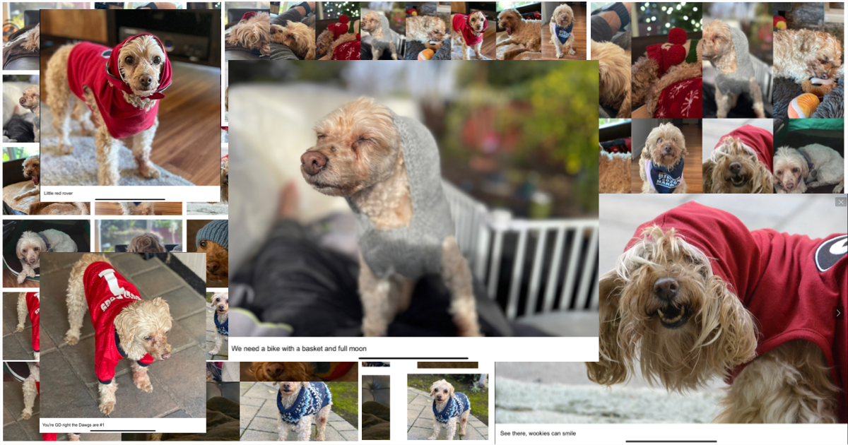
I grabbed fifteen cute AF pictures of Murphy, stuck them inside five different invocations of the gallery shortcode, grabbed some screenshots, and stuck them on top of each other to make that collage up there. The cool thing about sticking the documentation for your Micro.blog plugin into a Micro.blog hosted post is that I can show you how it works … like right f$&kin' now … before your eyes. Who wants me to stick the galleries in this post as like the next f$&kin' thing I do?
*raises hand* *raises hand* *raises hand* *raises hand* *raises hand*
Okay … okay … I see the thought hadn't occured to you … that you might be test driving the plugin like immediately … higher hand count … more enthusiasm. I like it. Let me show a complete invocation the first time. After the first example I'll only be showing the line of code that carries the shortcode parameters.
A Complete Invocation (or Just the Defaults Please)
So, the gallery shortcode requires opening and closing tags and, at the very least, a gallery name. When a gallery name is all you will be providing, you can pass it as a positional parameter. If you want your gallery to serve a purpose, I suggest you also include some markdown-formatted images. If you include alt text between the square brackets, this text will be displayed as the slide's title within the lightbox. Without further ado, I give you the invocation…
{{< gallery Murphy >}}


{{< /gallery >}}
and the result:


Pretty cool, am I right?
I mean … it's nothing new.
Meh, I'll give you that one … but what if you really wanted to know up front precisely how much vertical space the gallery would be taking up?
Must Be At Least This Short To Ride This Post
Switching to named parameters now (since I want to pass more than just the name of the gallery), let's say I wanted two rows each 100px in height. I pass the parameters in like so…
{{< gallery gallery="Murphy-RowHeight-RowCount" row-height="100px" row-count=2 >}}
which produces a gallery that's all:
How ya like me now?
I mean … the number of rows isn't really…
FFS … okay … how about if we wanted to determine how many cells wide each row would be on the fly? Would that be enough for you?
Three Doors Down (and By Doors I mean Cells, and By Down I Mean Wide)
Keeping the row-height ('cause that's how I captured the screenshot dammit and I'd rather be accurate than logical), let's tell the shortcode we want a grid made up of rows that are three cells wide. Pass the parameters in kinda like…
{{< gallery gallery="Murphy-RowHeight-GridWidth" row-height="100px" grid-width=3 >}}
and you'll score yourself a gallery kinda like:
How 'bout that m0therf$&kers?
Okay, that's kinda neat … but all the images are smushed tog…
Alright, Stop.
Collaborate and Listen
Want some space between the images? Keep the grid-width and pass in a gap (setting the row-height to 150px for some f$&king reason)…
{{< gallery gallery="Murphy-RowHeight-Gap-GridWidth" row-height="150px" gap="10px" grid-width=3 >}}
and you'll have yourself some space:
Does that do it? Is that enough to satisfy you lot? What more could you possible need?
*I mean … the gap is great, don't get me wrong … but … the image thumbnails … you can't really see… *
M0therf$&ker. Okay, last one. If you ain't happy with this … well … I'm all out of give-a-f$&ks
The Last Given F$&k
If you'd rather demolish the beautiful symmetry in the name of visibility, just add a fit value of contain into the mix like so…
{{< gallery gallery="Murphy" fit="contain" row-height="150px" gap="10px" grid-width=3 >}}
and your images will look beautiful (if asymmetric AF):
Happy now?
*opens mouth to speak*
ZZZzzzzsst. Zip it. Like I said. Your answer is irrelavant. Let's move on to the nuts and bolts that nobody will ever need to f$&k with aside from, perhaps, a pair of style parameters that control the default grid width and row height.

The Nuts and Bolts Nobody Will Ever Need to F$&k With (for the Most Part)
Hopefully this isn't the first one of my READMEs you've read. I'm tired of explaining about storing the plugin parameters as data templates so Imma just half-a$$ it here if you don't mind.
Actually…
*eye-origin death rays*
I'll browse the other READMEs
Much appreciated.
Stylin'
Anyway, the configuration file that controls the default gallery style lives at data/plugin_lightbox/Style.toml and it looks like this:
# Parameters for styling the galleries via the generated stylesheet.
####################################################################

# Class assigned to gallery containers.
#
GalleryClassName = 'gallery'

# The default number of images / videos to display per row
# in gallery grids.
#
GridWidth = 5

# The default row height in gallery grids.
#
RowHeight = '20vh'

# Sass (or CSS) block applied to gallery containers.
#
Gallery = ''

# Class assigned to gallery links.
#
LinkClassName = 'gallery-link'

# Sass (or CSS) block to apply to gallery links.
#
Link = ''

# Class assigned to gallery video tags.
#
VideoClassName = 'gallery-video'

# Sass (or CSS) block to apply to gallery video tags.
#
Video = ''

# Class assigned to gallery img tags.
#
ImgClassName = 'gallery-image'

# Sass (or CSS) block applied to gallery img tags.
#
Img = ''

# The default fit for images and videos inside links
# (contain or cover).
#
Fit = 'cover'

# Pixel width used to fetch thumbnail images via the photos API.
#
PhotoWidth = 260
The class names are in the file to ensure consistency across plugin files. Should you happen upon a naming collision with other HTML elements, feel free to modify them … otherwise, forget about them. The default grid width is controlled by the value of GridWidth. The default row height is controlled by … wait for it … RowHeight. Whether images fit inside or fully cover their cells by default is controlled by Fit. PhotoWidth is used when utilizing the Micro.blog photos API to fetch scaled down images for use as thumbnails. You can modify the default value or stick a hashtag in front of it to always use the link to the fullscale image.
All the empty strings up there are meant to hold chunks of Sass or CSS code intended to alter the default style via the generated stylesheet. Given the default class names, your custom code (along with your GridWidth and RowHeight values) gets injected into the generated Sass file like so:
.gallery {
  display: grid;
  grid-template-columns: repeat(/* GridWidth */, 1fr);
  grid-auto-rows: /* RowHeight */;
  /* Gallery */
}

.gallery-link {
  width: 100%;
  height: 100%;
  /* Link */
}

.gallery-image {
  min-width: 100%;
  min-height: 100%;
  max-height: 100%;
  object-fit: cover;
  /* Img */
}

.gallery-video {
  min-width: 100%;
  min-height: 100%;
  max-height: 100%;
  object-fit: cover;
  /* Video */
}
Powering through now … let's look at a few parameters for controlling the use of videos as thumbnails.
Video Thumbnails Beetches
I like using videos as their own thumbnails. If you do too, you can control a few properties by modifiying data/plugin_lightbox/Gallery.toml, which starts out like this:
# Default parameter values for galleries.
#########################################

# Whether videos used as link content should loop by default.
#
Loop = true

# Whether videos used as link content should autoplay by default.
#
Autoplay = true

# Whether videos used as link content should preload by default.
# Valid values are 'auto', 'metadata', and 'none'. Ignored when
# autoplay is true
#
Preload = 'metadata'
Straightforward … moving on. Let's look at build-related parameters.
Build-Related Parameters
Like all my plugins, there is a core configuration file. It is located at data/plugin_lightbox/Config.toml and it looks like this:
# Debug and build related parameters
####################################

# Theme version, printed to HTML comment when the plugin loads.
#
Version = '10.0.3'

# Whether to print HTML comments for debugging purposes.
#
DebugPrint = false

# Whether to provide subresource integrity by generating a
# base64-encoded cryptographic hash and attaching a .Data.Integrity
# property containing an integrity string, which is made up of the
# name of the hash function, one hyphen and the base64-encoded hash sum.
#
Fingerprint = true

# Output style for the generated stylesheet.
# Valid options are nested, expanded, compact and compressed
#
SassOutput = 'compact'

# Whether to minify the generated Javascript file.
#
MinifyScript = false

# Whether to generate and push analytic events into window.dataLayer.
#
GenerateEvents = false
All my plugins inject an HTML comment into the page <head> with theirVersion value and build time. DebugPrint toggles the injection of an HTML comment containing the parameter values as parsed by the plugin. Fingerprint, SassOutput, and MinifyScript control the building and linking of the CSS and Javascript files. GenerateEvents is only useful if you are running Javascript that creates a dataLayer object and you'd like lightbox_opened, lightbox_closed, and slide_changed events to be pushed into dataLayer.
Okay, who's ready for the last configuration file?
*raises hand* *raises hand* *raises hand* *raises hand* *raises hand* *raises hand* *raises hand* *raises hand*
Yeah, y'all and me both. Here it comes.
The Last (and Least Likely to Ever Be Touched) Configuration File
The plugin gives you the ability to specify precisely how the GLightbox Javascript object is initialized by bridging every possible parameter via the file living at data/plugin_lightbox/GLightbox.toml. It is filled with the GLightbox library's default values … which are commented out as including them is unnecessary. Feel free to follow the links in the parameter comments to the library's documentation and f$&k around. I've never needed to.
# Parameters corresponding to those receivable by the
# glightbox Javascript object.
#####################################################

# Name of the selector for example '.glightbox' or 'data-glightbox'
# or '*[data-glightbox]'
#
# Selector = '.glightbox'

# Name of the skin, it will add a class to the lightbox so you
# can style it with css.
#
# Skin = 'clean'

# Name of the effect on lightbox open. (zoom, fade, none)
#
# OpenEffect = 'zoom'

# Name of the effect on lightbox close. (zoom, fade, none)
#
# CloseEffect = 'zoom'

# Name of the effect on slide change. (slide, fade, zoom, none)
#
# SlideEffect = 'slide'

# More text for descriptions on mobile devices.
#
# MoreText = 'See more'

# Number of characters to display on the description before adding
# the moreText link (only for mobiles), if 0 it will display the
# entire description.
#
# MoreLength = 60

# Show or hide the close button.
#
# CloseButton = true

# Enable or disable the touch navigation (swipe).
#
# TouchNavigation = true

# Image follow axis when dragging on mobile.
#
# TouchFollowAxis = true

# Enable or disable the keyboard navigation.
#
# KeyboardNavigation = true

# Close the lightbox when clicking outside the active slide.
#
# CloseOnOutsideClick = true

# Start lightbox at defined index.
#
# StartAt = 0

# Default width for inline elements and iframes, you can define a
# specific size on each slide. You can use any unit for example
# 90% or 100vw for full width
#
# Width = '900px'

# Default height for inline elements and iframes, you can define
# a specific size on each slide.You can use any unit for example
# 90% or 100vw For inline elements you can set the height to auto.
#
# Height = '506px'

# Default width for videos. Videos are responsive so height is not
# required. The width can be in px % or even vw for example, 500px,
# 90% or 100vw for full width videos
# VideosWidth = '960px'

# Global position for slides description, you can define a
# specific position on each slide (bottom, top, left, right).
#
# DescPosition = 'bottom'

# Loop slides on end.
#
# Loop = false

# Enable or disable zoomable images you can also use
# data-zoomable="false" on individual nodes.
#
# Zoomable = true

# Enable or disable mouse drag to go prev and next slide
# (only images and inline content), you can also use
# data-draggable="false" on individual nodes.
# Draggable = true

# Used with draggable. Number of pixels the user has to drag
# to go to prev or next slide.
#
# DragToleranceX = 40

# Used with draggable. Number of pixels the user has to drag up
# or down to close the lightbox (Set 0 to disable vertical drag).
#
# DragToleranceY = 65

# If true the slide will automatically change to prev/next or
# close if dragToleranceX or dragToleranceY is reached,
# otherwise it will wait till the mouse is released.
#
# DragAutoSnap = false

# Enable or disable preloading.
#
# Preload = true

# You can completely change the html of GLightbox. See the
# Themeable section in the README:
# https://github.com/biati-digital/glightbox#readme.
#
# LightboxHTML = '''
# <div id="glightbox-body" class="glightbox-container">
#   <div class="gloader visible"></div>
#   <div class="goverlay"></div>
#   <div class="gcontainer">
#     <div id="glightbox-slider" class="gslider"></div>
#     <button class="gnext gbtn" tabindex="0"
#             aria-label="Next">{nextSVG}</button>
#     <button class="gprev gbtn" tabindex="1"
#             aria-label="Previous">{prevSVG}</button>
#     <button class="gclose gbtn" tabindex="2"
#             aria-label="Close">{closeSVG}</button>
#   </div>
# </div>
# '''

# You can completely change the html of the individual slide.
# See the Themeable section in the README:
# https://github.com/biati-digital/glightbox#readme.
#
# SlideHTML = '''
# <div class="gslide">
#   <div class="gslide-inner-content">
#     <div class="ginner-container">
#       <div class="gslide-media"></div>
#       <div class="gslide-description">
#         <div class="gdesc-inner">
#           <h4 class="gslide-title"></h4>
#           <div class="gslide-desc"></div>
#         </div>
#       </div>
#     </div>
#   </div>
# </div>
# '''

# Autoplay videos on open.
#
# AutoplayVideos =  true

# If true video will be focused on play to allow keyboard
# shortcuts for the player, this will deactivate prev and
# next arrows to change slide so use it only if you know
# what you are doing.
#
# AutofocusVideos = false

# Set your own svg icons.
#
# [SVG]

# Define or adjust lightbox animations.
#
# See the custom animation section of the README:
# https://github.com/biati-digital/glightbox#adding-a-custom-animation
#
# [CSSEfects]

# Video player options. See the video player options in
# the README: https://github.com/biati-digital/glightbox#video-player
#
# The example given in the README would look like
# this:
# [Plyr]
# css = 'https://cdn.plyr.io/3.5.6/plyr.css'
# js = 'https://cdn.plyr.io/3.5.6/plyr.js'
# config.ratio = '16:9' # or '4:3'
# config.muted = false
# config.hideControls = true
# config.youtube.noCookie = true
# config.youtube.rel = 0
# config.youtube.showinfo = 0
# config.youtube.iv_load_policy = 3
# config.vimeo.byline = false
# config.vimeo.portrait = false
# config.vimeo.title = false
# config.vimeo.speed = true
# config.vimeo.transparent = false
#
# [Plyr]
Shortcodes and Partials (a Deeper Dive … but not by much)
I suppose I should point out those shortcodes and partials this plugin makes available that I have yet to discuss. So here it goes.
There is a Shortcode that Mimics Becker's glightbox shortcode for compatibility
There is a shortcode that mimics Beckers glightbox shortcode for compatibility. Moving on.
There is a Shortcode for Bouncing Parameters to the lightbox Partial, If That's What You Really Want to Do.
There is a shortcode for bouncing parameters to the lightbox partial if that's what you really want to do. Moving on.
The Partials (or Where the Meat Is)
Aside from the image parsing done by the gallery shortcode, all the shortcodes really just live to bounce captital-cased parameter values, derived from the dash-cased parameters that were provided to the shortcode, over to one of the two partials: layouts/partials/plugin-lightbox/gallery.html and layouts/partials/plugin-lightbox/lightbox.html.
The parameters expected by each partial is documented in the top of the respective file. The top of layouts/partials/plugin-lightbox/gallery.html starts out like this…
{{- /*

  Required Parameters:
    Page: The page context.
    Gallery: The name of the gallery. This is required.
    Slides: The map of slide data.

  Optional Parameters:
    GridWidth: The number of grid cells per row.
    RowHeight: The height of each row.
    RowCount: The maximum number of rows. Ignored when GridWidth
              has been provided.
    Fit: (contain or cover) The fit for images and videos.
    Gap: The padding between cells.
    GalleryClass: Custom class to apply to the div.
    GalleryStyle: Custom style to apply to the div.
    LinkClass: Custom class to apply to all anchor tags.
    LinkStyle: Custom style to apply to all anchor tags.
    DescPosition: (bottom, top, left, right) Where all slides
                  descriptions should be positioned.
    Effect: (zoom, fade, none) The animation effect all slide should use.
    Width: The custom width for all slides.
    Height: The custom height for all slides.
    Zoomable: Whether slides should be zoomable.
    Draggable: Whether slides should be draggable.
    VideoClass: Custom class to apply to all video tags.
    VideoStyle: Custom style to apply to all video tags.
    Loop: Whether link videos should loop.
    Autoplay: Whether link videos should be set to autoplay.
    Preload: Value for link video preload attributes.
    ImgClass: Custom class to apply to all img tags.
    ImgStyle: Custom style to apply to all img tags.
    PhotoWidth: Specifies a pixel width for a thumbnail image to be
                fetched using the photos API. Default is undefined.

*/ -}}
where the slide data referred to in the description of Slides is fed to layouts/partials/plugin-lightbox/lightbox.html … which starts out like this:
{{- /*

  Required Parameters:

    Page: The page context.
    Href: The URL for the slide content.
          Optional when Src is provided.
    Src: The URL for the link content.
          Optional when Href is provided.

  Optional Parameters:
    LinkClass: Custom class to apply to the anchor tag.
    LinkStyle: Custom style to apply to the anchor tag.
    Gallery: The name of the slide's gallery.
    Title: The slide's title.
    Description: The slide's description.
    DescPosition: (bottom, top, left, right)
    Effect: (zoom, fade, none) The slide's animation effect.
    Width: The custom width for this slide.
    Height: The custom height for this slide.
    Zoomable: Whether this slide should be zoomable.
    Draggable: Whether this slide should be draggable.
    Sizes: Image sizes for different page layouts.
    Srcset: List of image files to use in different situations.
    VideoClass: Custom class to apply to the video tag.
    VideoStyle: Custom style to apply to the video tag.
    Loop: Whether the link video should loop.
    Autoplay: Whether the link video should be set to autoplay.
    Preload: Value for the link video's preload attribute.
             This ignored when set to autoplay.
    Alt: Specifies an alternate text for an image.
    ImgClass: Custom class to apply to the img tag.
    ImgStyle: Custom style to apply to the img tag.
    PhotoWidth: Specifies a pixel width for a thumbnail image to be
                fetched using the photos API.
    Fit: (contain or cover)

*/ -}}
And I'm out. As always, feel free to holler with any questions.