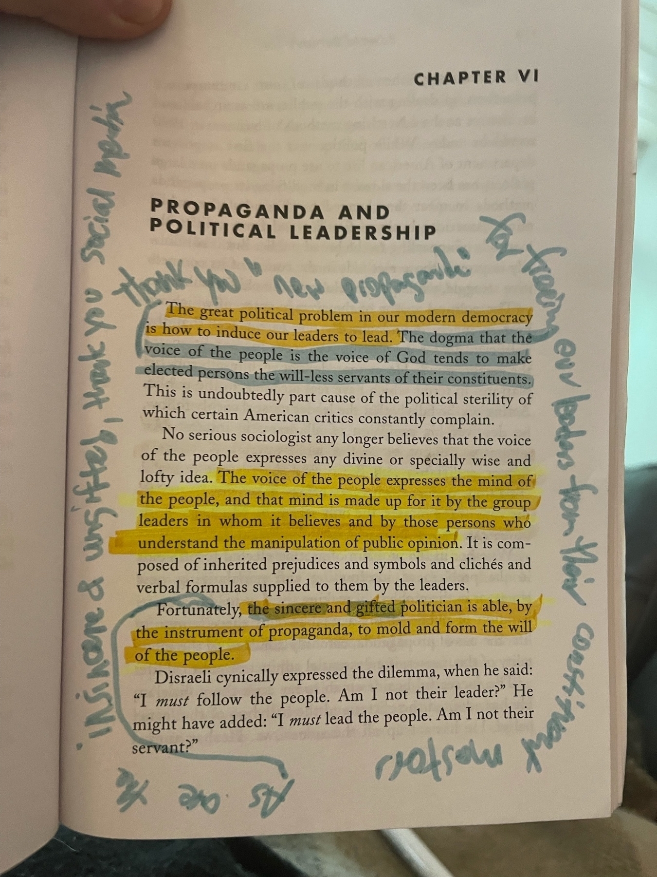
For anyone following along at home, the yellow highlights were my initial read through upon purchase, the orange from my read through for the art, and the blue highlights are my current read through for what went wrong since 1928.

For anyone following along at home, the yellow highlights were my initial read through upon purchase, the orange from my read through for the art, and the blue highlights are my current read through for what went wrong since 1928.
