Episode 5 of #TheShrinkNextDoor is hard to watch.
F$&k Mark … this is meta
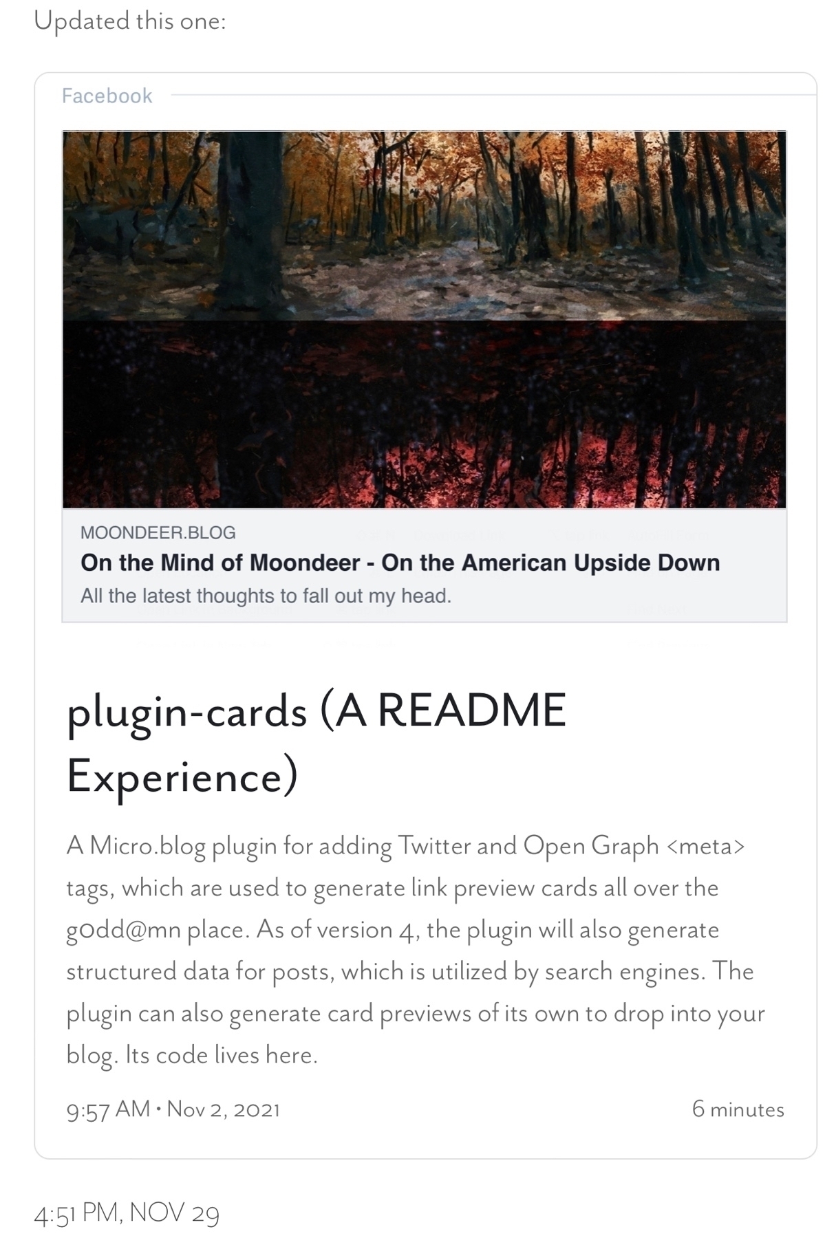
Updated this one:
For the Micro.bloggers that are watching the plugin development … once I slow down a bit on innovation I plan to do some practical posts that are more like guides to how to use or implement this stuff. I tend to get caught up in all the things I think of next.
A storytime spaghetti reply thread experience
Now that I've rolled my own Twitter cards I oughta be able to recreate my storytime spaghetti reply threads … first attempt incoming.
Honestly kinda shocked that all stuff I've been building for the Micro.blog platform hasn't gotten the attention of folks actually using Micro.blog: moondeer.blog/categorie...
Murphy just after donning her jersey.
#Pumped #GameDay #GooooDawgssSicEmWoofWoofWoofWoofWoof
What would really make this sick, @manton, would be letting me drop a hint to your cross-post parser (perhaps via
dataattribute tag with a URL value) that when cross-posting the cardify-carddivshould be replaced with a simple link so that other platforms generate their own preview cards in its place.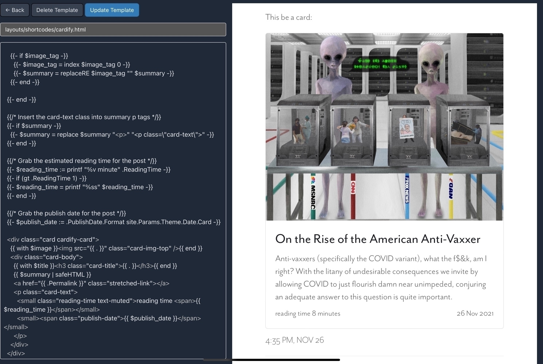
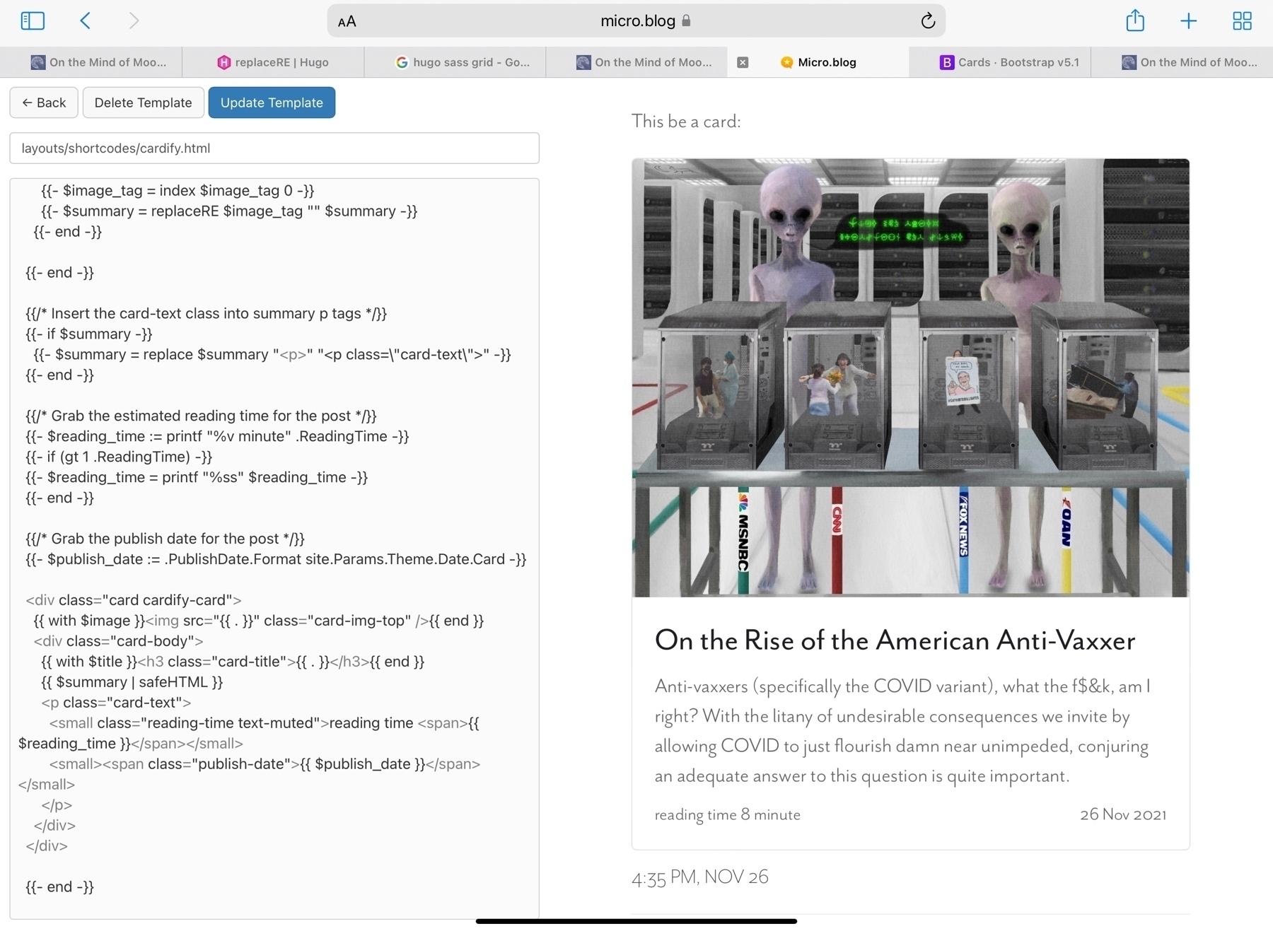
Now that I've injected Bootstrap, rolling my own preview cards by Hugo shortcode is even easier.
#Cruisin'
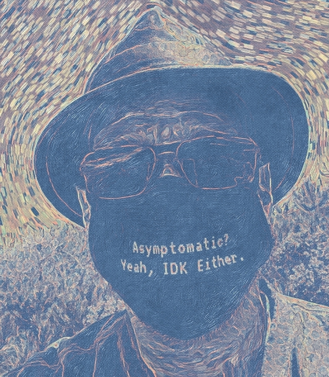
In honor of the new COVID variant coming out of South Africa:
For the non-Twitter folks, this is my Twitter promotion this week … no words … just the image (thanks for the inspiration Jack):

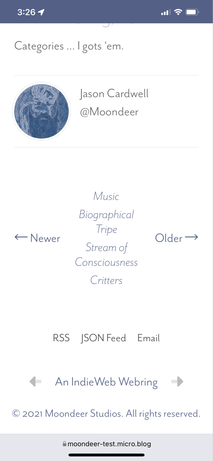
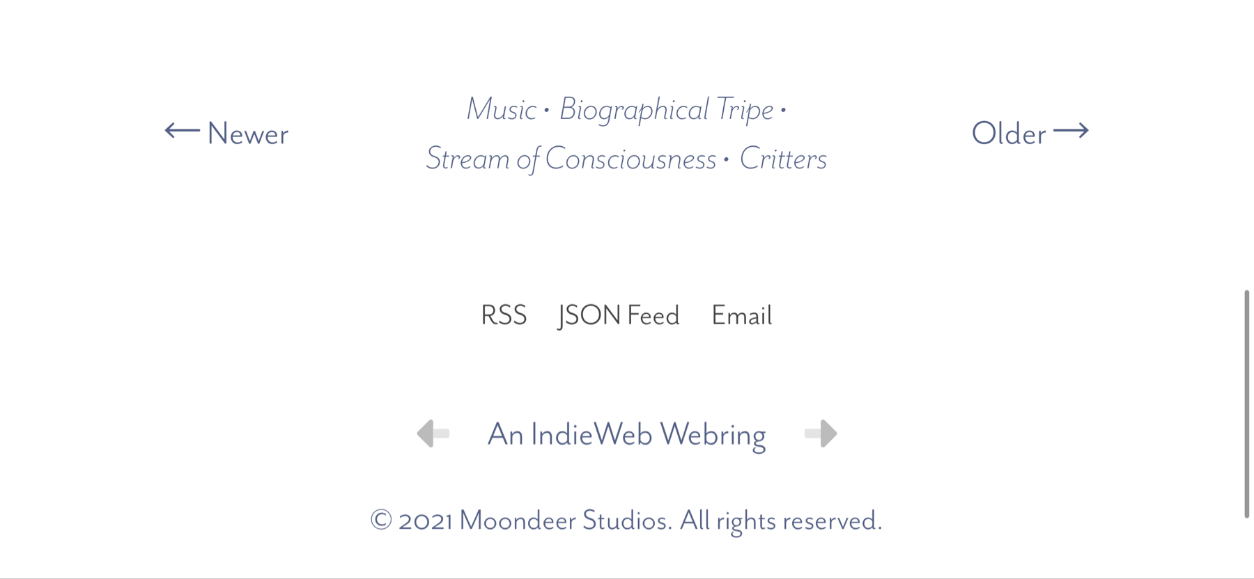
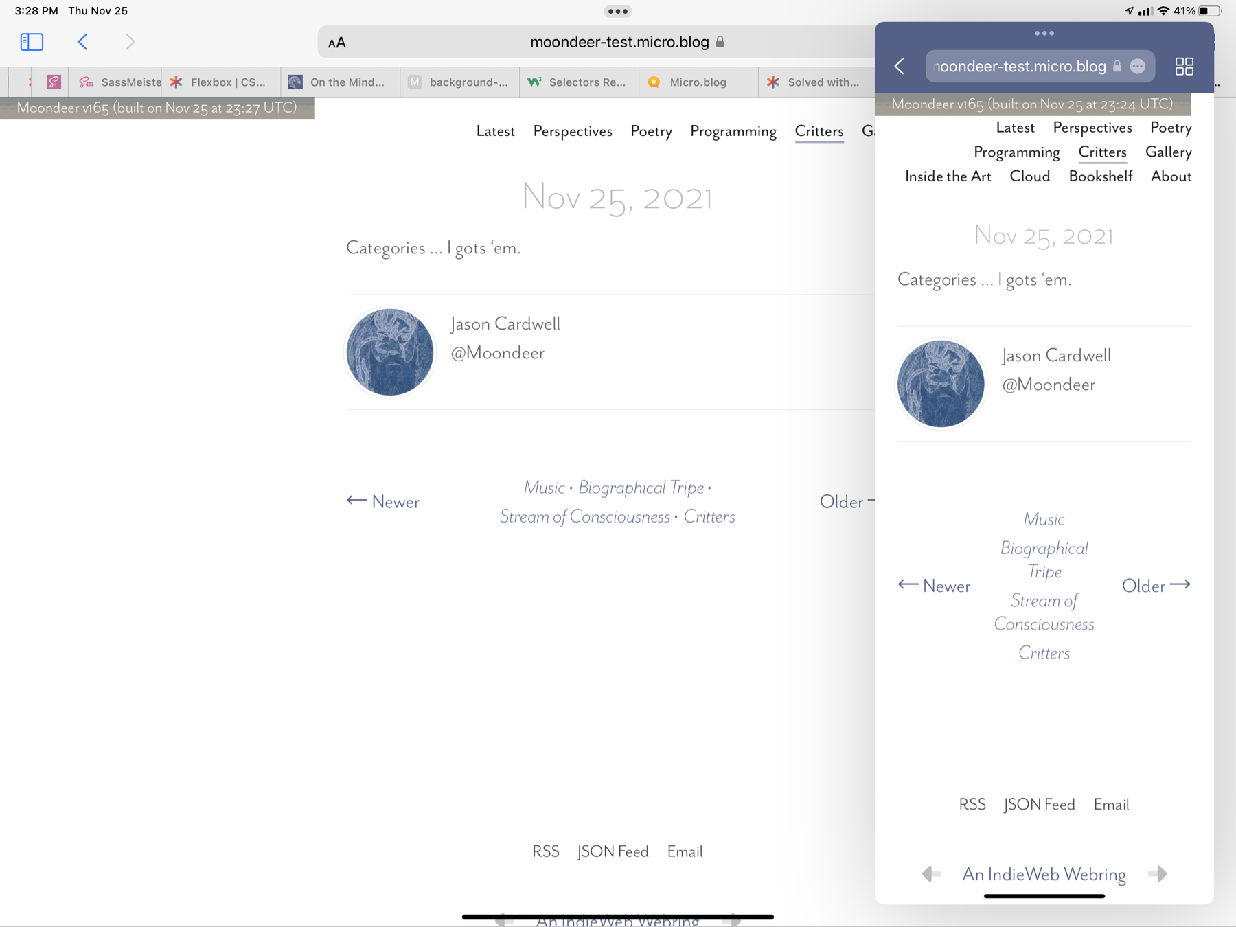
A footer beneath a post with navigation to the next / previous posts in the current section and a
<nav>list in the middle with links to the current post's categories that behaves responsively with regard to screen real estate in that when there are too many categories for an itty bitty screen the category links know to ditch their bullet divider and stack themselves vertically … yeah … I gots it.iPhone Portrait:
iPhone Landscape:
A Pair of iPad Safari Windows:
// Next/Prev nav#next-prev { display: grid; grid-template-columns: 100px auto 100px; grid-template-areas: "next categories prev"; margin: 2em 0; // width: 350px; @include media-breakpoint-up(sm) { width: 100%; } span { align-self: center; &#next { grid-area: next; justify-self: start; } &#prev { grid-area: prev; justify-self: end; } a { @include eaves-font($np-link-weight, $np-link-style); color: $np-link-col; &:hover { color: $np-link-hov-col; } } } // span nav#category-list { grid-area: categories; max-width: 100%; [@include](https://micro.blog/include) hstack(wrap, $justify: center, $align: baseline, $gap: 0.25rem); place-self: center; line-height: $line-height-sm; .category-link { text-align: center; @include eaves-font($np-cat-link-weight, $np-cat-link-style); color: $np-cat-link-col; &:hover { color: $np-cat-link-hov-col; } &:not(:last-child)::after { content: " •"; } @include media-breakpoint-down(sm) { &:first-child:nth-last-child(n + 3), &:first-child:nth-last-child(n + 3) ~ * { width: 100%; &::after { content: ""; } } } @include media-breakpoint-up(sm) { width: auto; &:not(:last-child)::after { content: " •"; } } } } // nav#category-list } // nav#next-prevAdded a realistic highlighter overlay to
<mark>tags in my custom Micro.blog theme … f$&k if I know why.mark, .yellow-highlighter { position: relative; background-color: transparent; &::before { content: ""; background: transparent url("/assets/png/highlighter.png") repeat-x; background-size: cover; position: absolute; top: 0px; right: 0px; bottom: 0px; left: 0px; opacity: 0.25; } }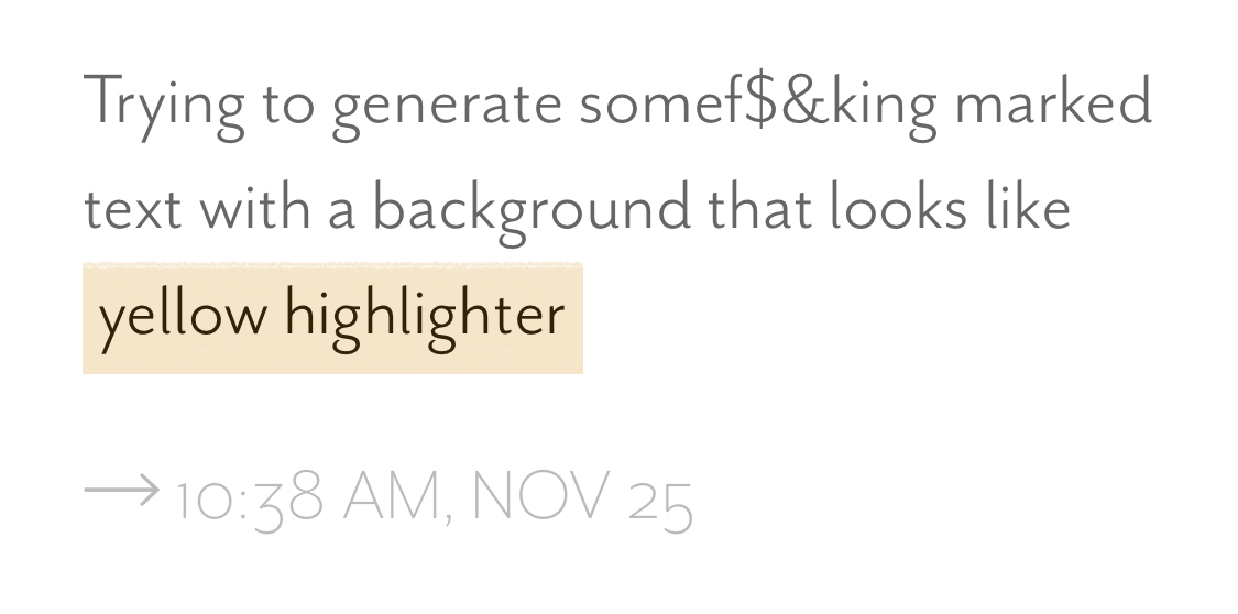
Challenge accepted.

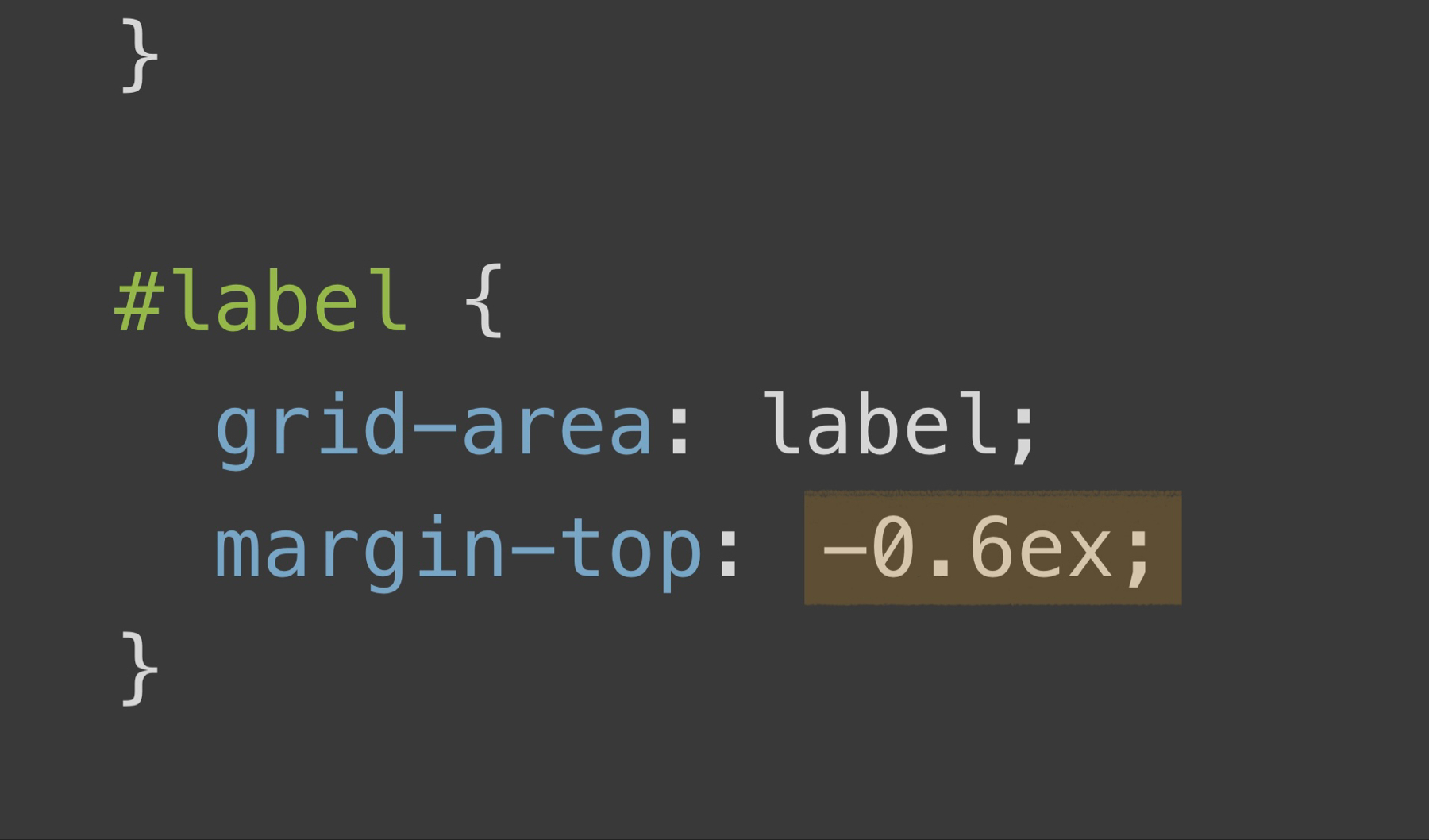
#webring { display: grid; grid-template-columns: auto max-content auto; grid-template-areas: "left-arrow label right-arrow"; place-items: center; gap: 1rem; a:first-child { grid-area: left-arrow; justify-self: end; } #label { grid-area: label; margin-top: -0.6ex; } a:last-child { grid-area: right-arrow; justify-self: start; } }Getting my CSS grid layout to play nicely with my iPhone in portrait is driving me bat sh$t crazy.
Propagaters of Twitter message requests, something to know … saying "hi" does not meet the curiousity prerequisite for gaining the attention of the #ADHD brain (neither do solicitations thus far, but you can never count out creativity).
Wonder if using Hugo's resource bundling capability to shove all the Micro.blog plugin Javascript into one file would be worth the time … or the stylesheets for that matter.
When @manton sticks you in timeout for the never-ending cycle of paste → update-template → make-adustment ↺
Wild hair runner up goes to refactoring some of my Sass variables into CSS variables … opening up all kinds of theme parameterization possibilities for the theme consumer without having to know a lick of code.
<body style="--md-header-bg: var(--md-header-bg-light); --md-footer-bg: var(--md-footer-bg-light); --md-footer-link-color: var(--md-footer-link-color-dark); --md-footer-link-hover-color: var(--md-footer-link-hover-color-dark); --md-nav-link-color: var(--md-nav-link-color-dark); --md-nav-link-hover-color: var(--md-nav-link-hover-color-dark); --md-nav-link-hover-shadow: var(--md-nav-link-hover-shadow-dark); --md-nav-link-selected-shadow: var(--md-nav-link-selected-shadow-dark); --md-copyright-color: var(--md-copyright-color-dark);">Any one of those MFers could just as easily be
{{/* site.Params.my_awesome_parameter_value */}}Today's wild hair award goes to adding the ability to conditionally load Micro.blog plugin assets according to configured page paths in plugin-precision-injection. No README yet, but I'm not sure how many of y'all are up for messing with custom themes to begin with.
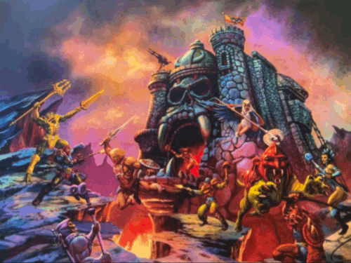
Today's nostalgically guilty pleasure.

I wish all the f$&kers that blocked my previous accounts had their block lists automatically updated to include this account so I could spare them from ever having to process what it is that I have to say.

Jason Cardwell
Creative nonfiction, art, poetry, apps, philosophy, music, wood work, knots, political culture critiques … some of the things I make.