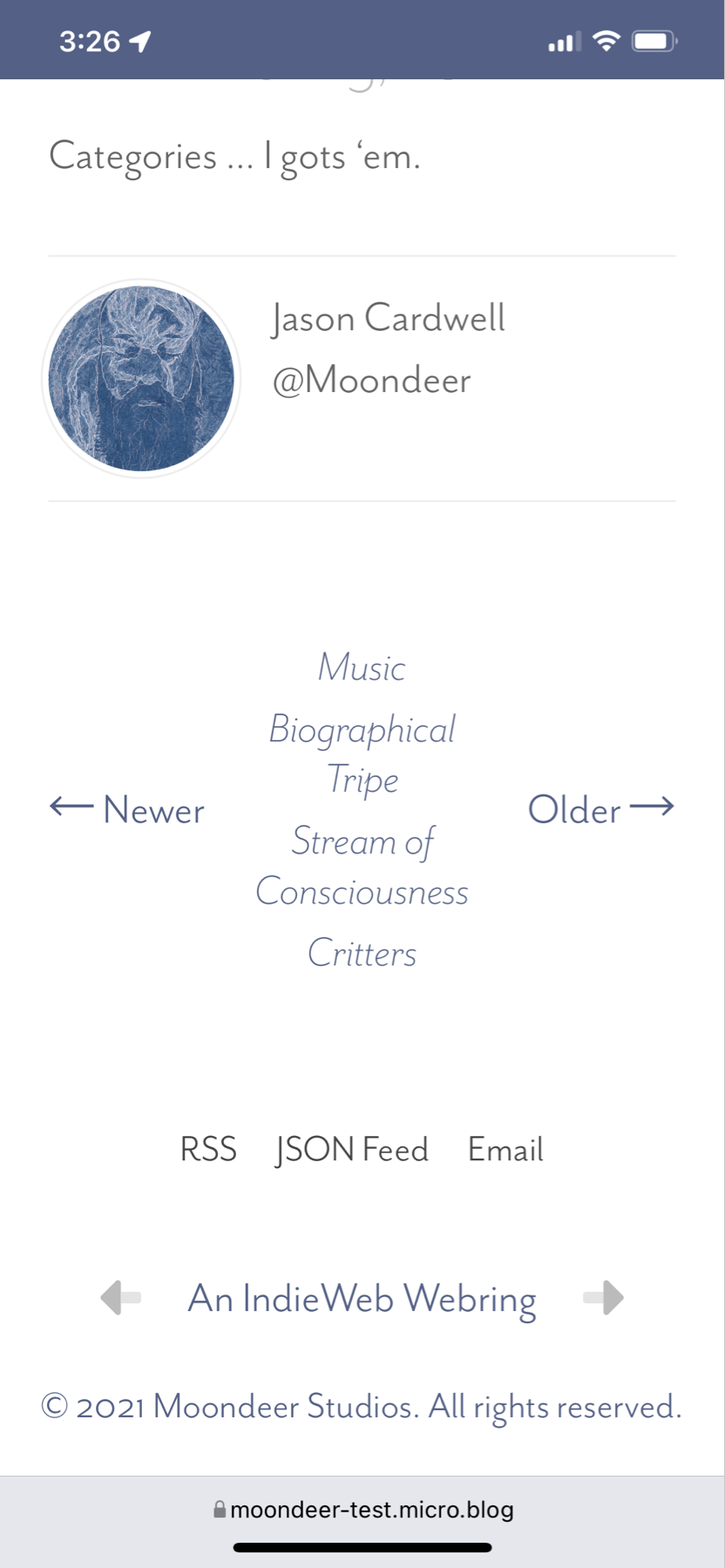
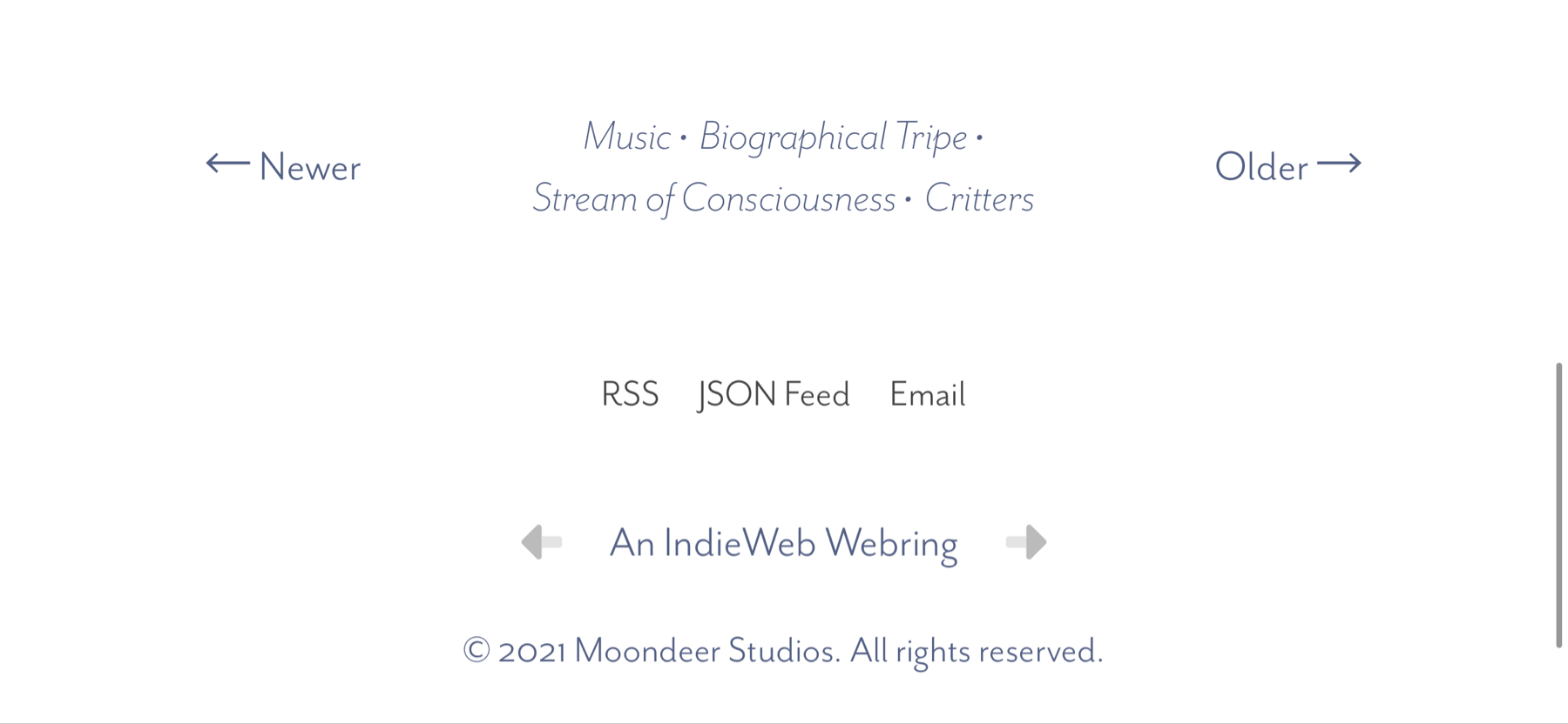
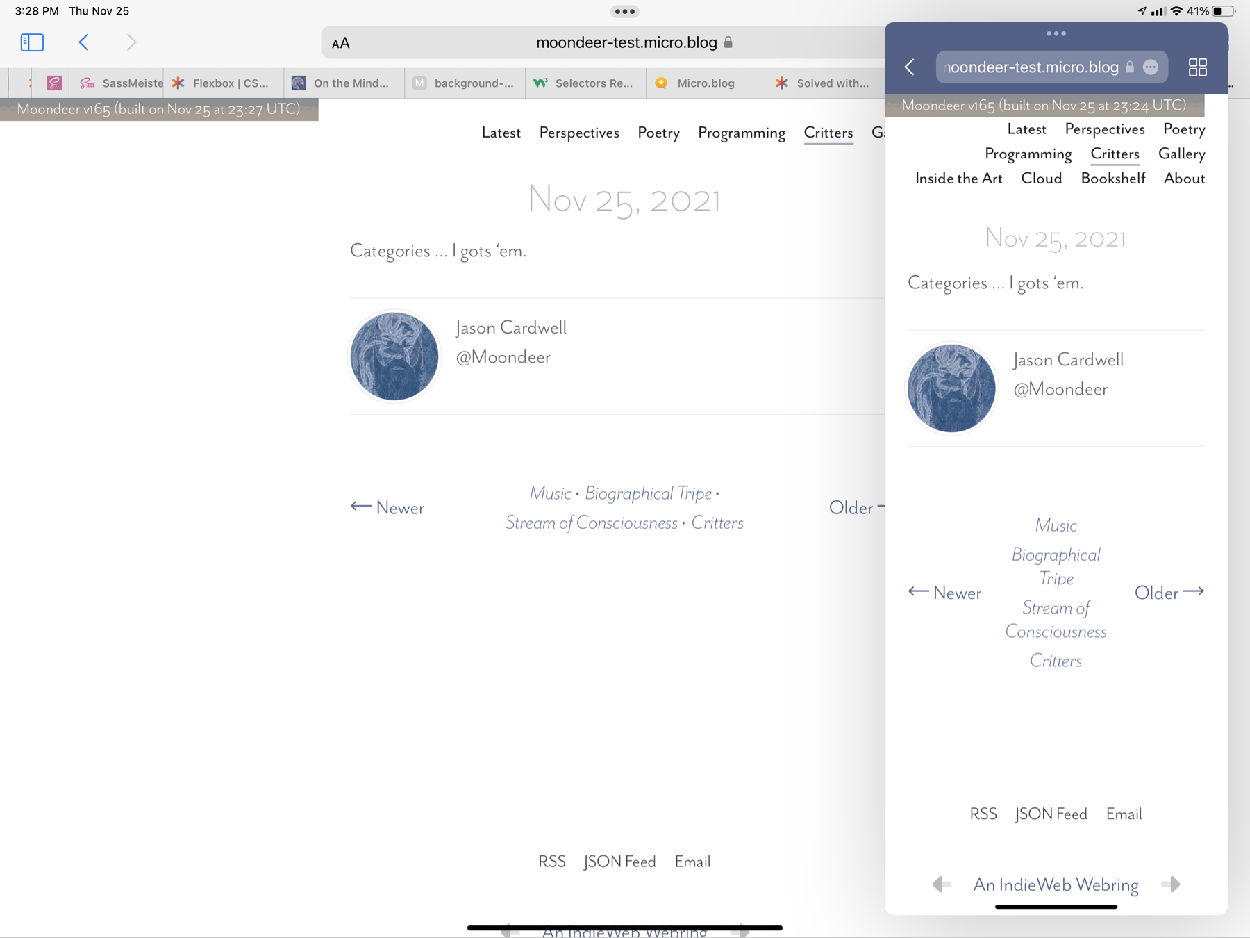
A footer beneath a post with navigation to the next / previous posts in the current section and a <nav> list in the middle with links to the current post's categories that behaves responsively with regard to screen real estate in that when there are too many categories for an itty bitty screen the category links know to ditch their bullet divider and stack themselves vertically … yeah … I gots it.
iPhone Portrait:
iPhone Landscape:
A Pair of iPad Safari Windows:
// Next/Prev
nav#next-prev {
  display: grid;
  grid-template-columns: 100px auto 100px;
  grid-template-areas: "next categories prev";
  margin: 2em 0;
  // width: 350px;

  @include media-breakpoint-up(sm) { width: 100%; }

  span {
    align-self: center;

    &#next { grid-area: next; justify-self: start; }

    &#prev { grid-area: prev; justify-self: end; }

    a {
      @include eaves-font($np-link-weight, $np-link-style);
      color: $np-link-col;
      &:hover { color: $np-link-hov-col; }
    }

  } // span

  nav#category-list {
    grid-area: categories;
    max-width: 100%;
    [@include](https://micro.blog/include) hstack(wrap,
                    $justify: center,
                    $align: baseline,
                    $gap: 0.25rem);
    place-self: center;
    line-height: $line-height-sm;

    .category-link {
      text-align: center;
      @include eaves-font($np-cat-link-weight, $np-cat-link-style);
      color: $np-cat-link-col;

      &:hover { color: $np-cat-link-hov-col; }

      &:not(:last-child)::after { content: " •"; }

      @include media-breakpoint-down(sm) {
        &:first-child:nth-last-child(n + 3),
        &:first-child:nth-last-child(n + 3) ~ * {
          width: 100%;
          &::after { content: ""; }
        }

      }

      @include media-breakpoint-up(sm) {
        width: auto;
        &:not(:last-child)::after { content: " •"; }
      }

    }

  } // nav#category-list

} // nav#next-prev