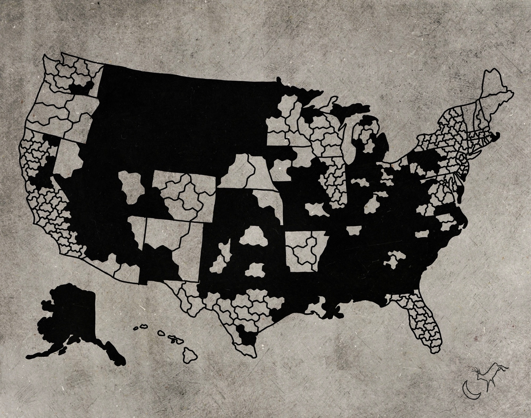
The raw data plot going into The Upside Down Pandemic. I'm using the cartographic representation of congressional districts as drawn by Daily Kos and metrics as of September 8th, 2021 gathered by Harvard University. In districts with a light background one is more likely to find a fully vaccinated person than a half/unvaccinated person. In districts with a dark background the opposite is true.