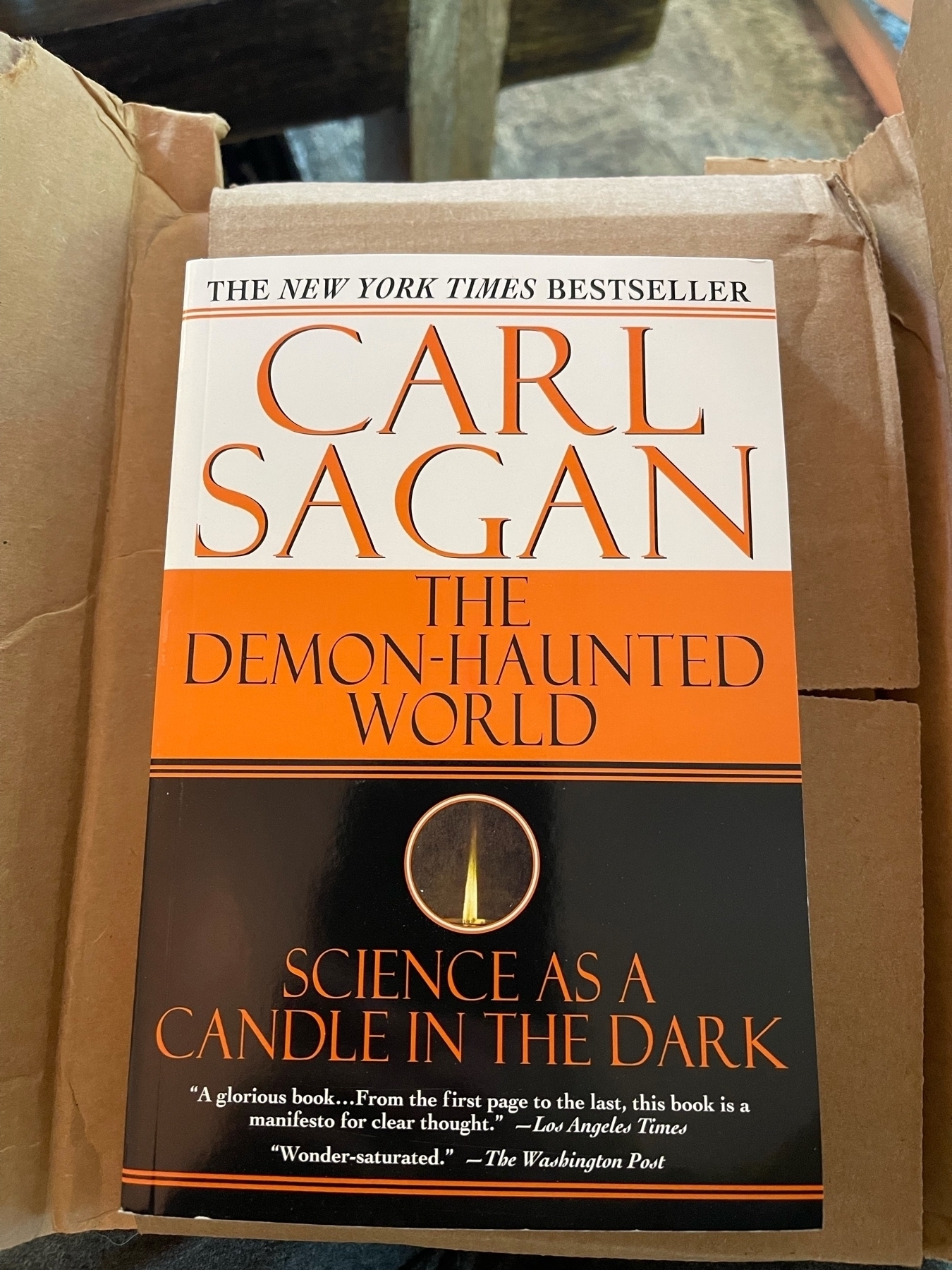
Book unboxing
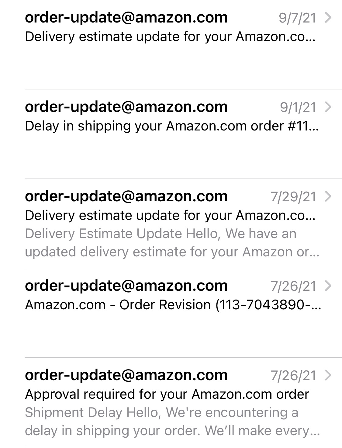
And to think, it was only delayed four times
Book unboxing

And to think, it was only delayed four times

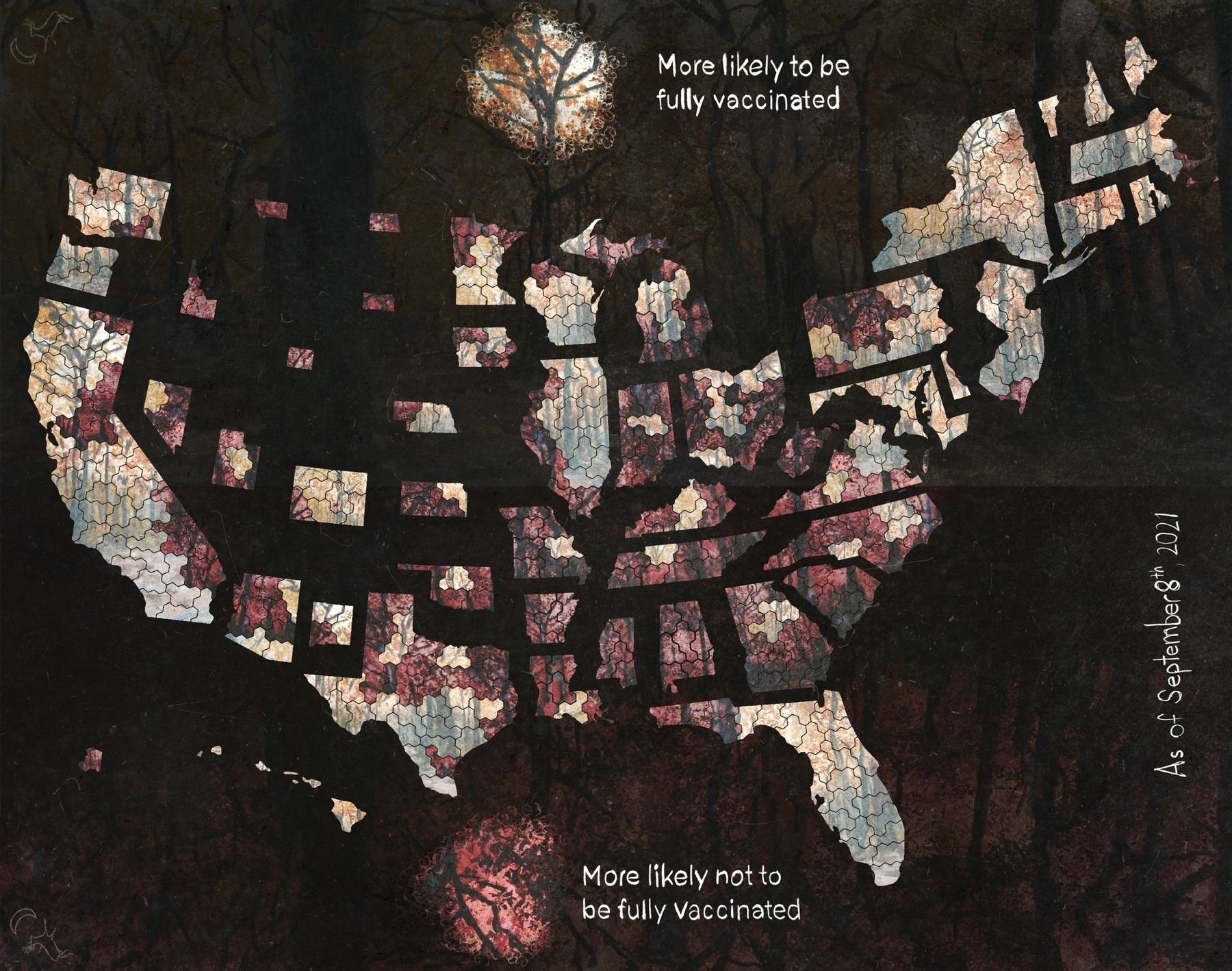
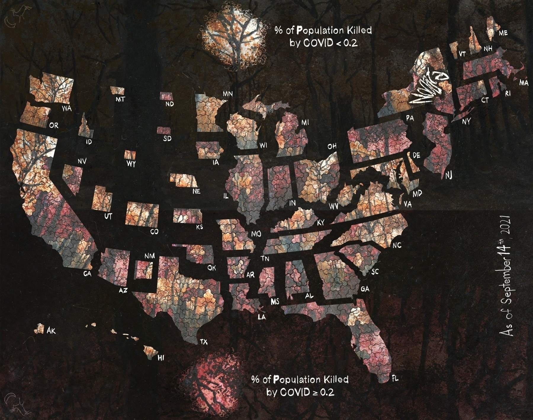
Revised vaccination and death maps
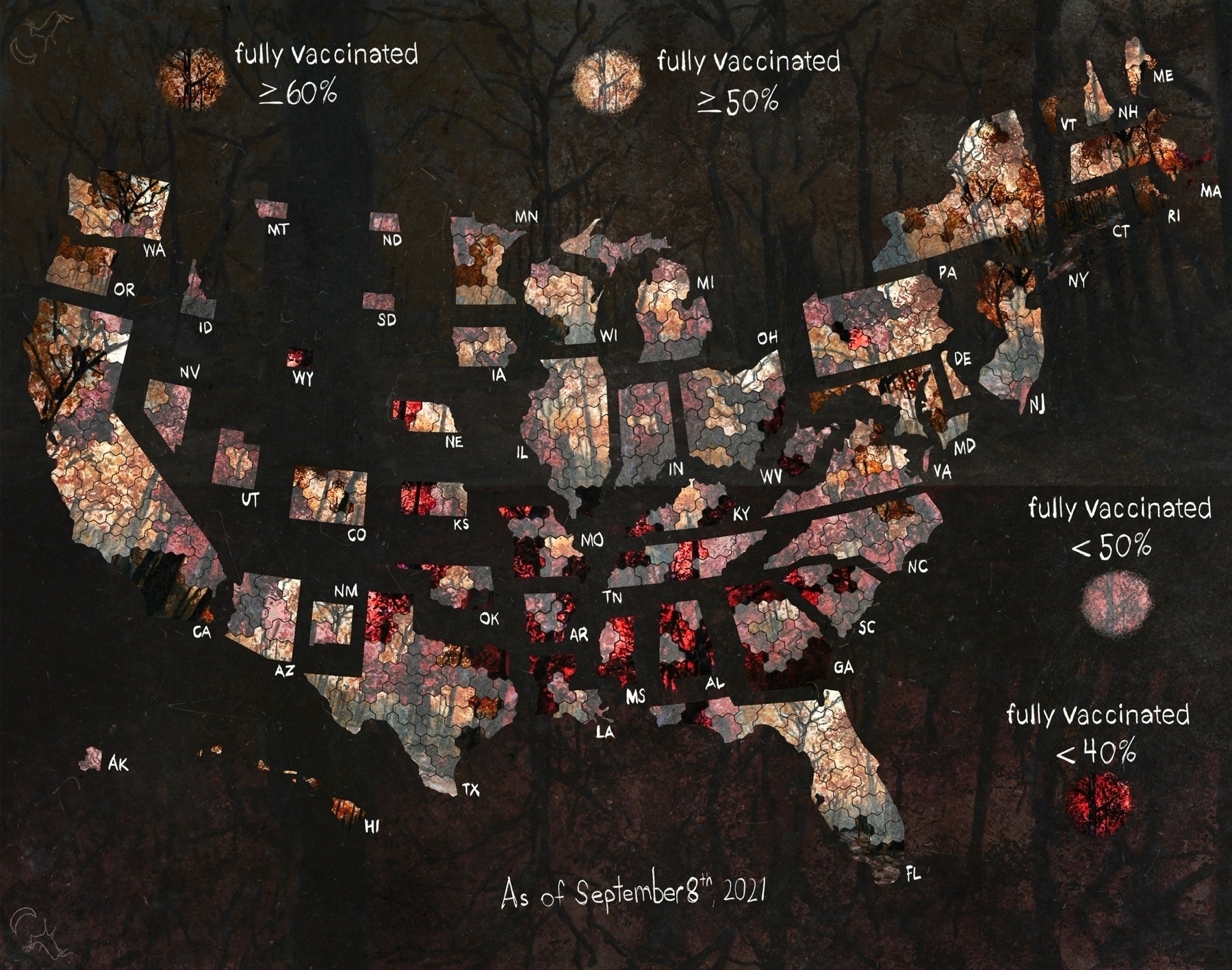
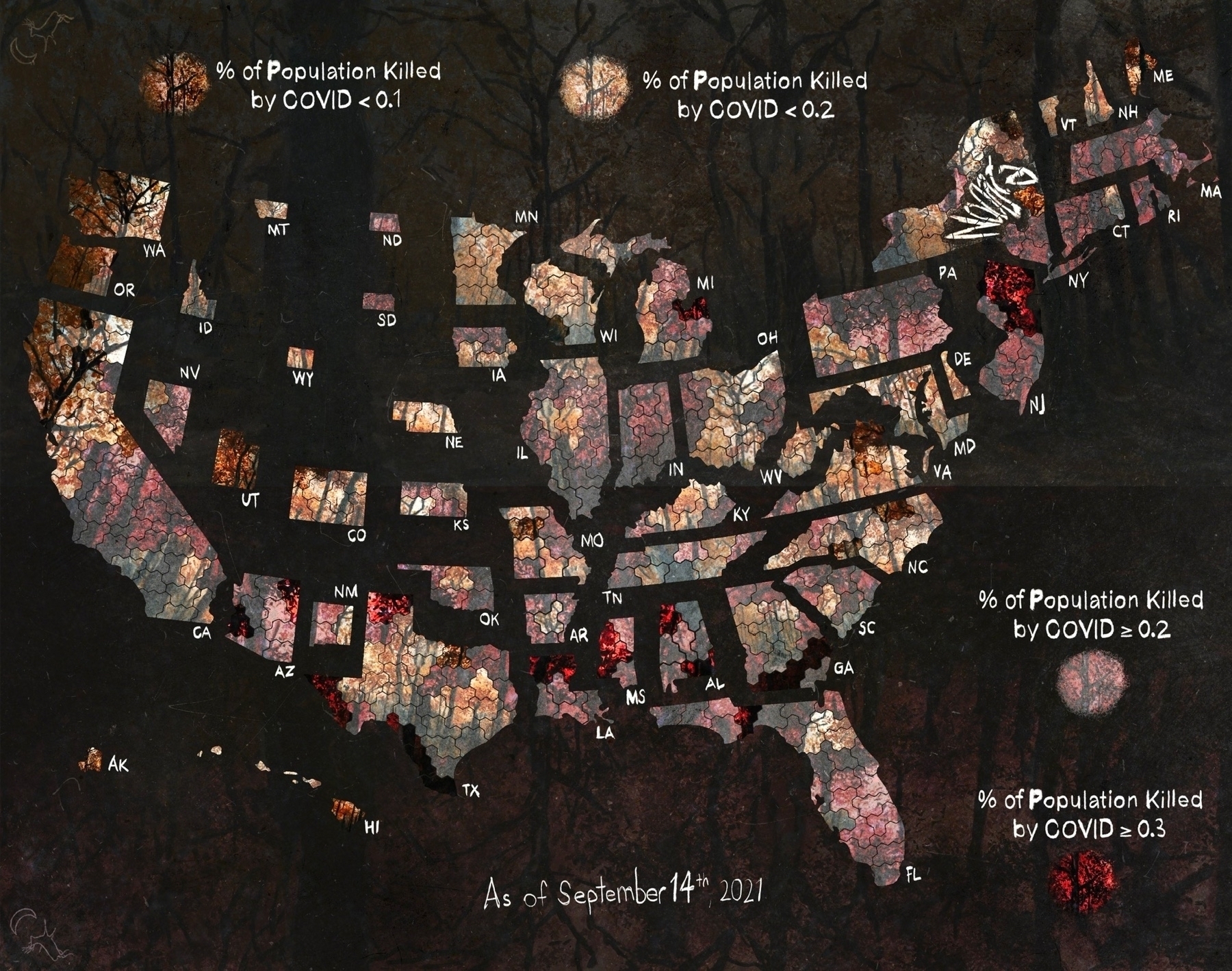
A pair of revised hospital impact maps

Still piddling with the maps.
The awards … like all of the awards … give them to Michael Shannon for his work thus far in #NinePerfectStrangers
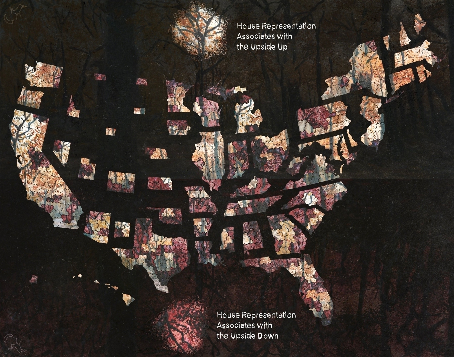
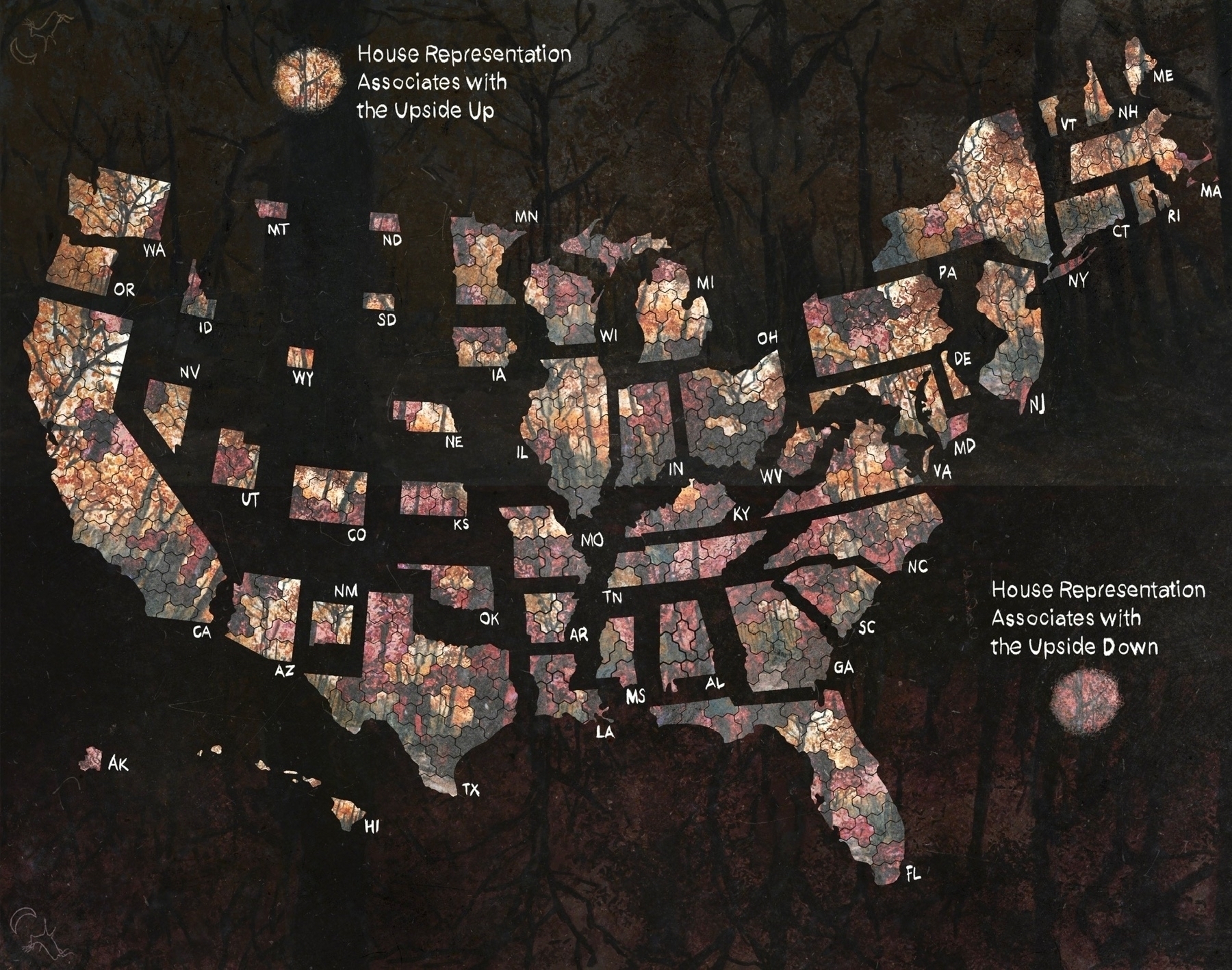
Decided to start showing a bit more specificity, probably add an equivalent marker for the Upside Up.
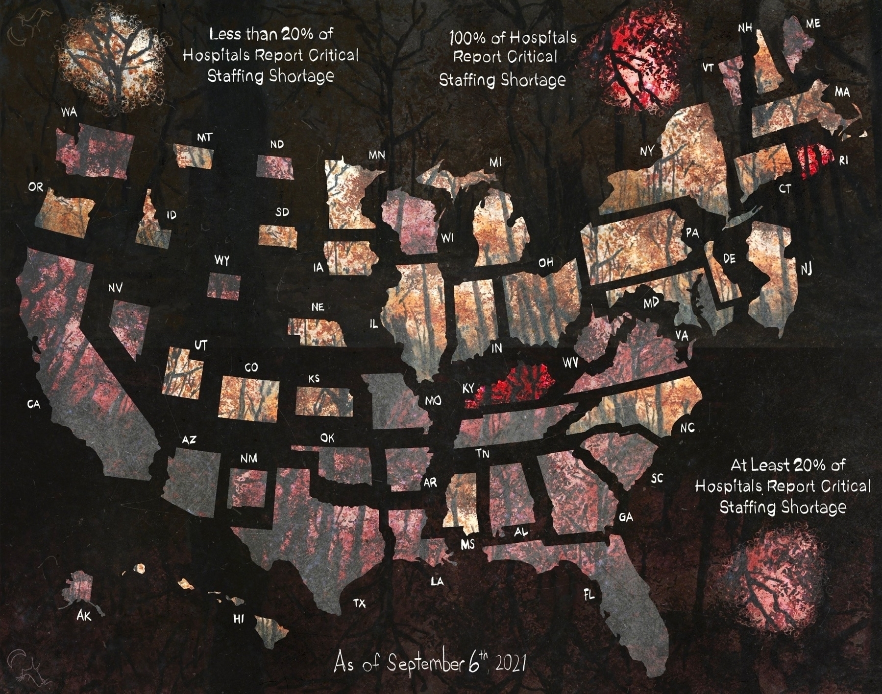
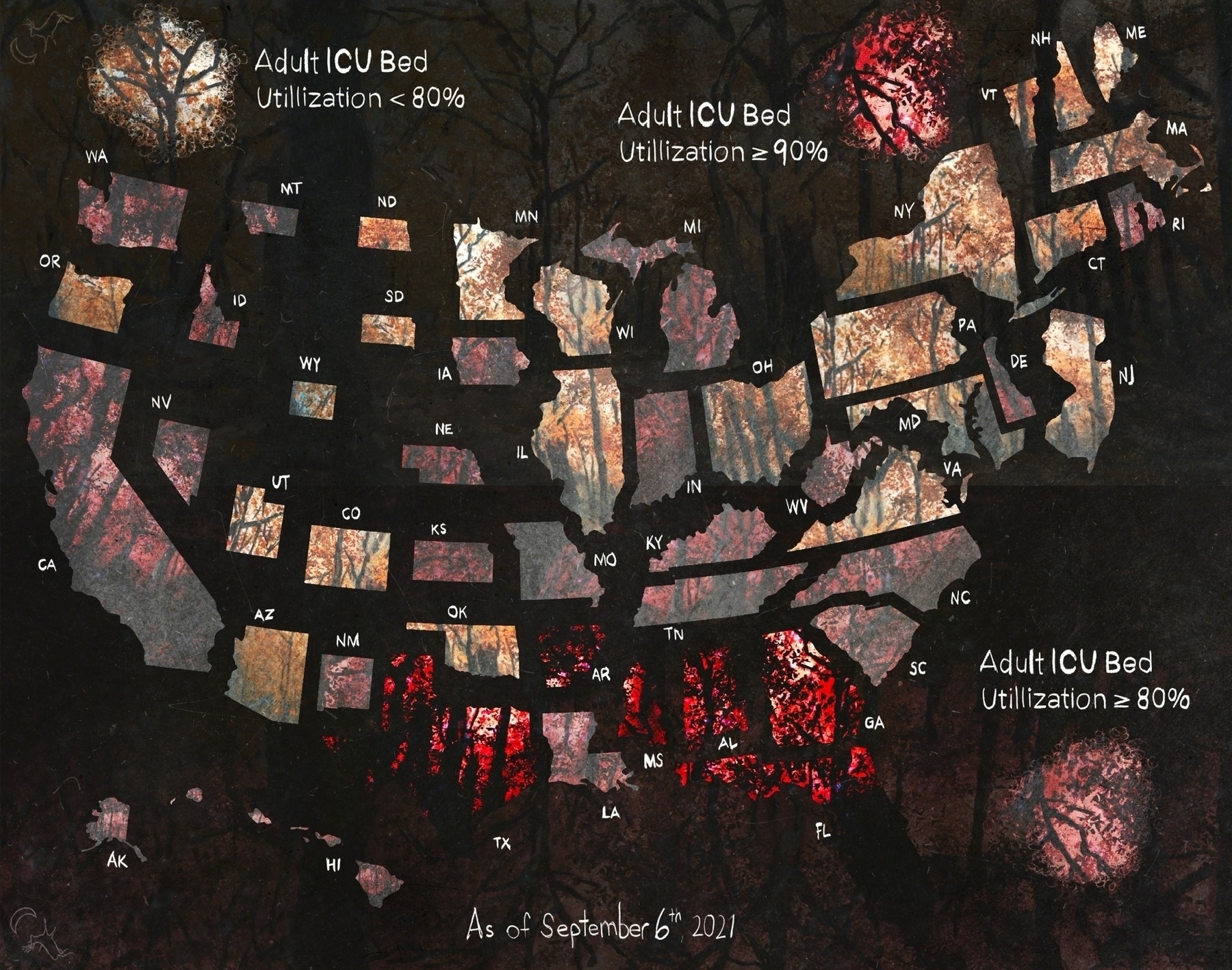
Maybe I'll animate the maps to show how COVID deaths drive vaccinations. Perhaps after I map the hospital critical shortage data I have.
This would be the order that tells the story.


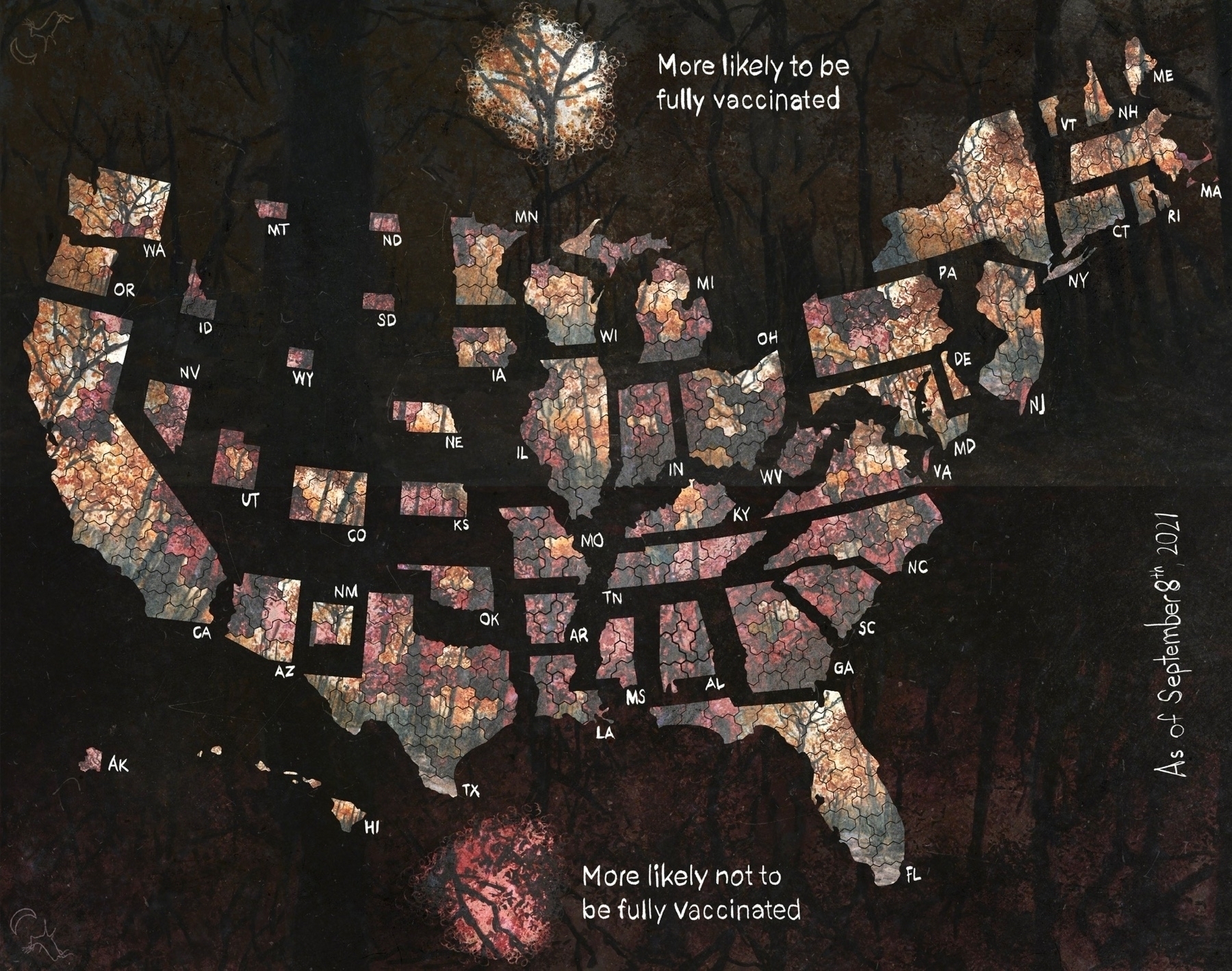
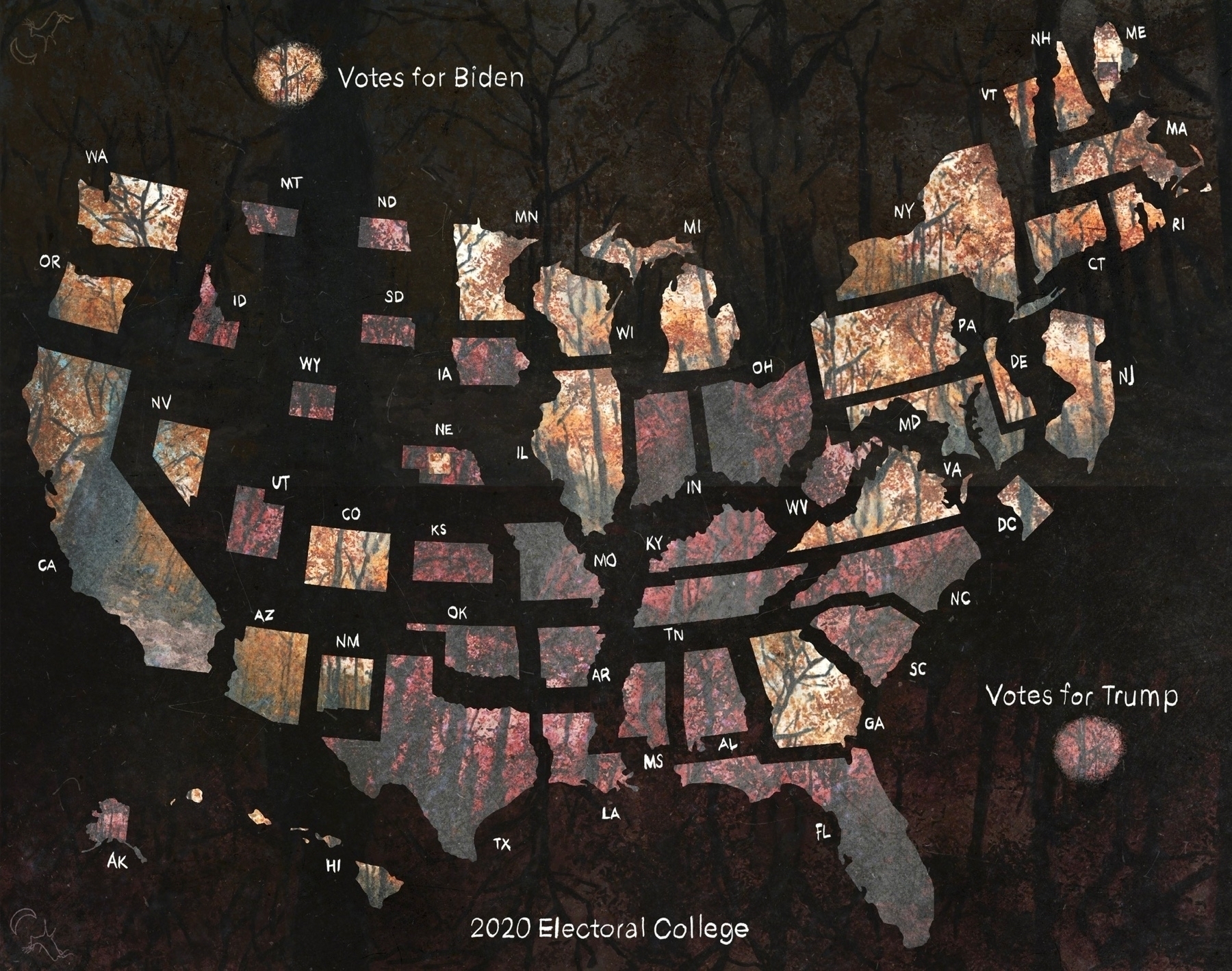
These single data point maps work better together.


Turns out Harvard is also tracking the COVID death by congressional district I was wanting.
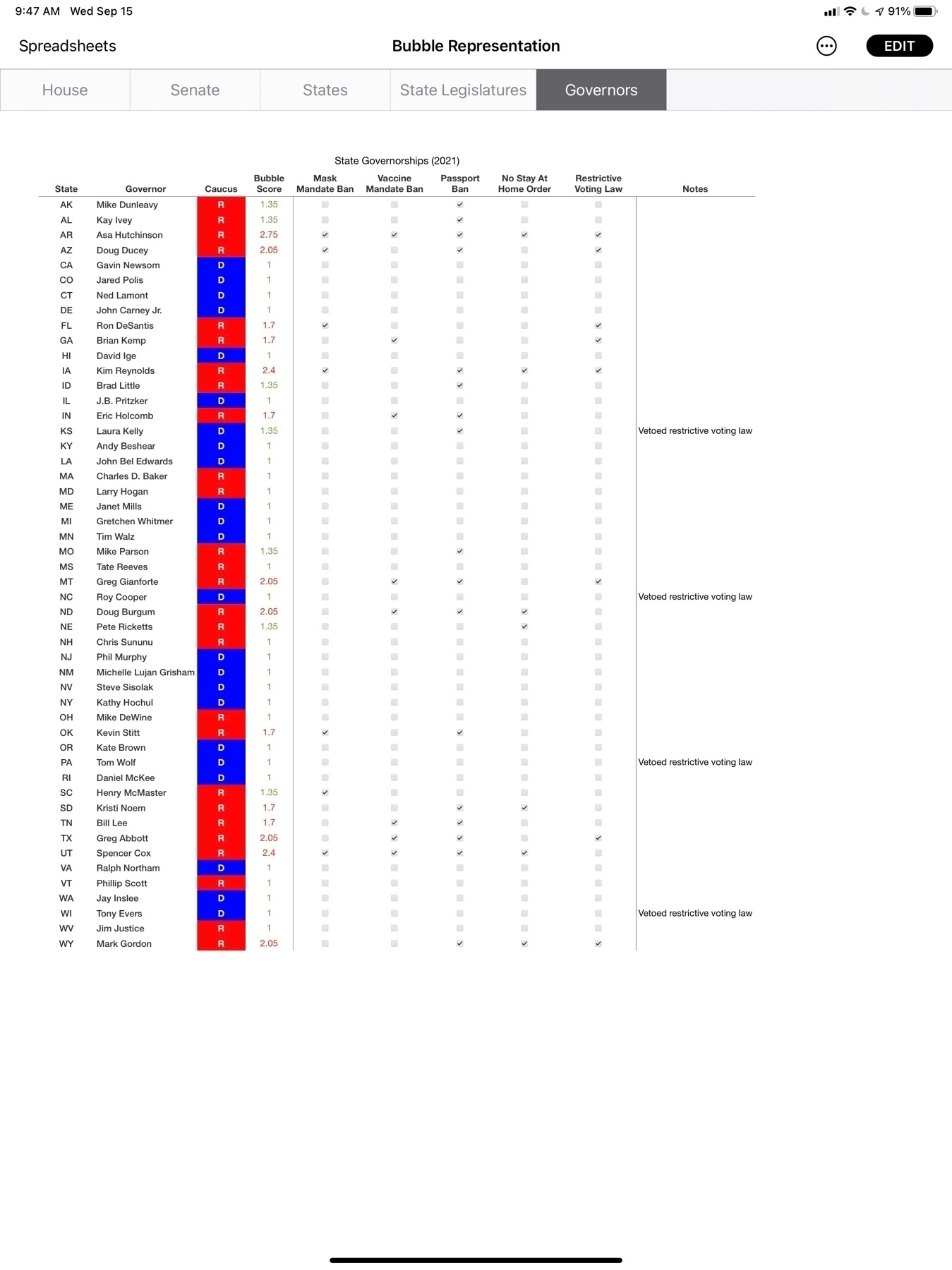
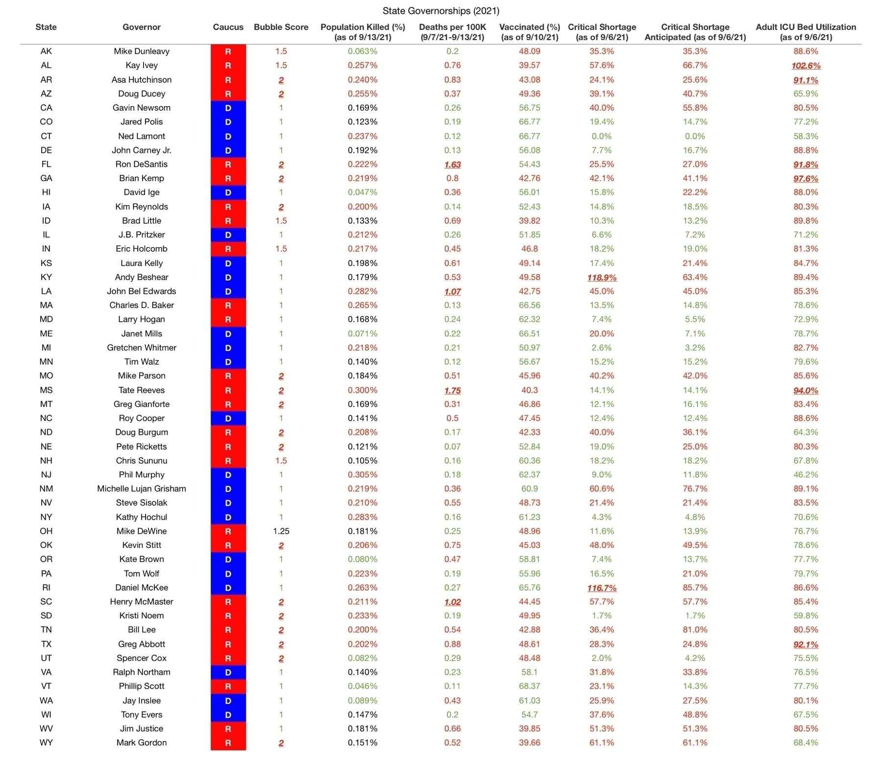
Been working to separate bubble scores for a state's governor and its legislature. Having to do a little refining at a time as this suddenly turned into more research than my #ADHD brain is cool with.
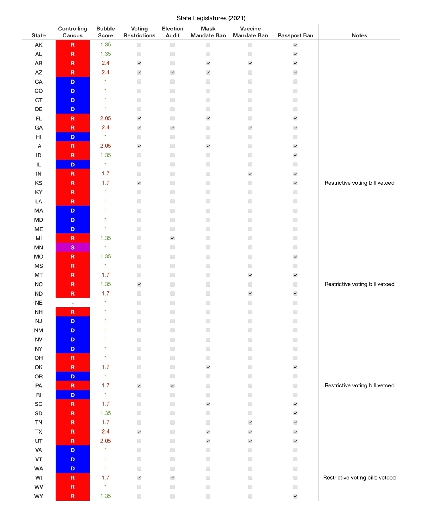
Nice to know political theater is still thriving in DC @SenatorRisch. Feels worth reinforcing the sentiment expressed in this post.
So @manton, now that I'm back to following the occasional person on Micro.blog, I'm curious whether you kicked any thoughts around with regard to some mechanism that might allow for displaying the content being replied to? Although now I think about this is probably already achievable, assuming replies can be traced to source via API, and would be an application level detail. ADHD and conversation click through are rarely compatible … but if I saw immediately what three of Lisa's favorite topics happened to be…
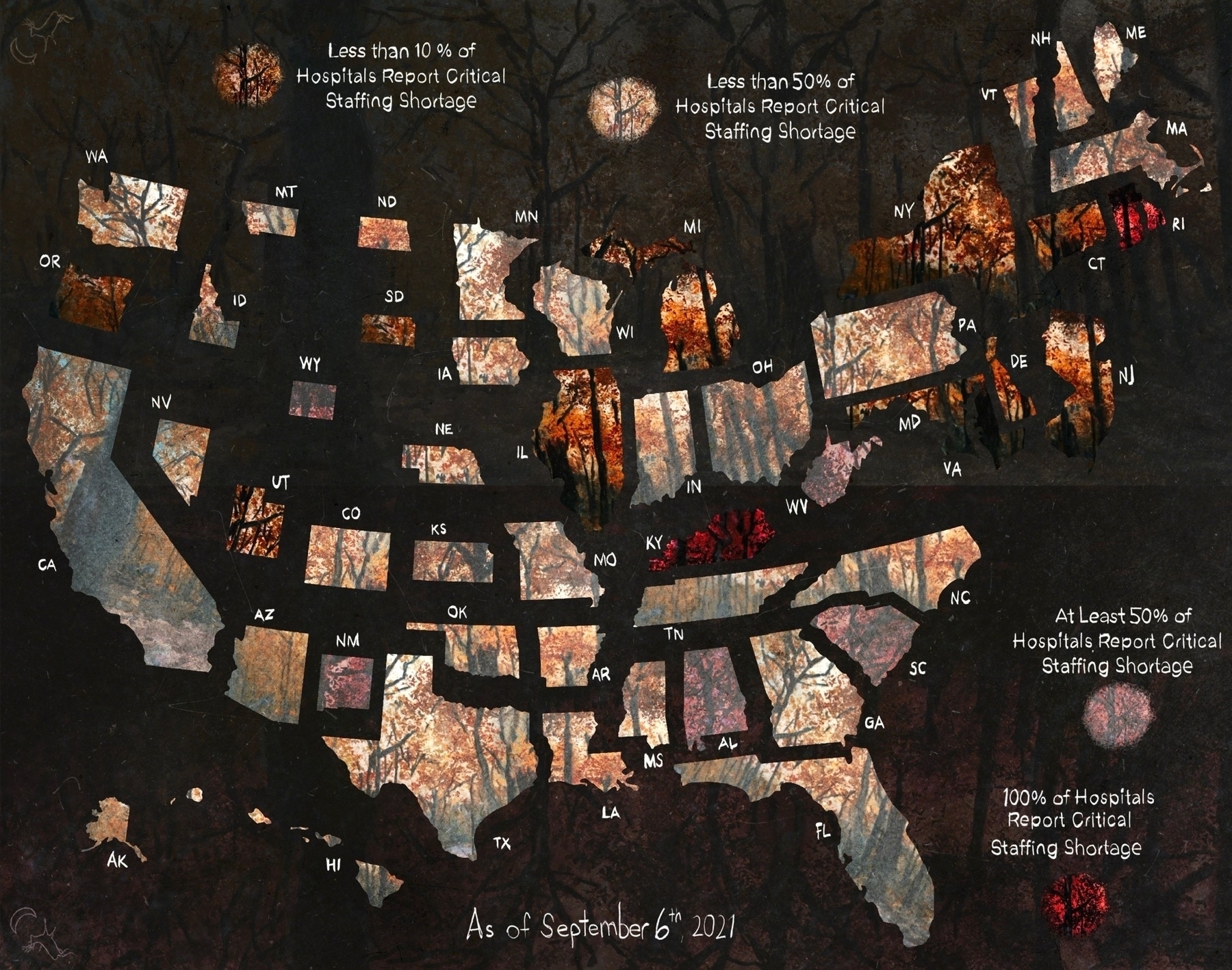
Added some hospital impact data (as of 9/6/21) to the table. Got a few more maps to make.
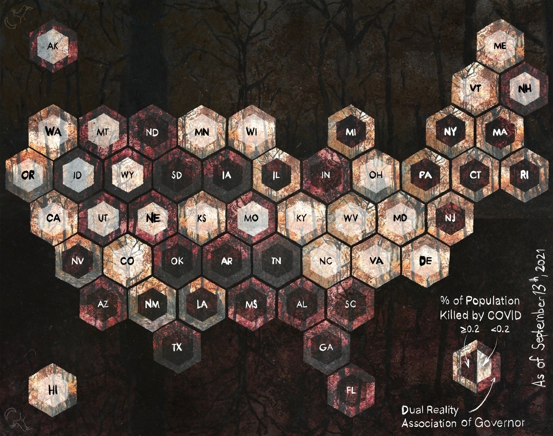
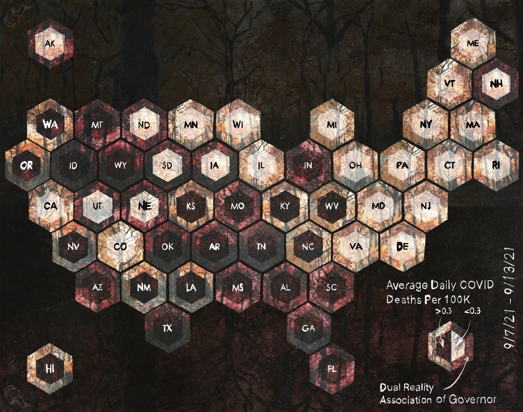
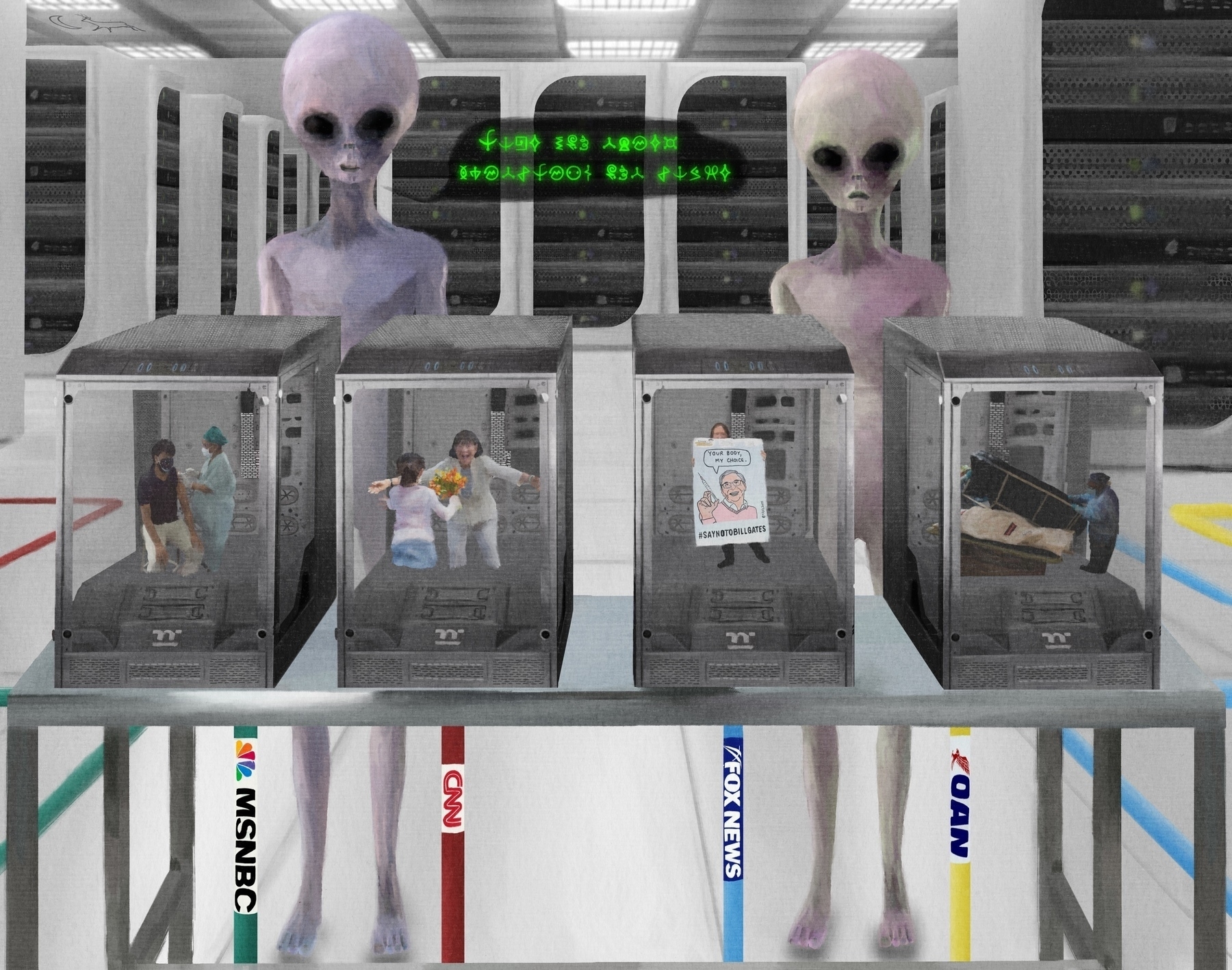
Anti-vaxxers (specifically the COVID variant), what the f$&k, am I right? With the litany of undesirable consequences we invite by allowing COVID to just flourish damn near unimpeded, conjuring an adequate answer to this question is quite important.
Feels like a better format for the double hex data as well.
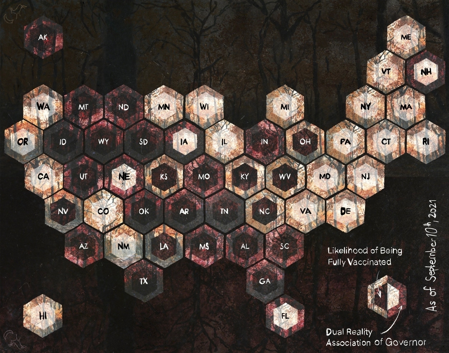
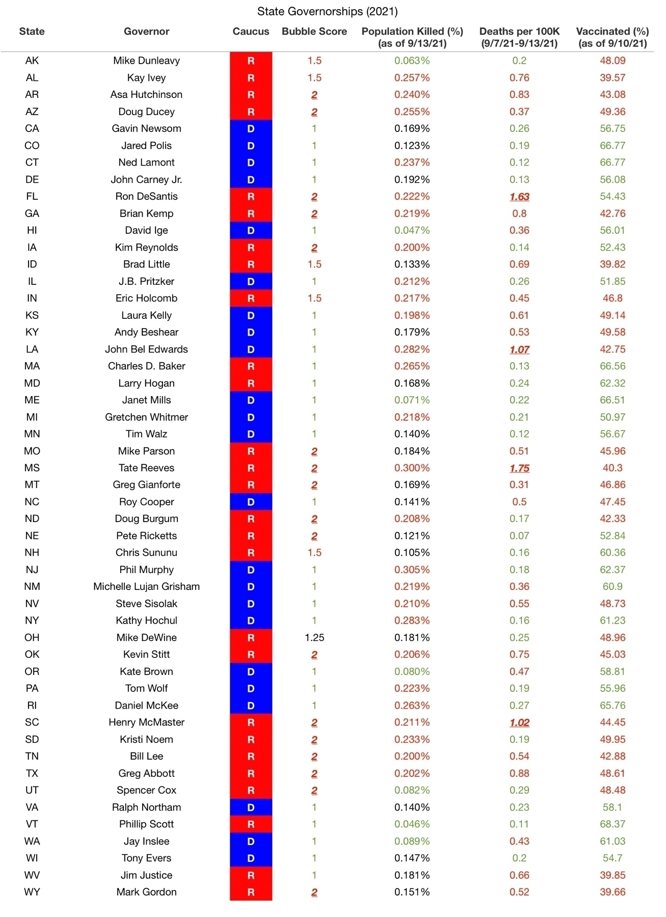
Alrighty, think I've settled on bubble scores for our governors.
Absolutely brilliant performance by Michael Shannon in episode three of #NinePerfectStrangers
Spousal-type has trouble understanding the art & the essays. This is normal. Now I feel like I have 2 explicitly state that I can explain all this 6 ways 2 Sunday … for any & all levels of comprehension. There simply hasn't been any interest. Therefore, the personal journal vibe.
Maybe I should just go back to tying knots.
Twitter is a lot more useless than I would have anticipated back in February. There is literally no one interested in reading uniquely insightful analysis … even when it's dressed up with original digital art. Big fat fart sound to the whole f$&king endeavor.
Added the new maps to On the American Upside Down, which I guess I'll keep doing 'til I'm bored of making the maps.
Think I settled on a presentation style for the flat, single data point maps.
