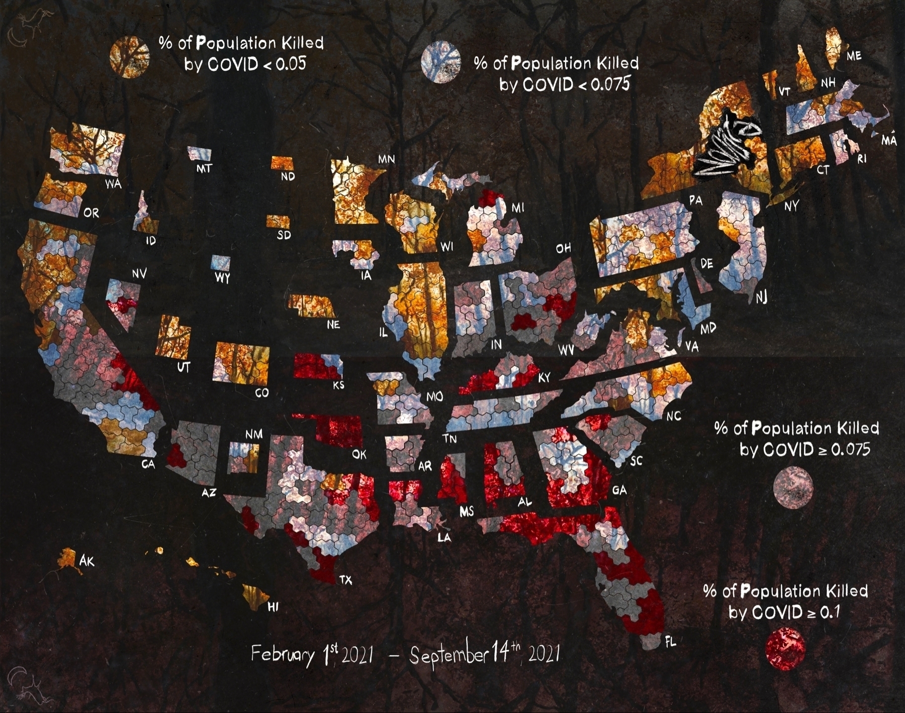
% of population killed by COVID by congressional district at scale
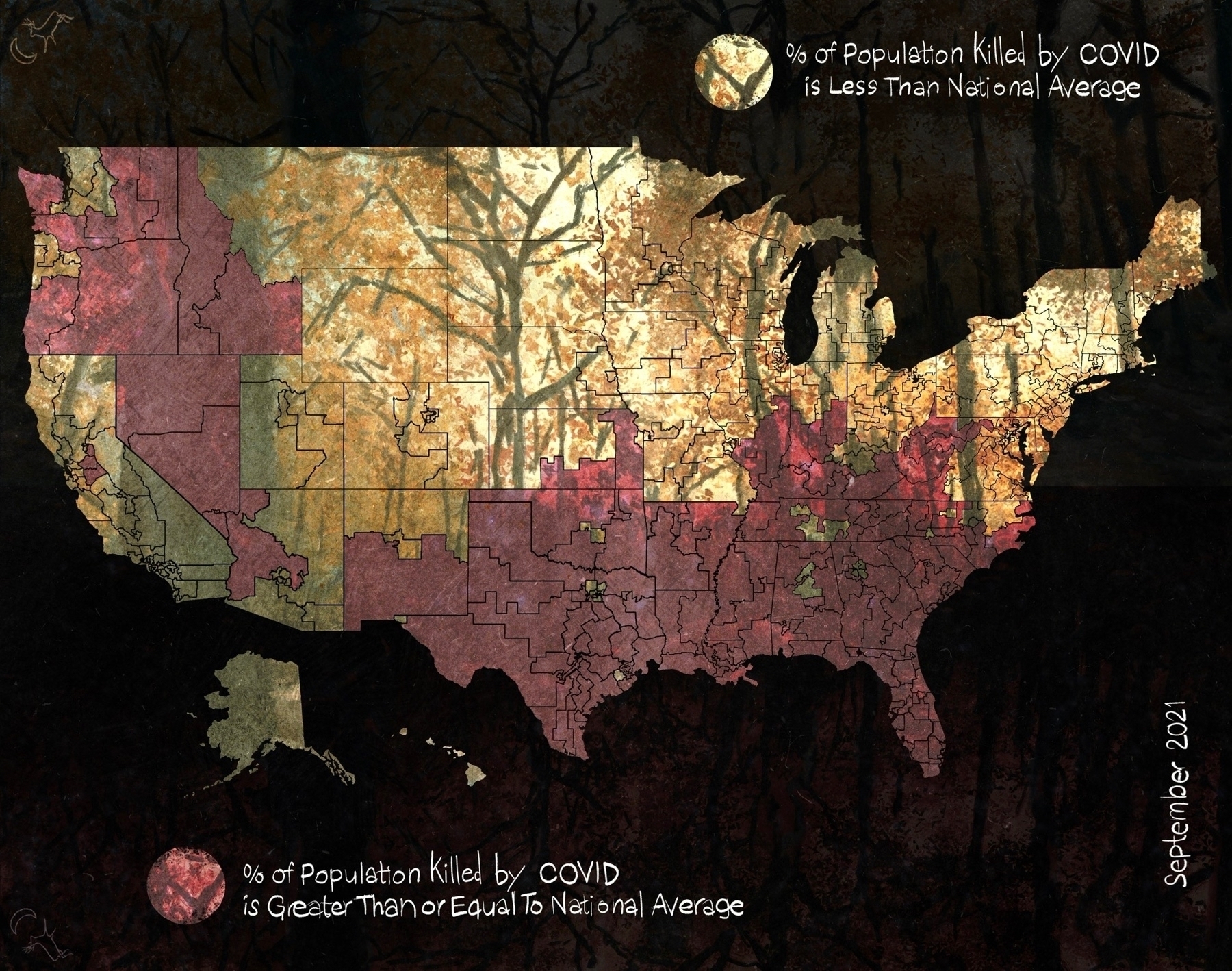
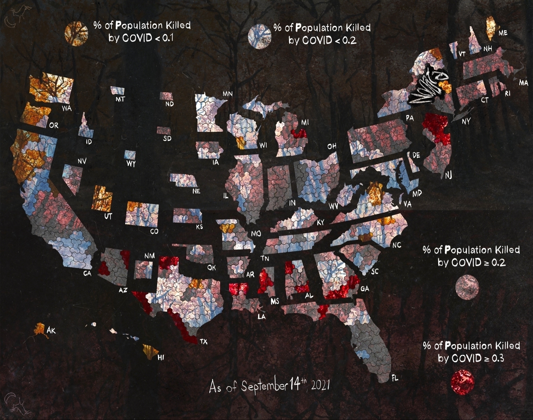
% of population killed by COVID by congressional district at scale

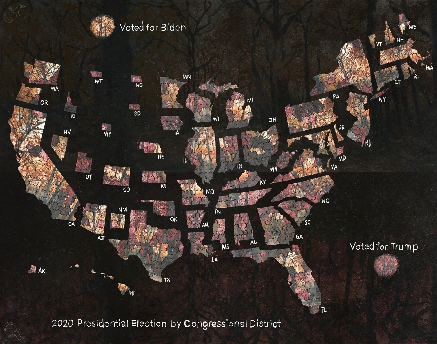
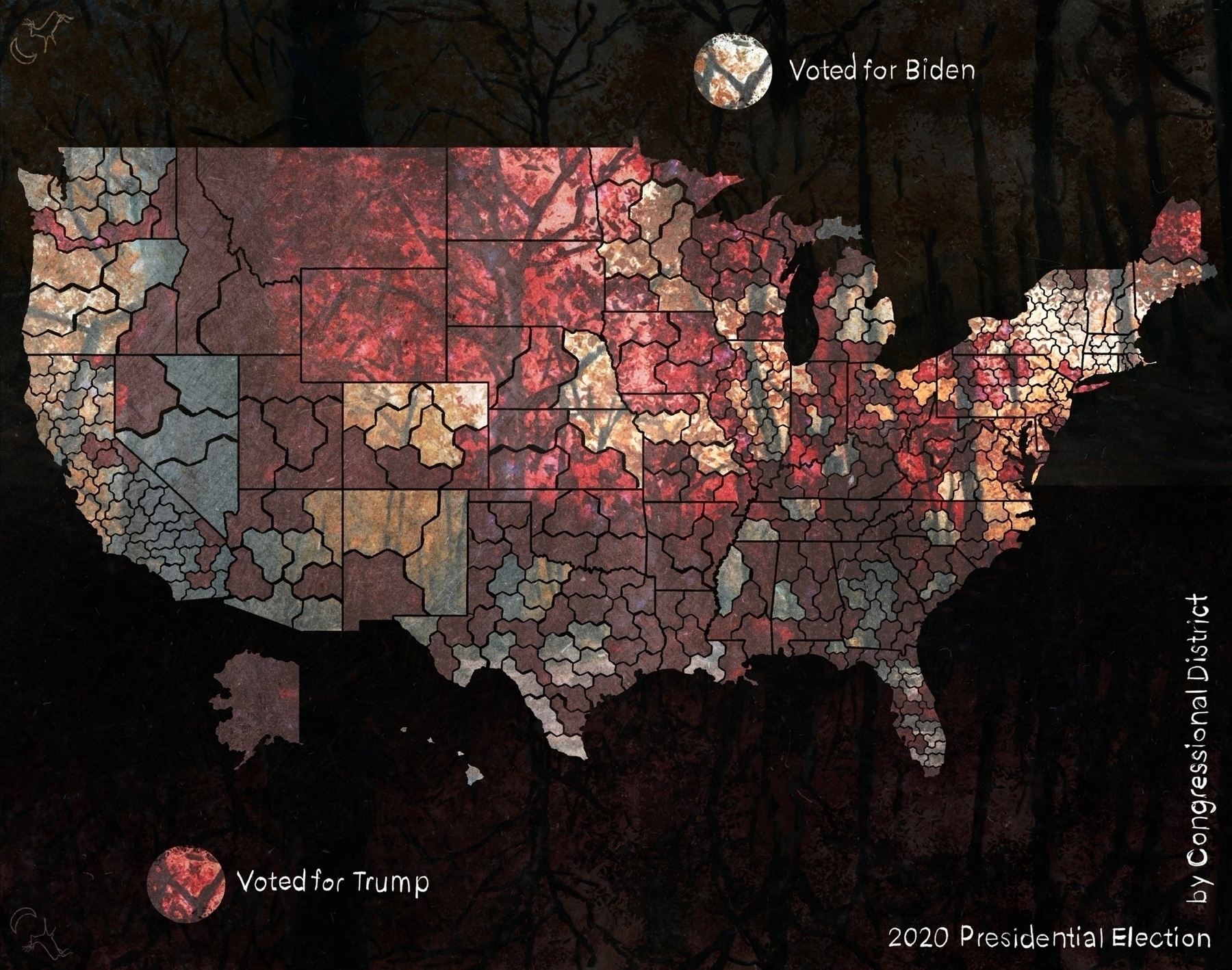
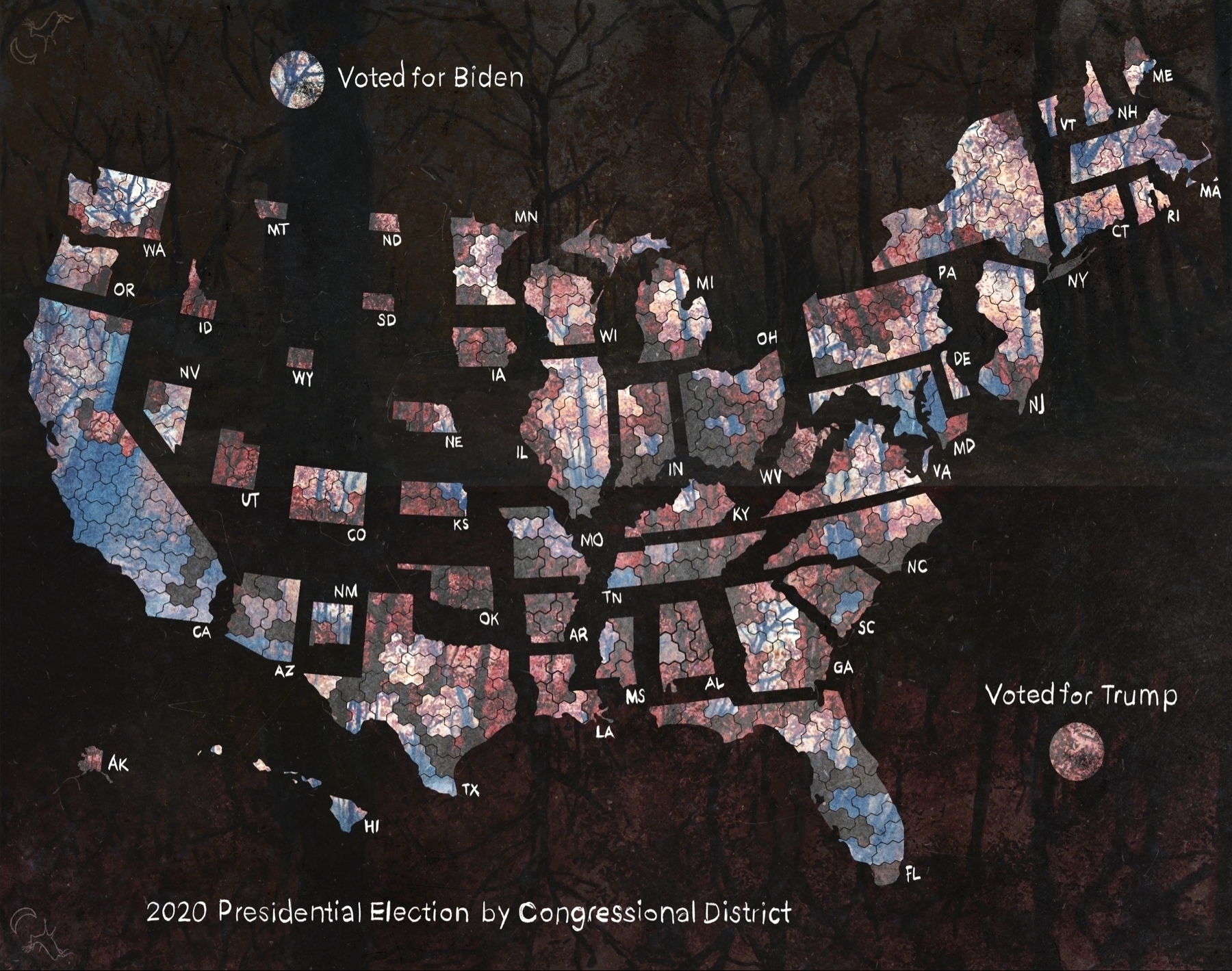
The remake of the 2020 Presidential Election
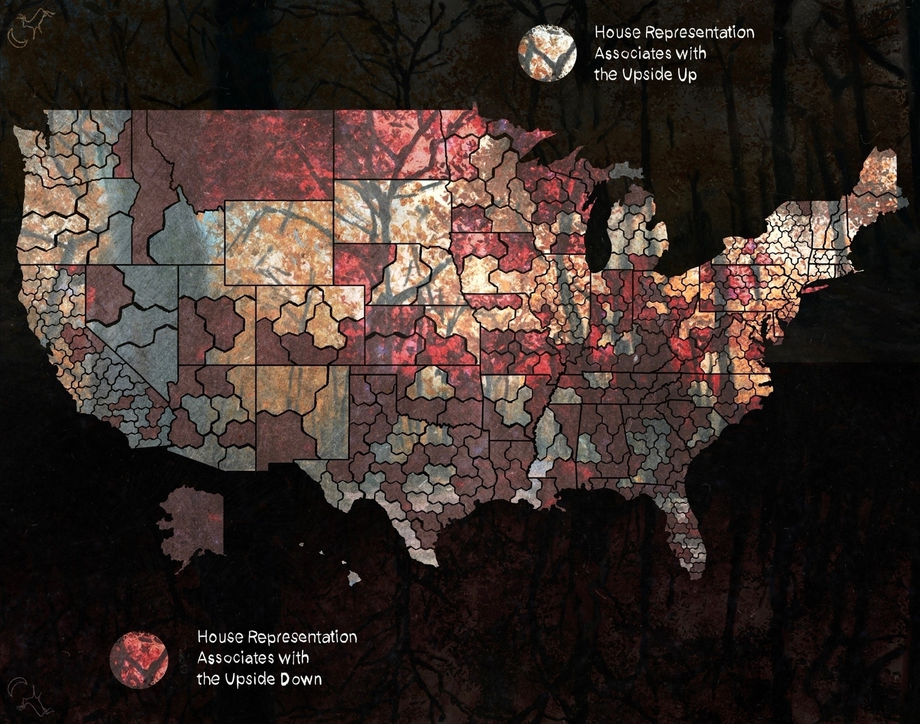
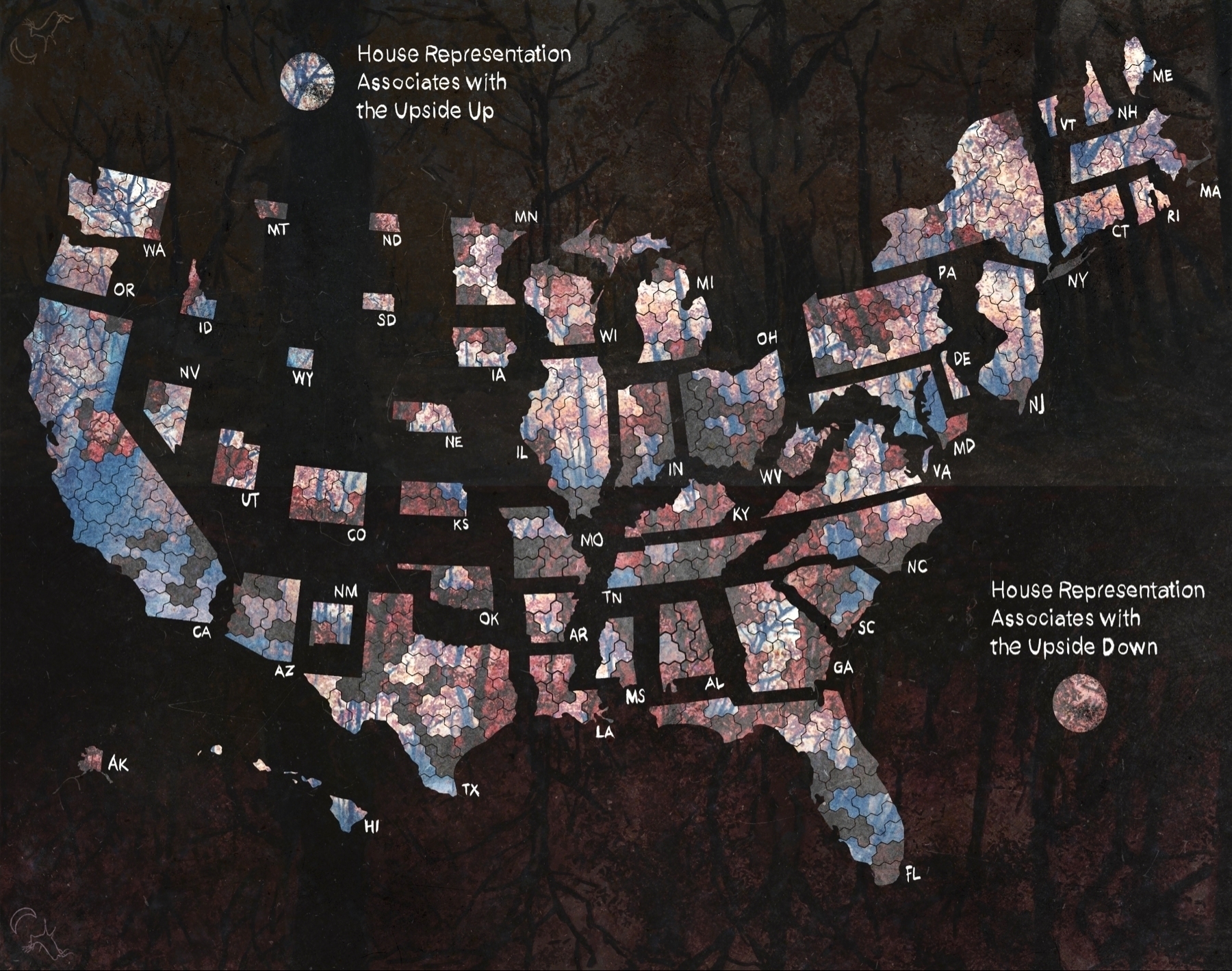
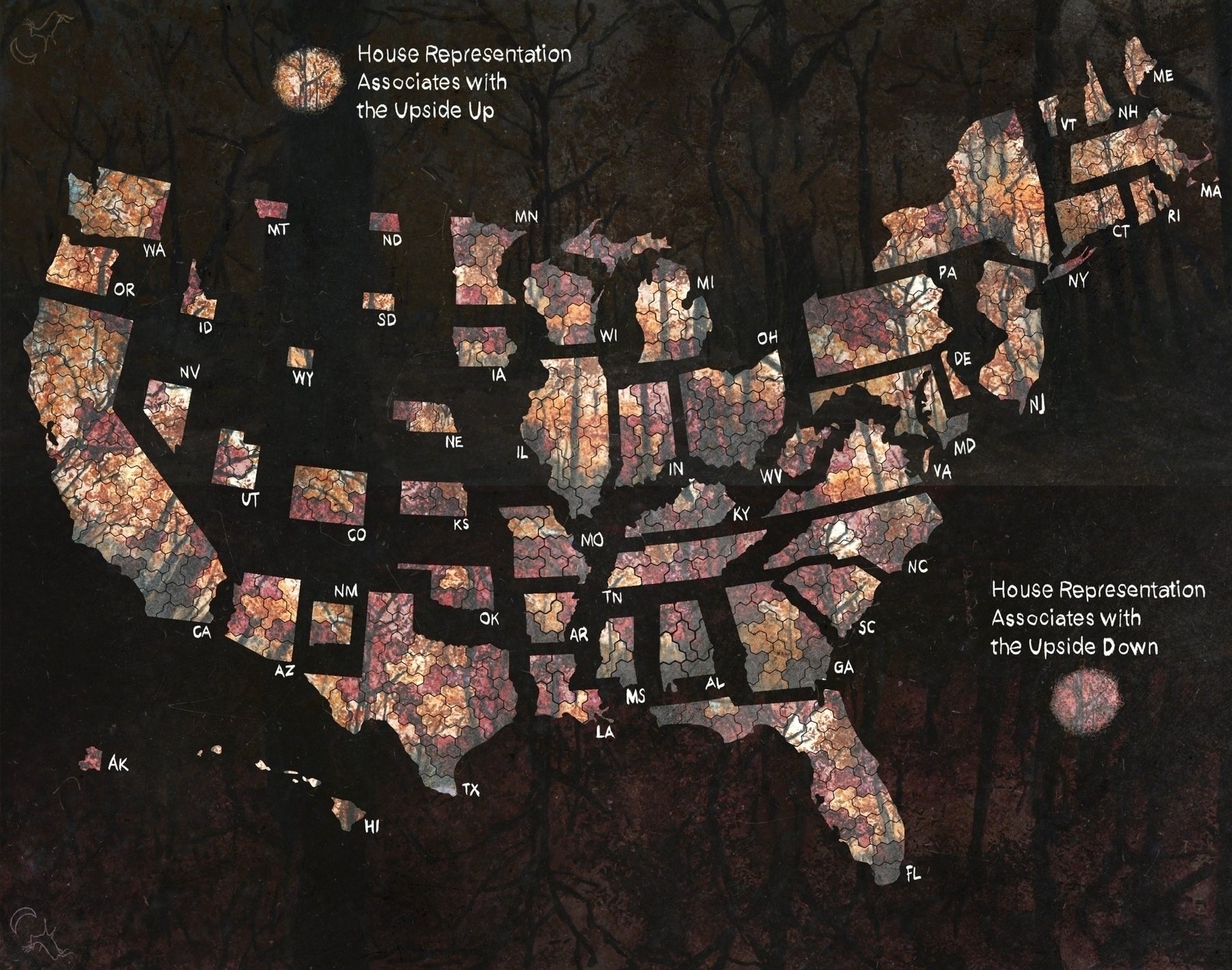
The remake of the House reality associations (the scoring of which is explained here
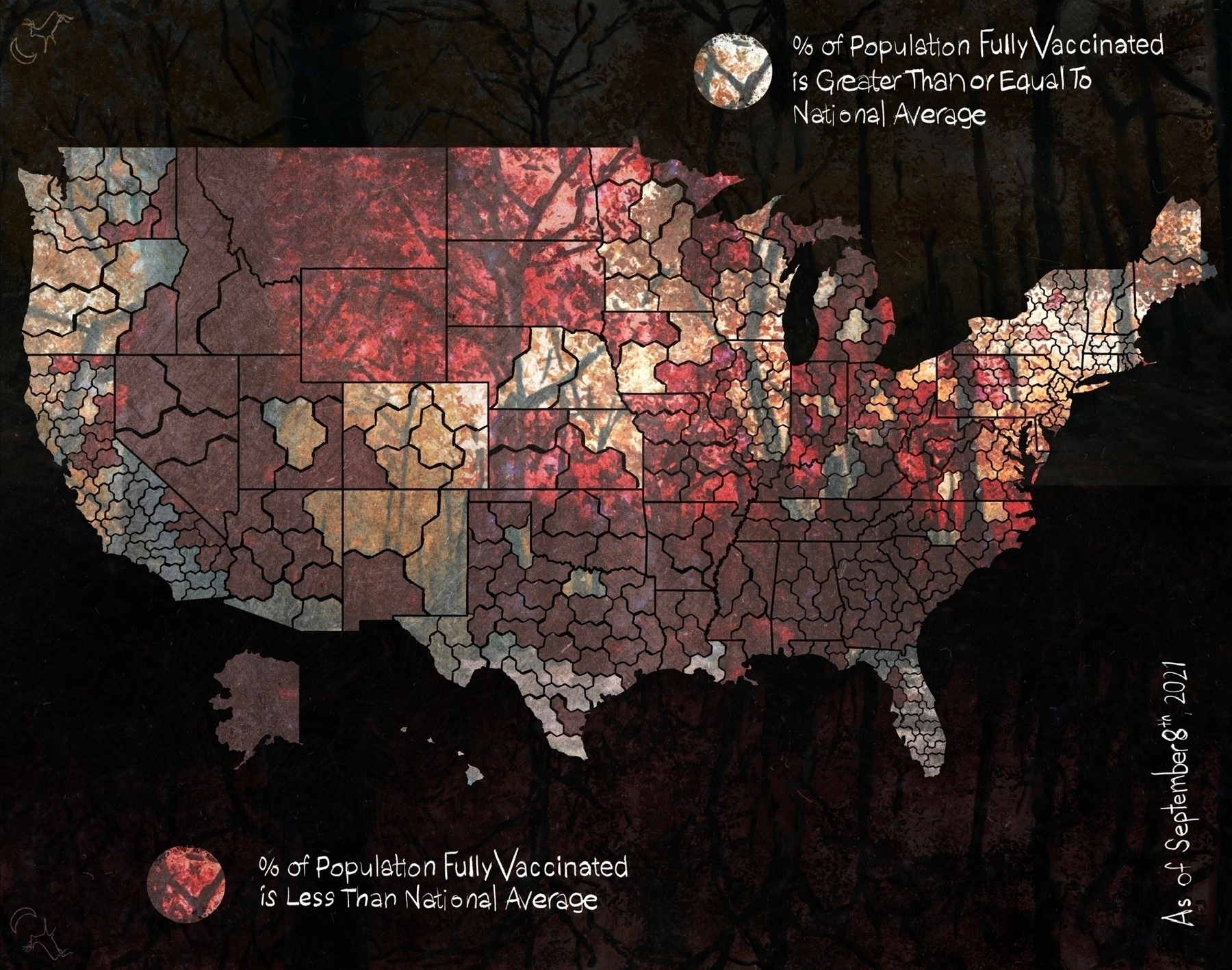
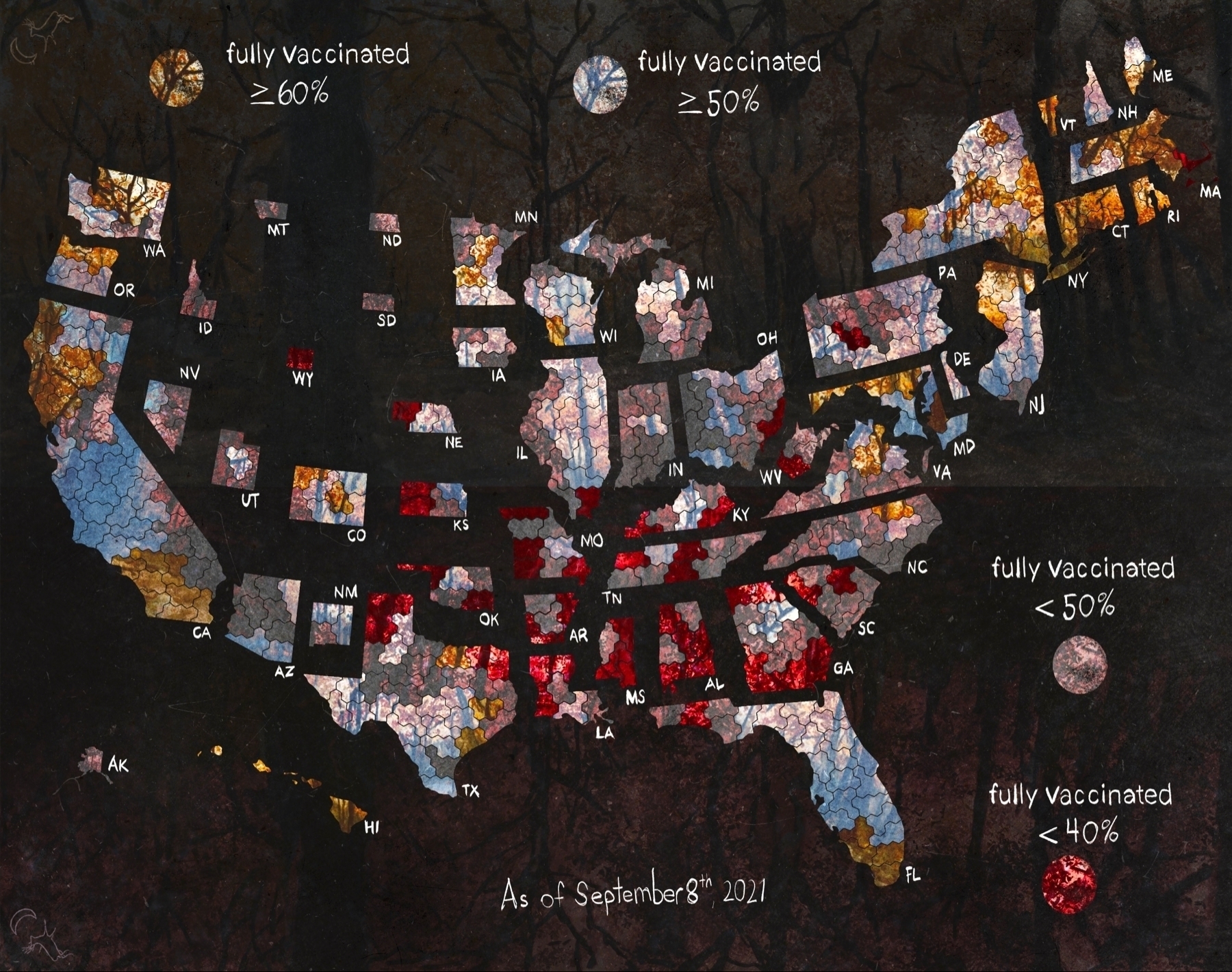
The remake of the national vaccination rate.
The remake of the national death rate.
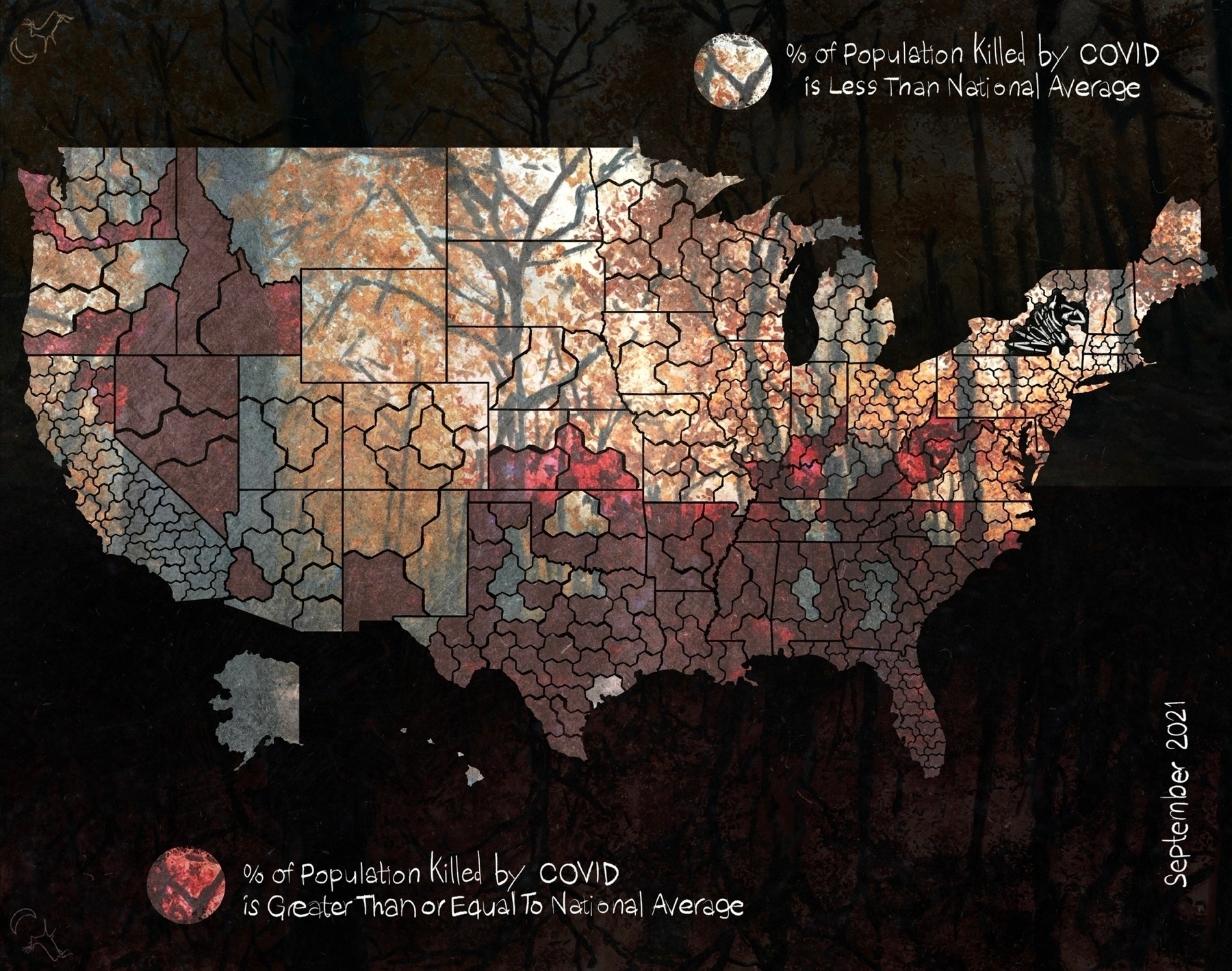
Spousal-type says the cartographic maps are too hard to read, so here's another stab at it.

Wonder what October, November and December are gonna look like.

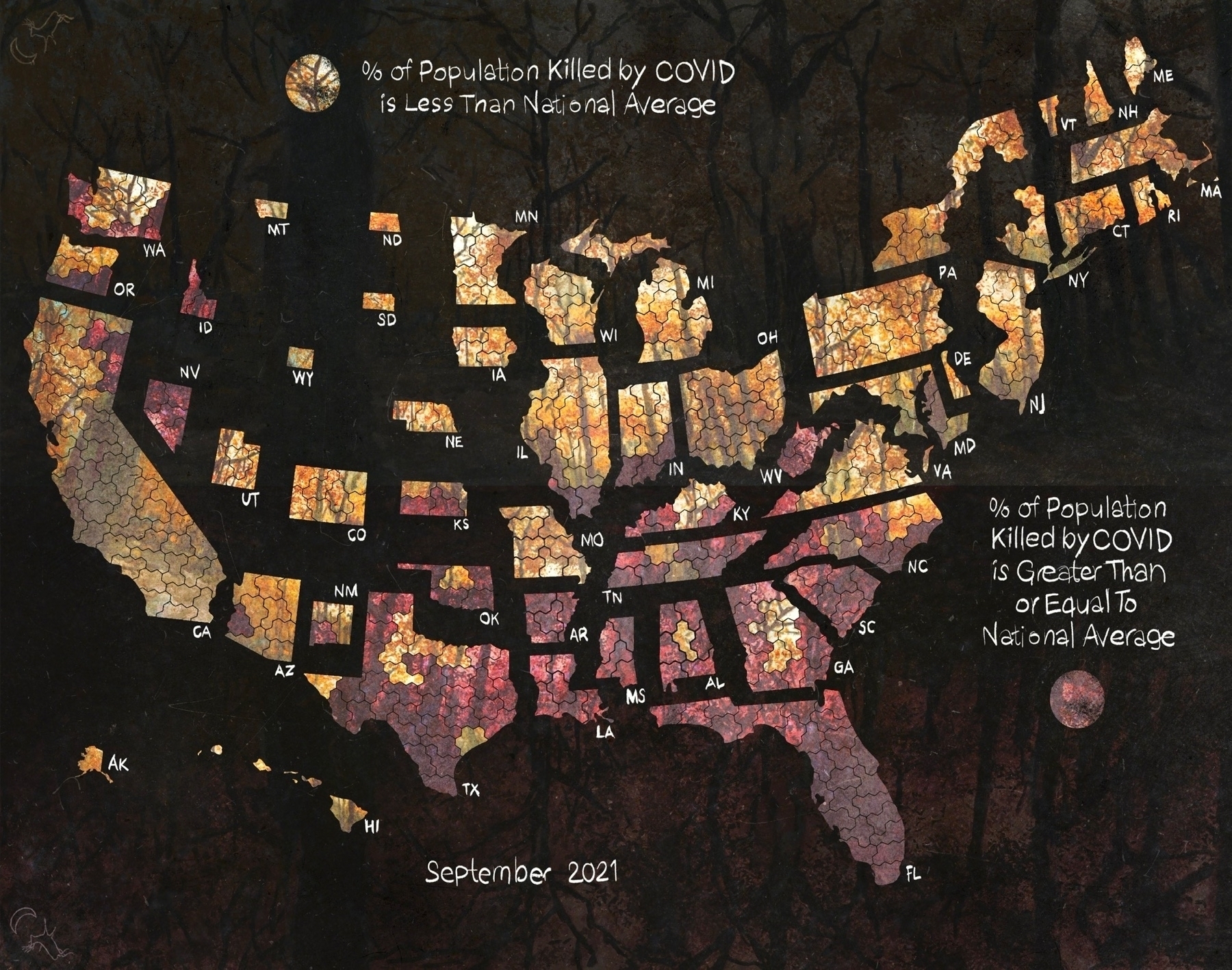
Tracking the national average percent of the population killed by COVID by congressional district.
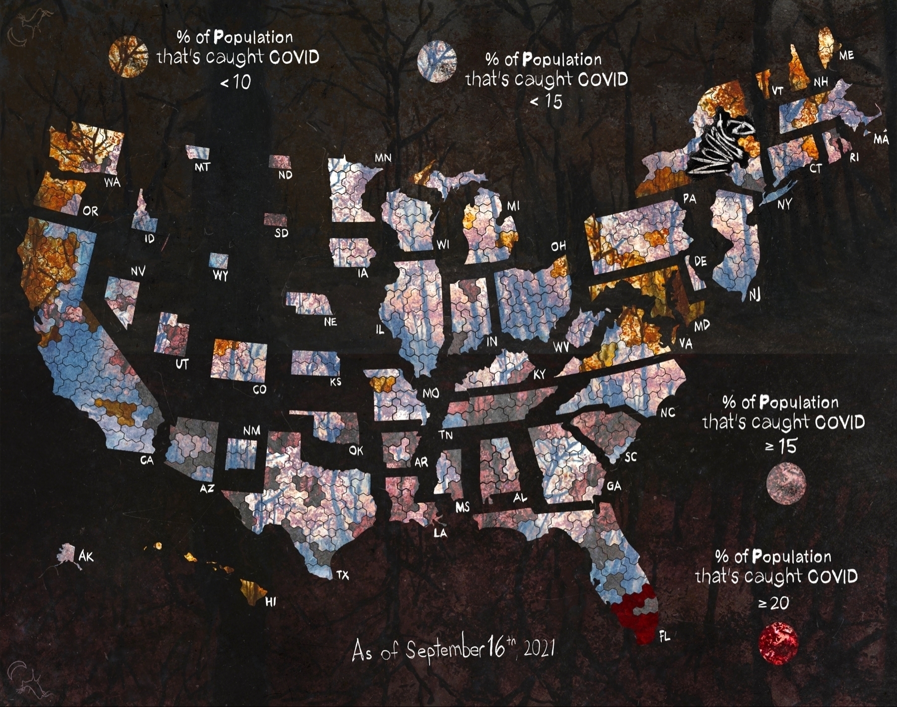
Tracking the national average percent of the population sick with COVID by congressional district.
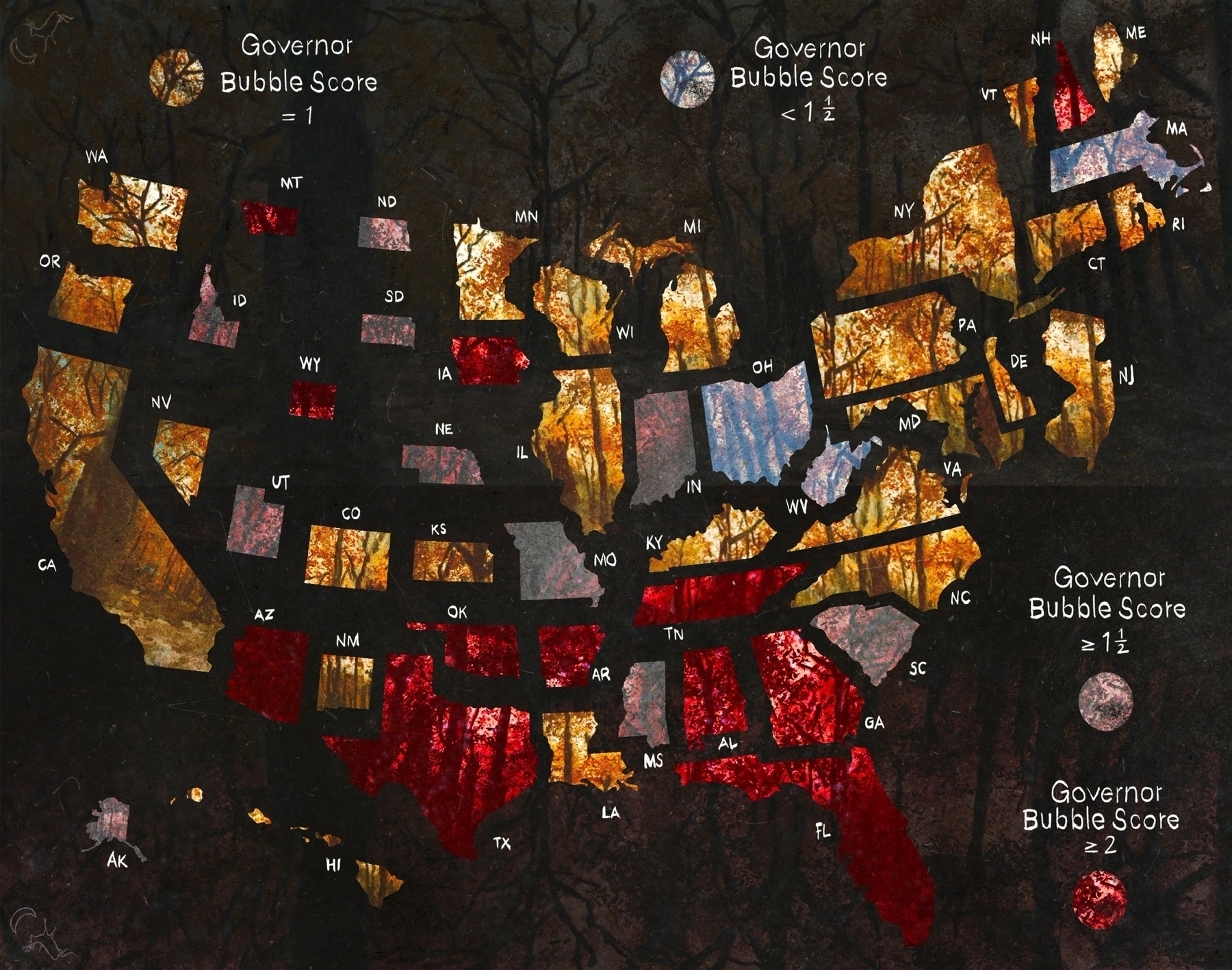
Updated bubble scores for governorships
Updated the congressional district maps with the easier to read color scheme.
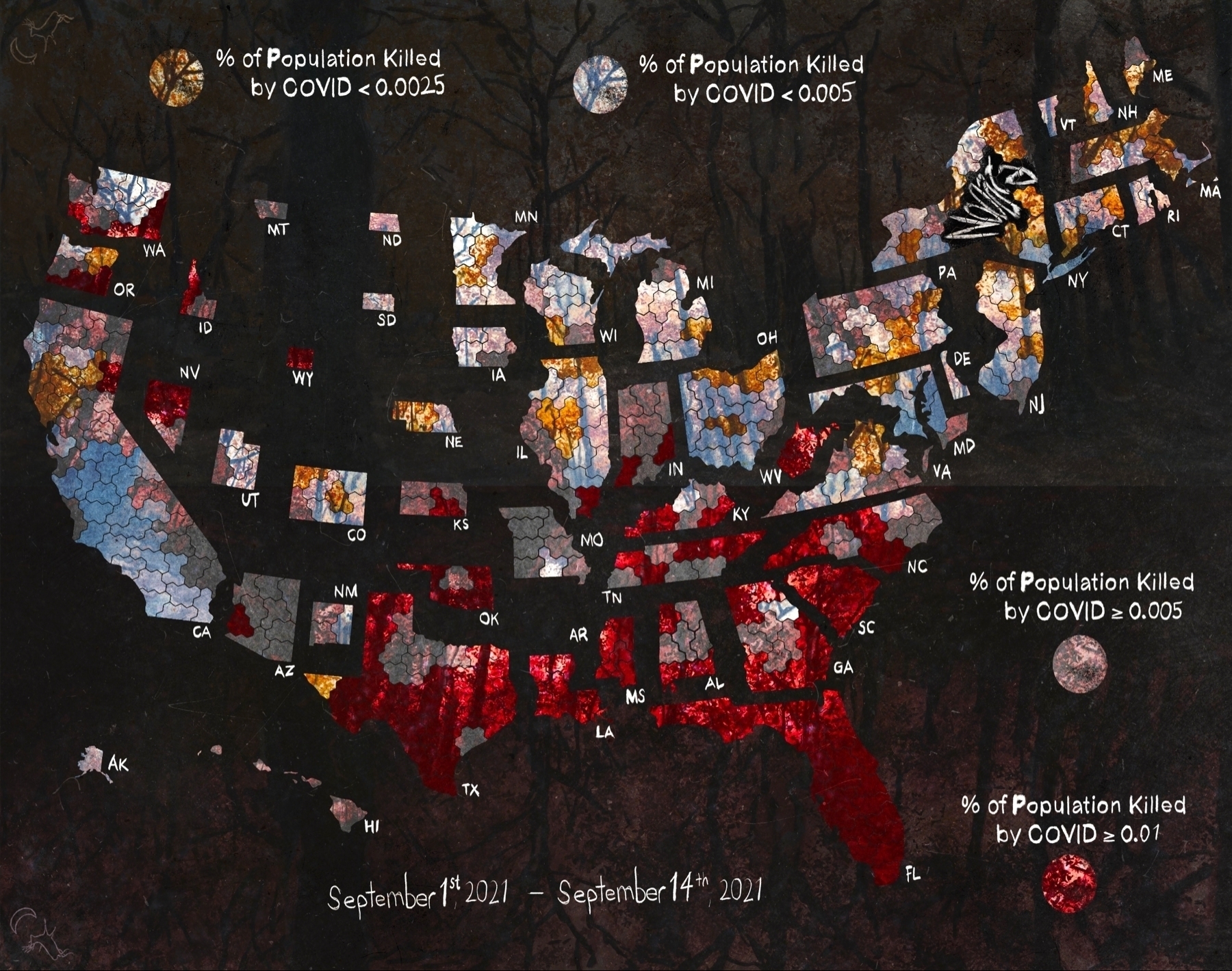

A post for collecting all the Upside Up / Upside Down themed art.
Couple more #COVID maps
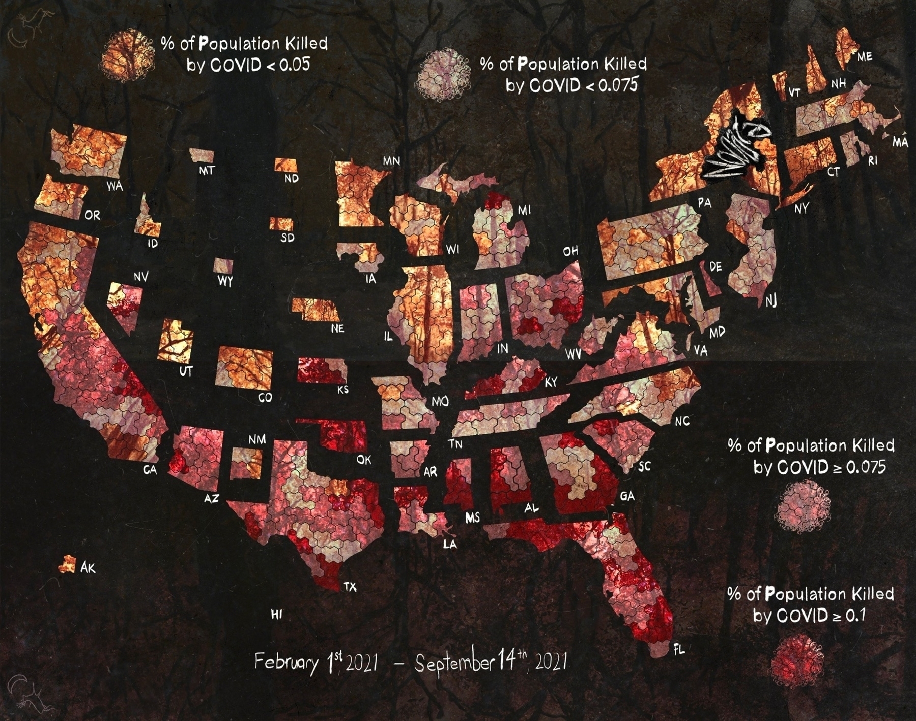
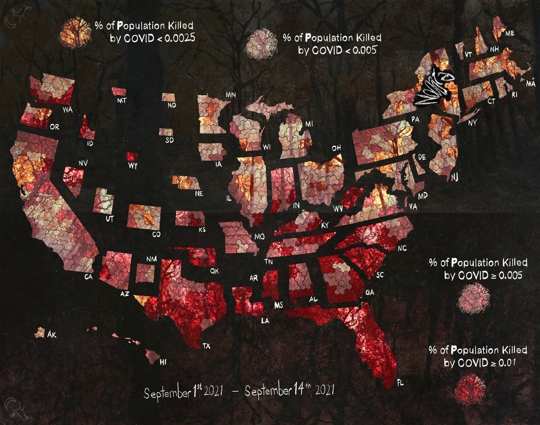
Some more trading of style for clarity.
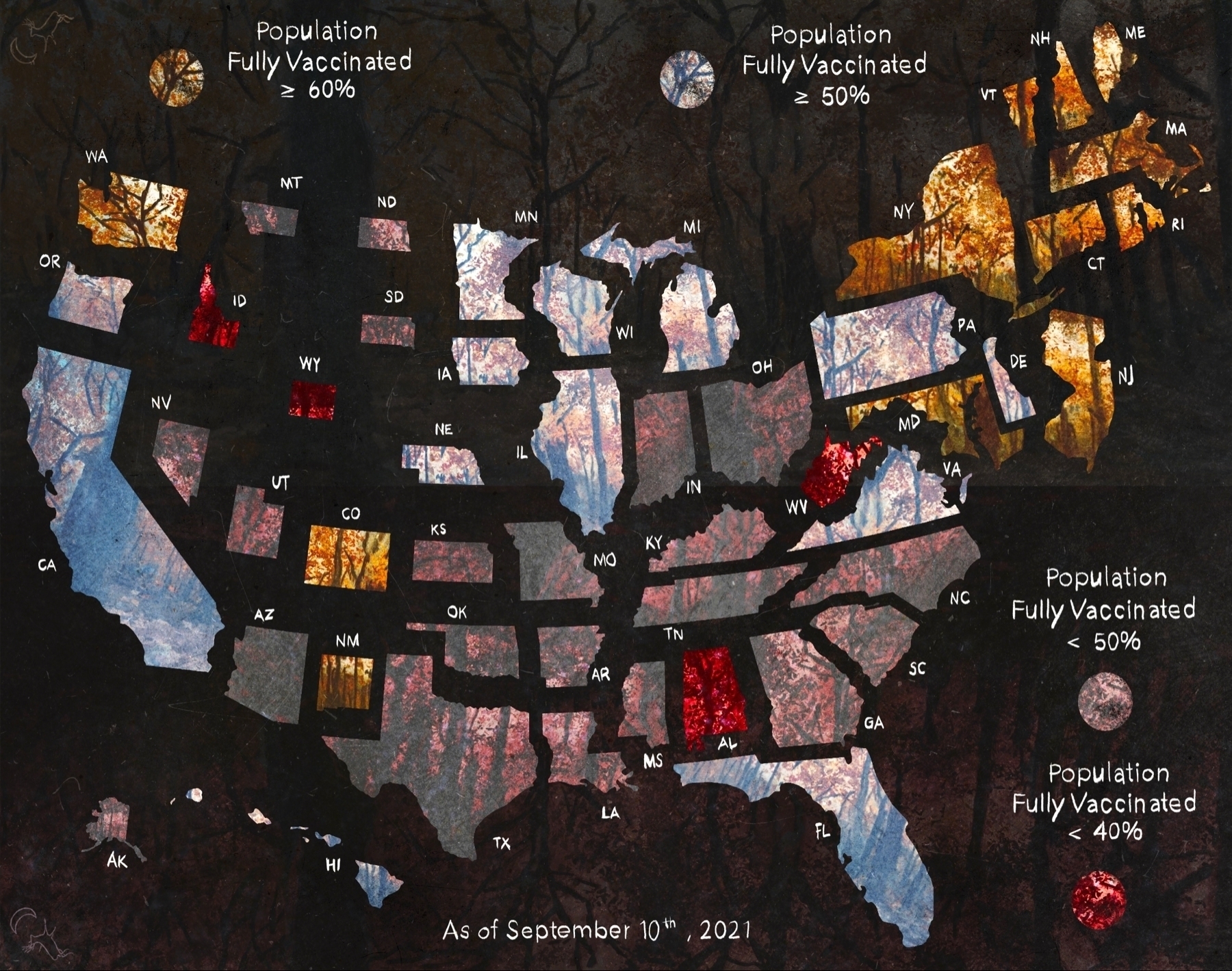

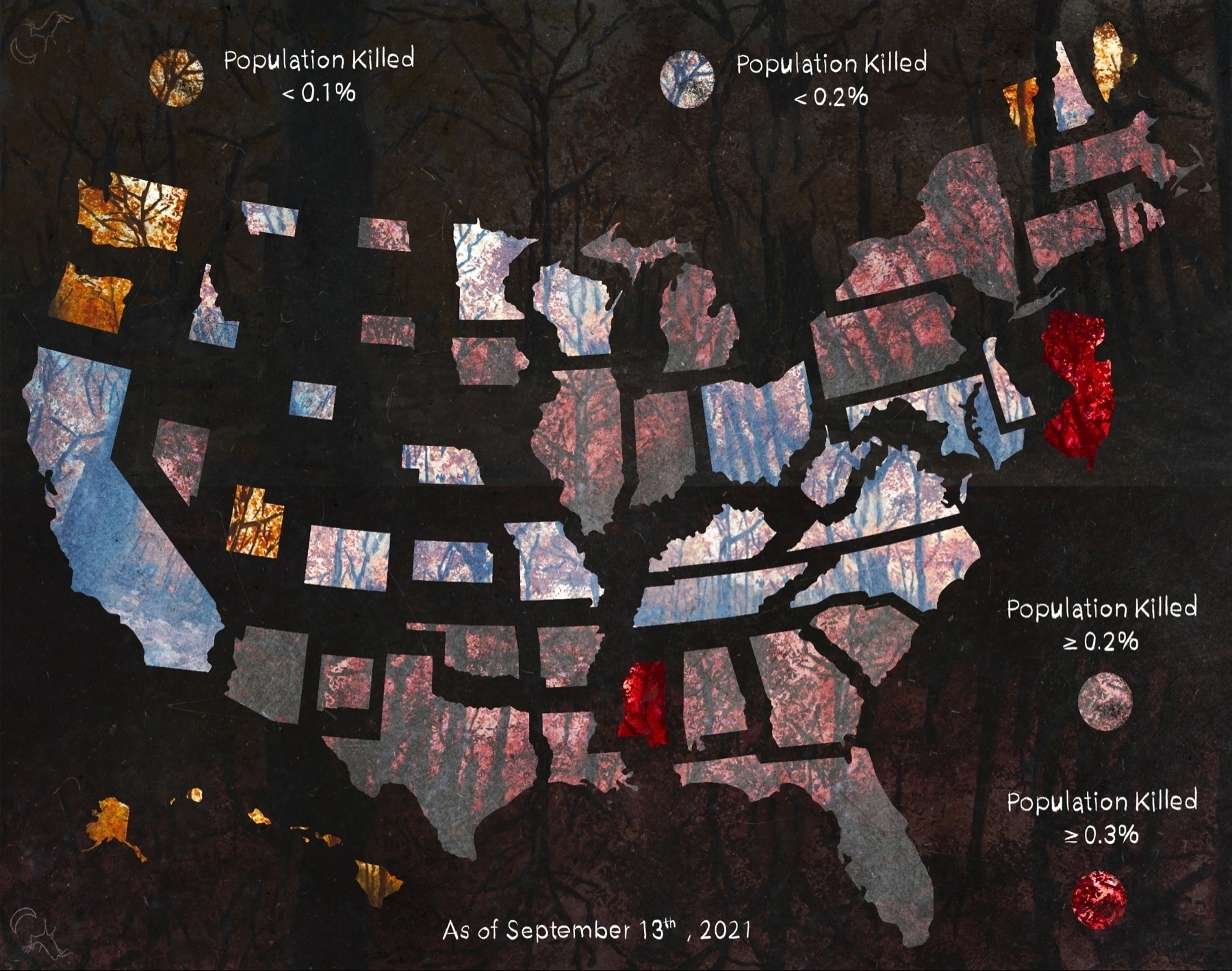
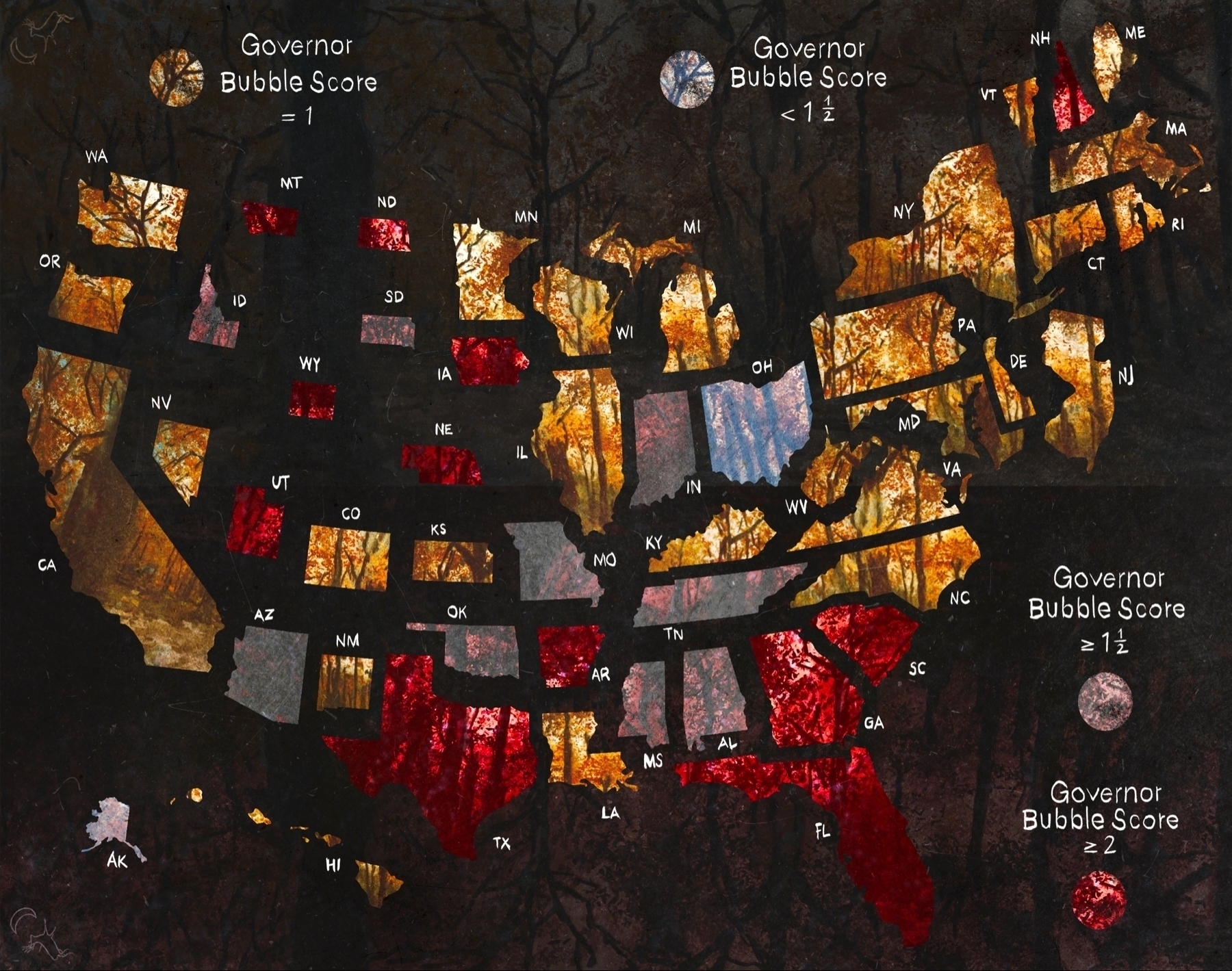
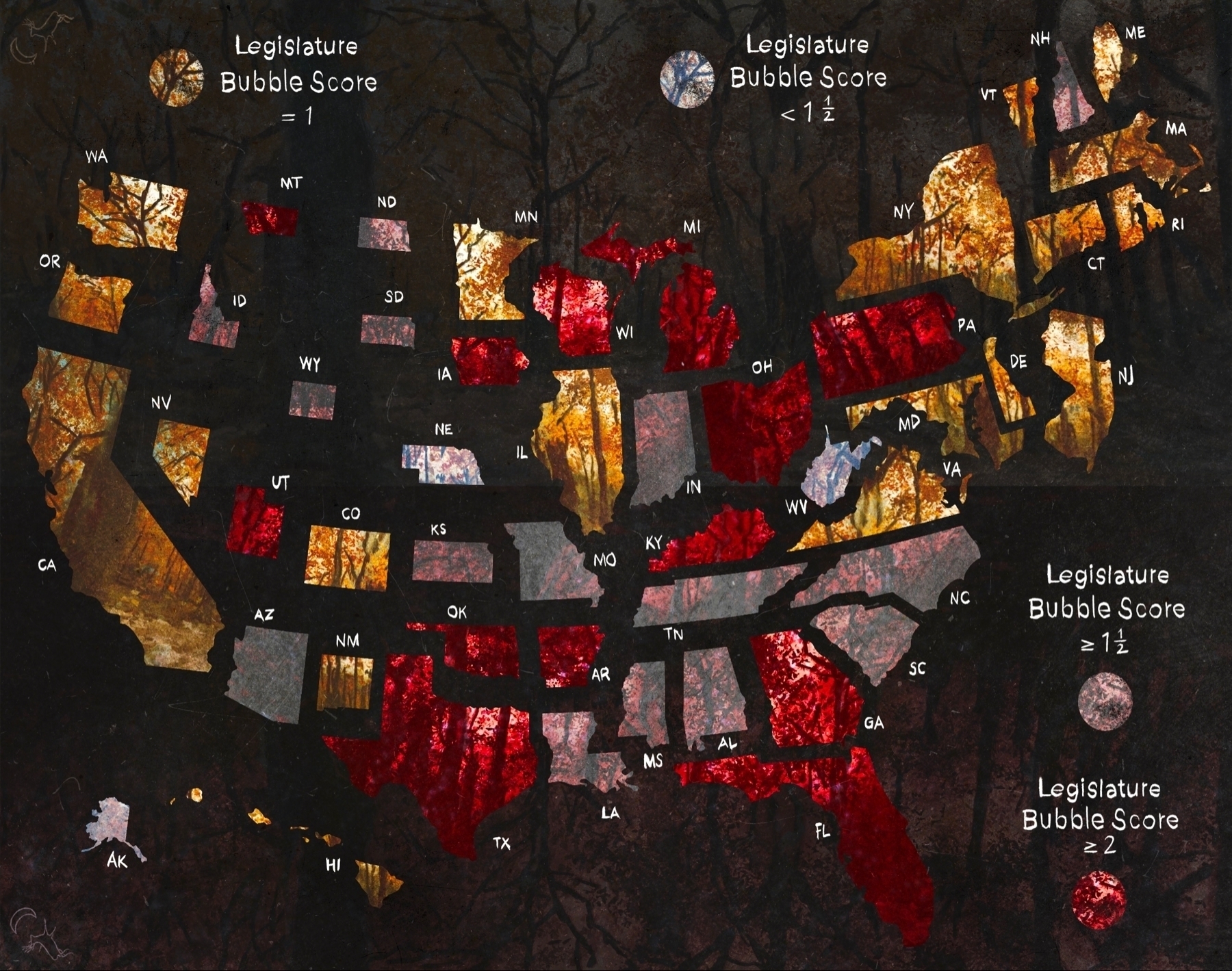

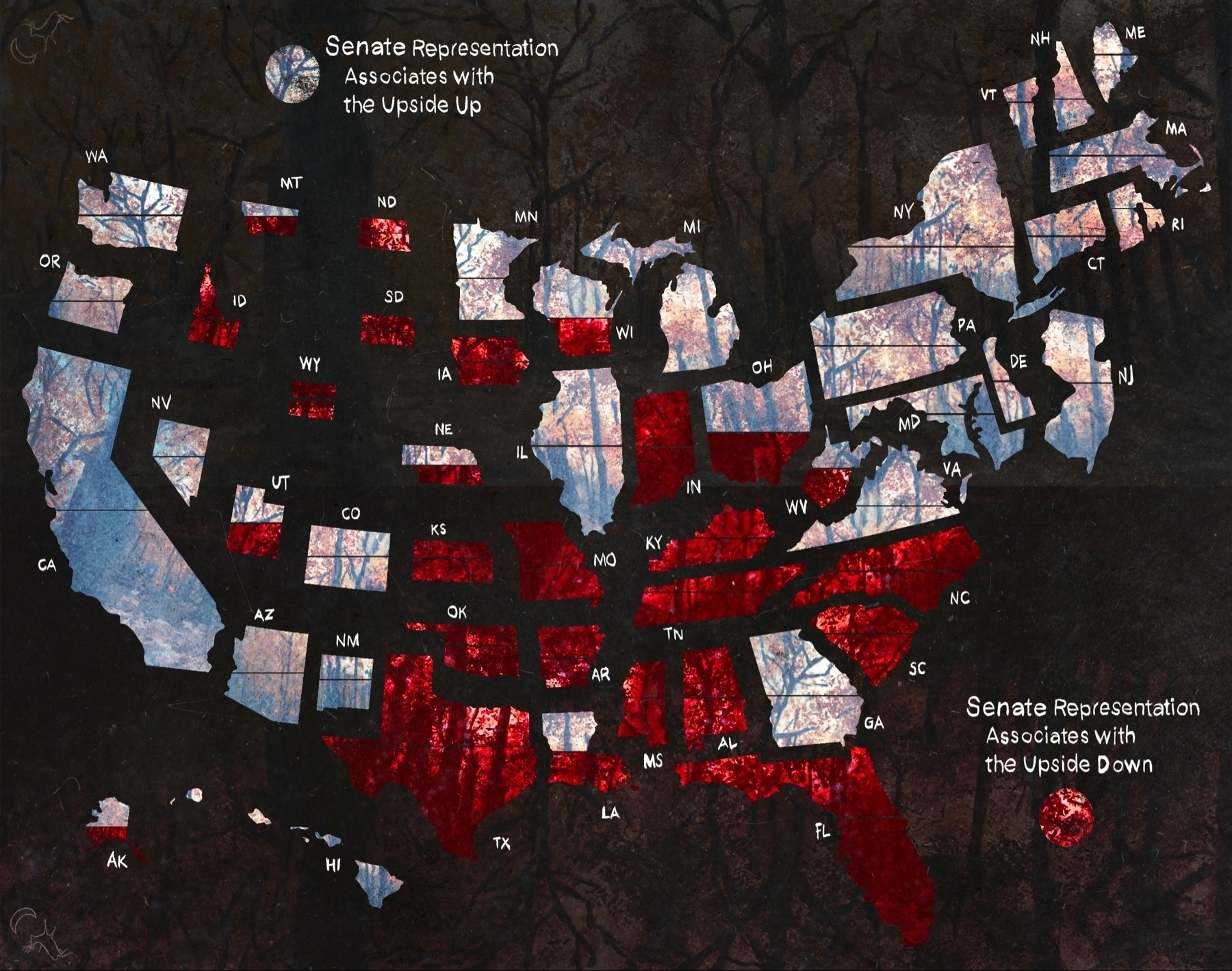
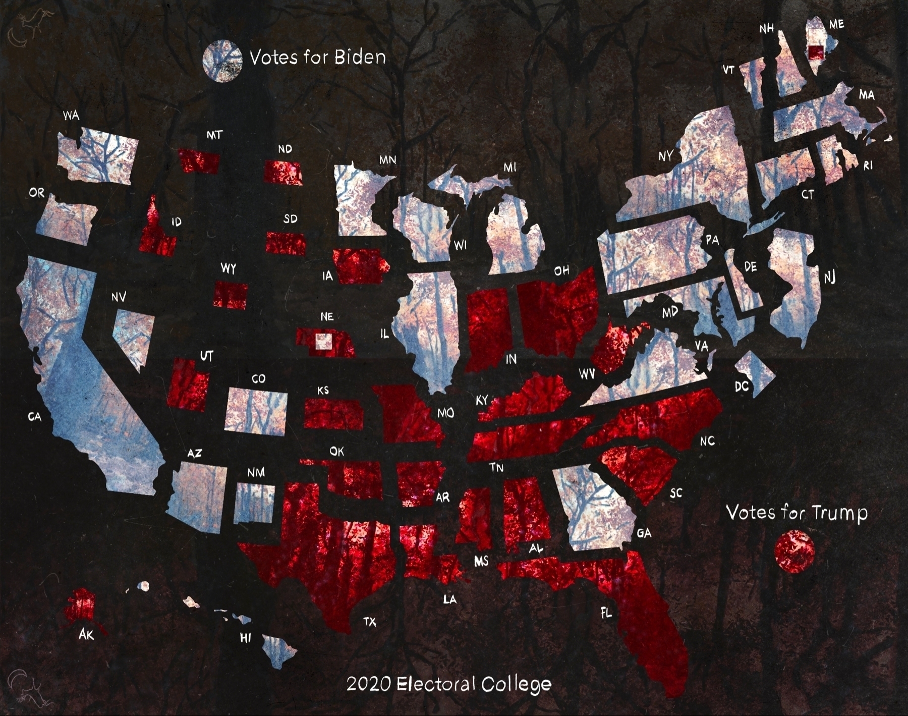


I'm thinking once I've settled with color scheme for these maps (in that they are understandable but still artsy) I will string them together into an animation highlighting the map-to-map correlations.
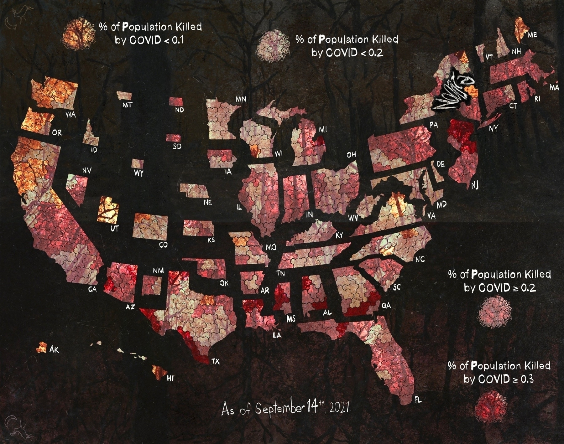
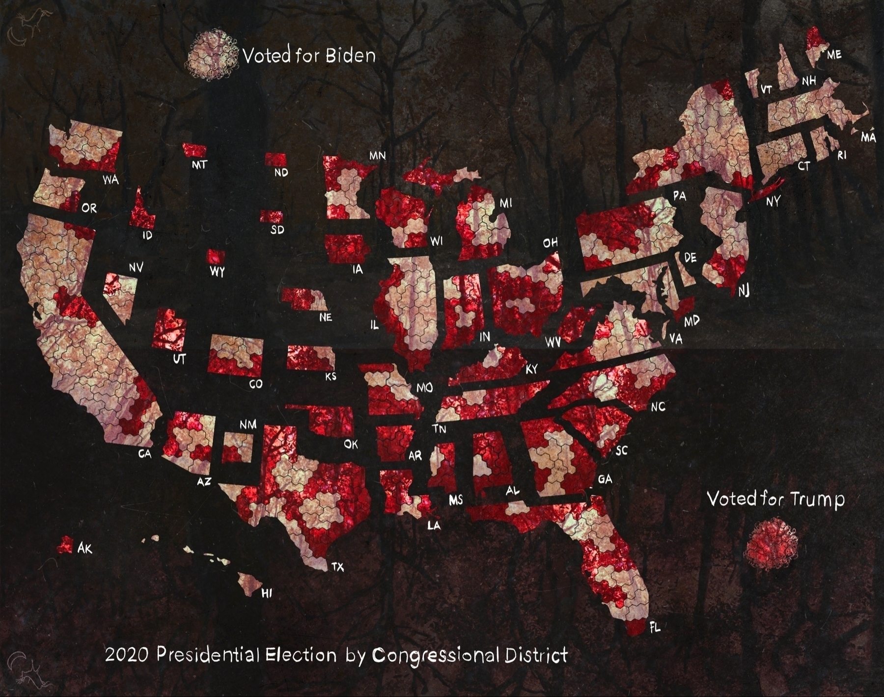
Working on tweaking the color scheme to make these maps easier to read. Here are the revised congressional district maps.
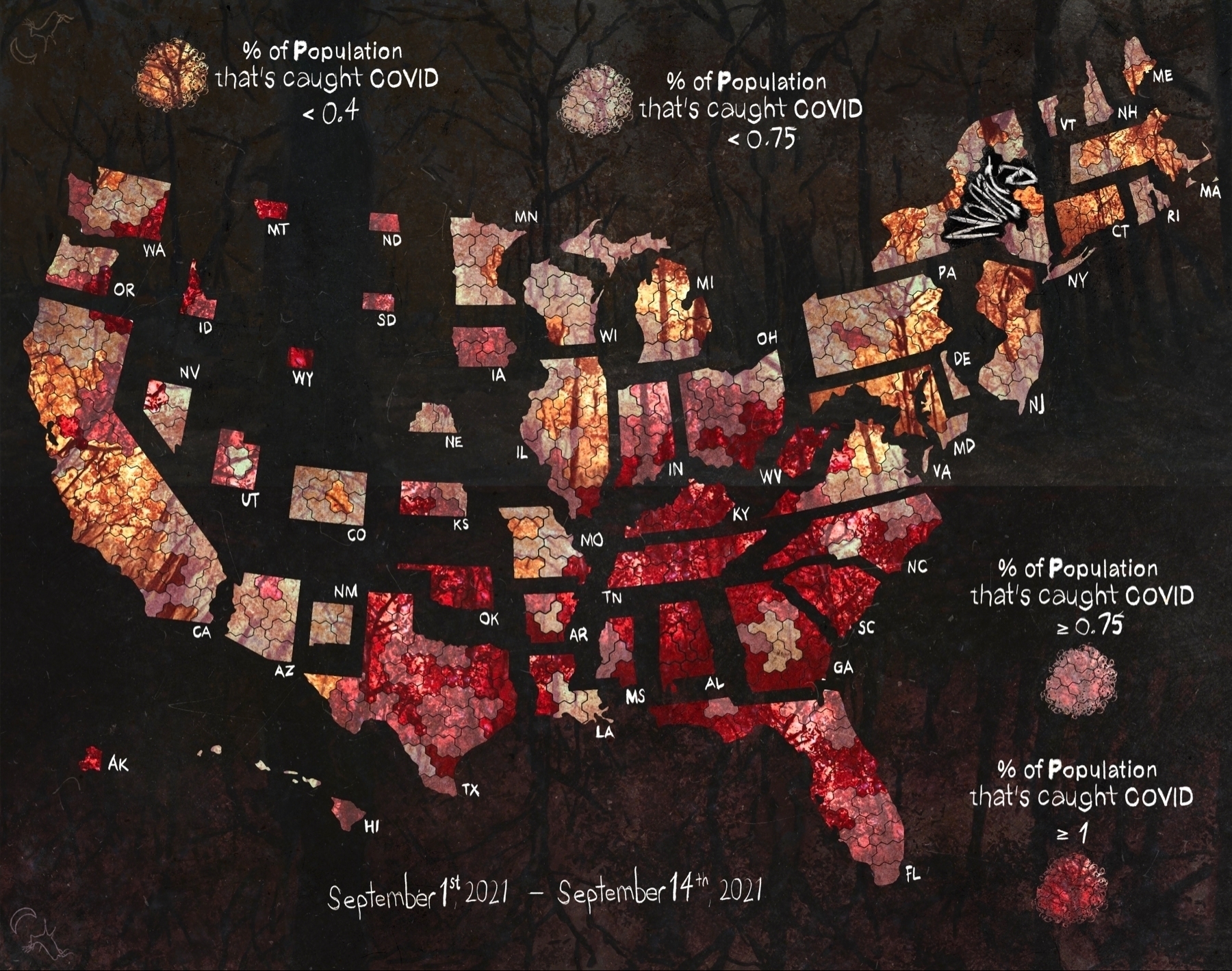
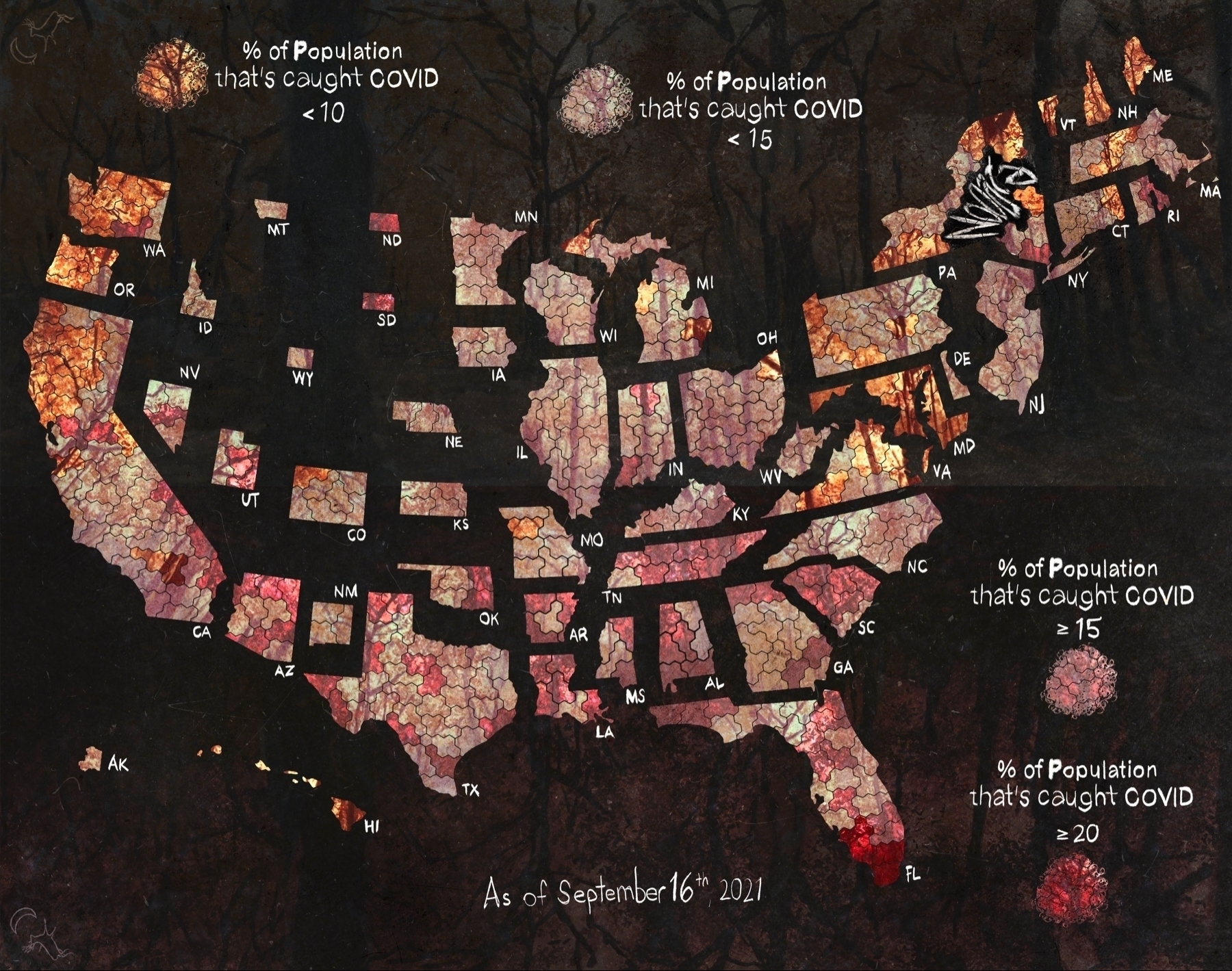

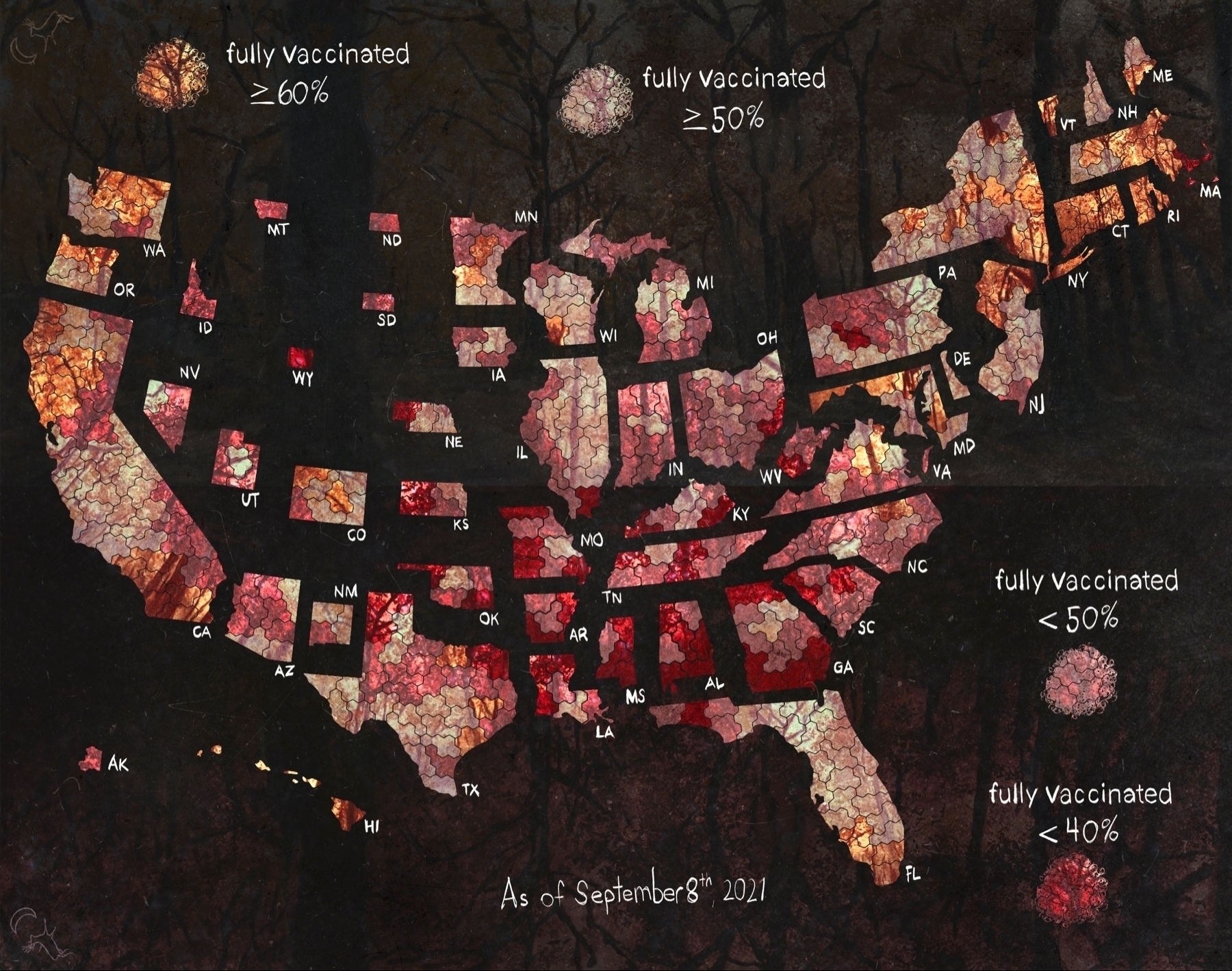
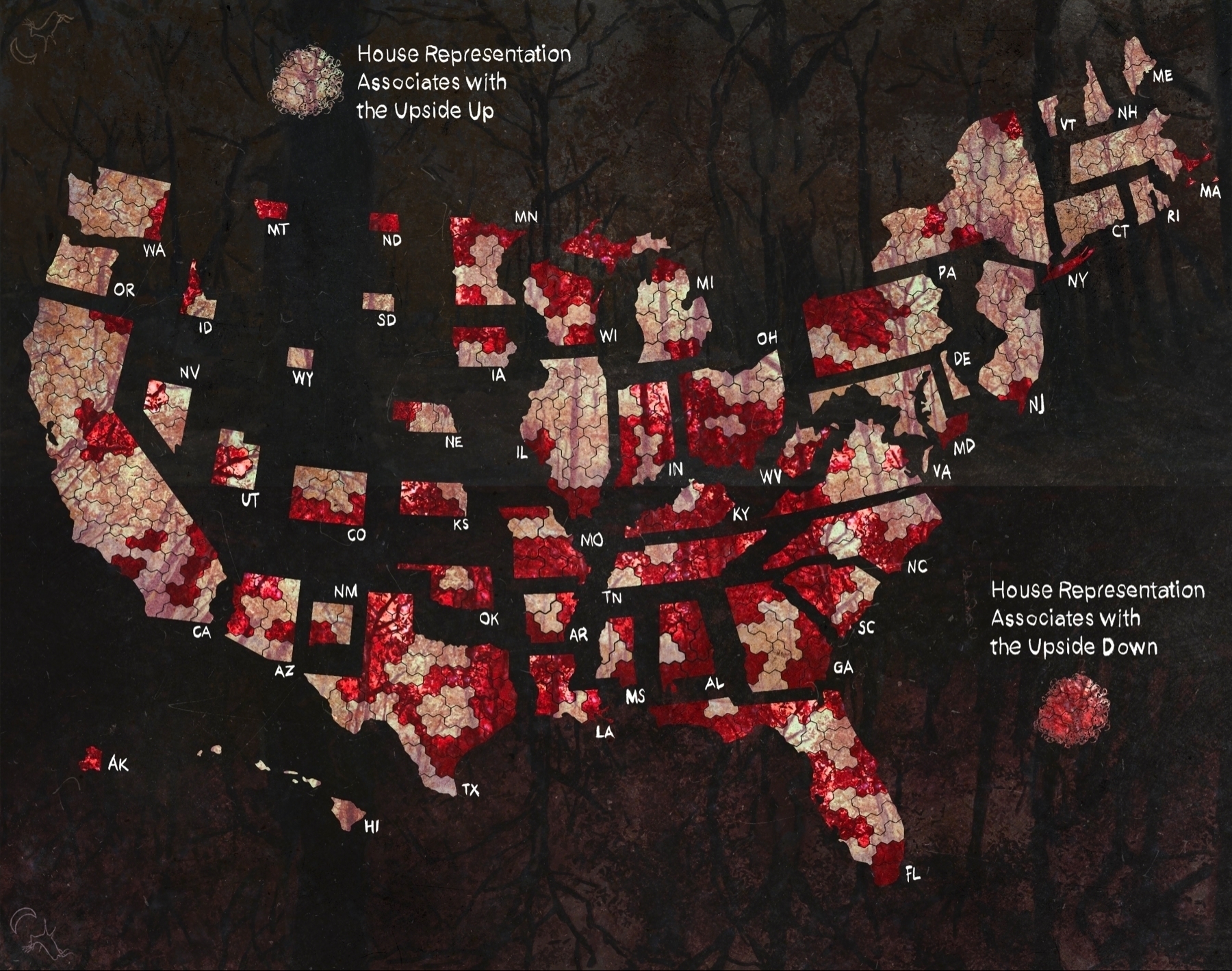
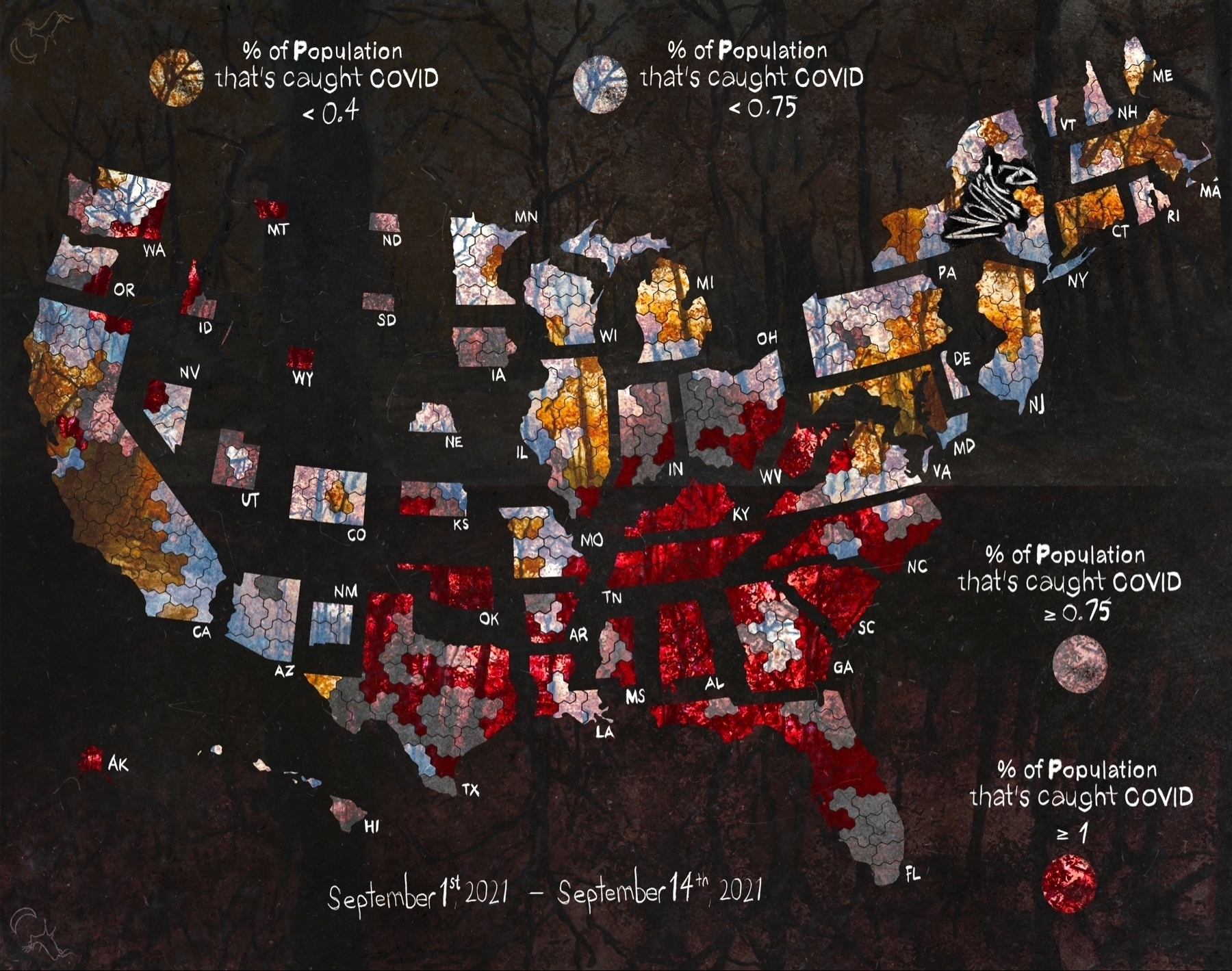
#COVID cases by congressional district since September 1st
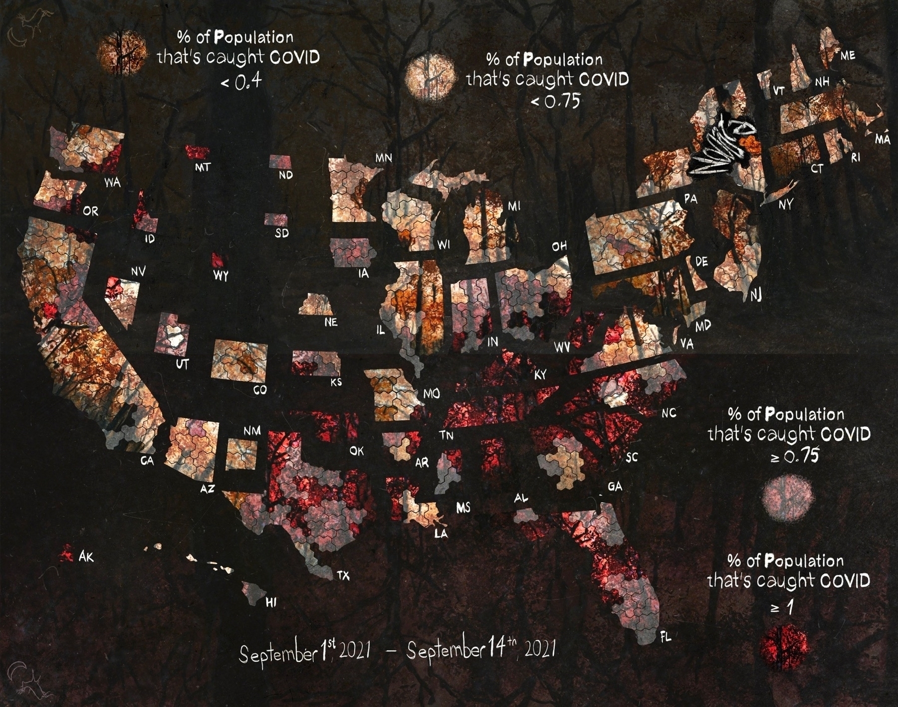
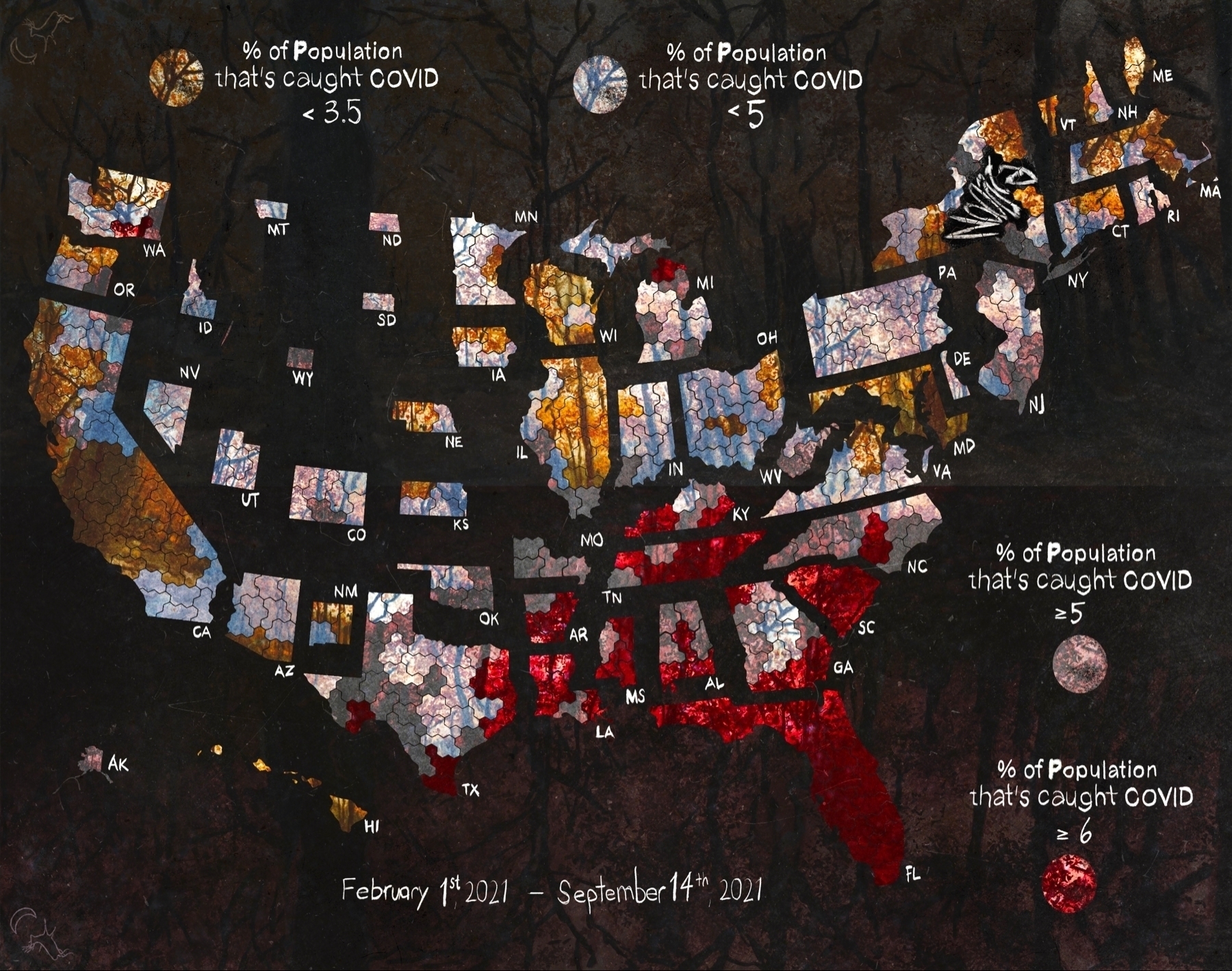
#COVID cases by congressional district since February 1st

#COVID cases by congressional district
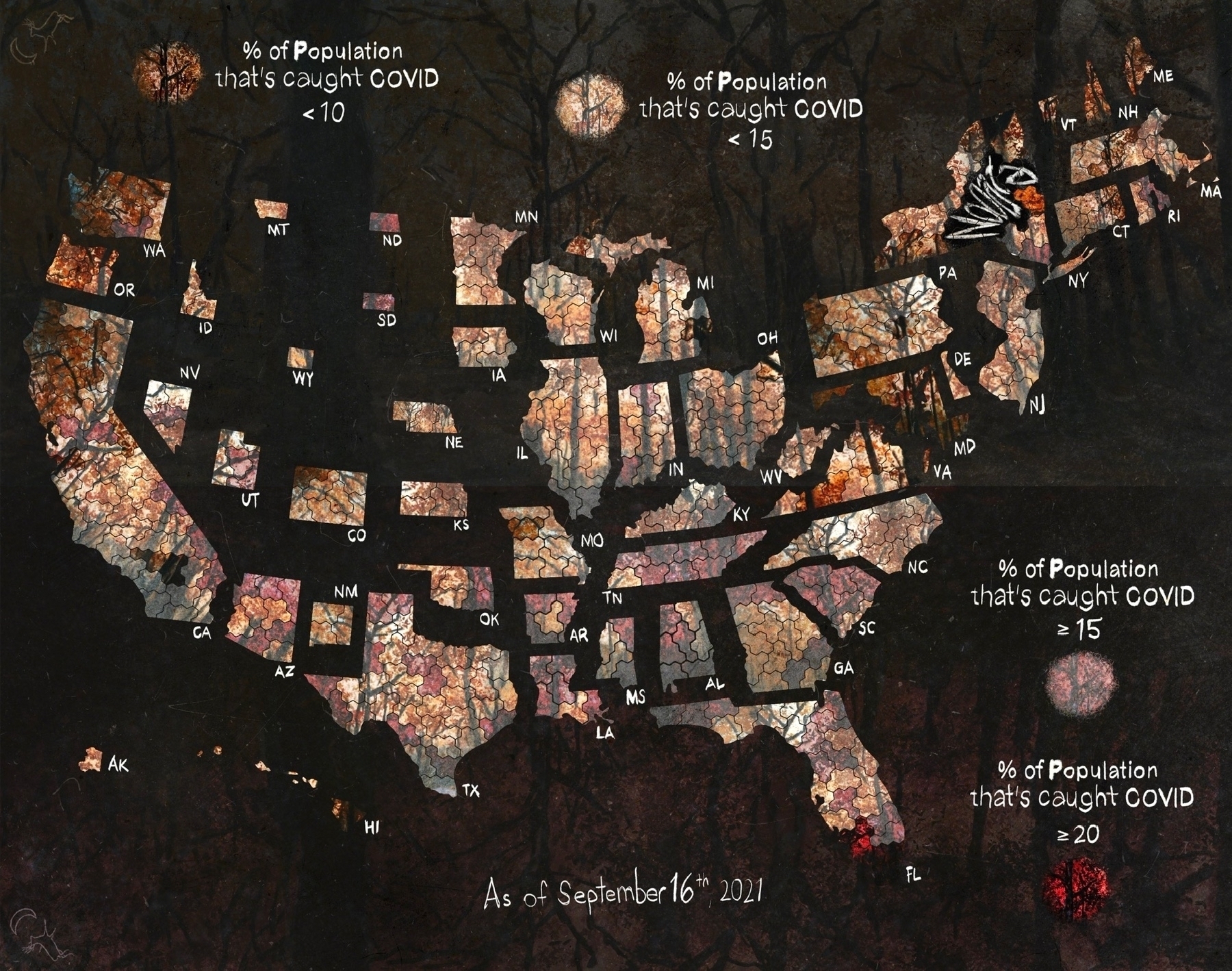
A few more maps
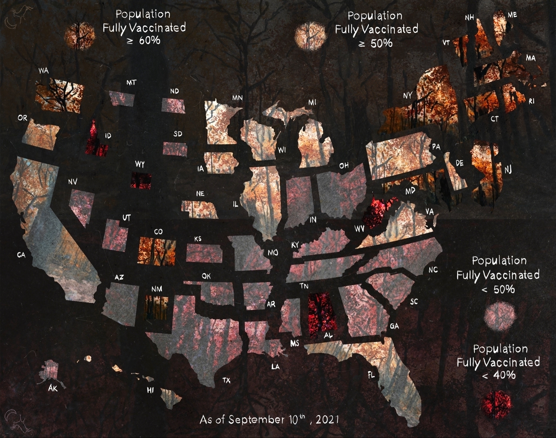
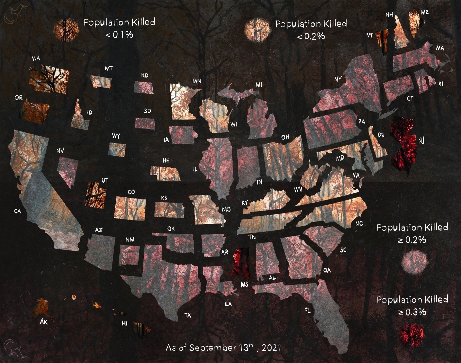
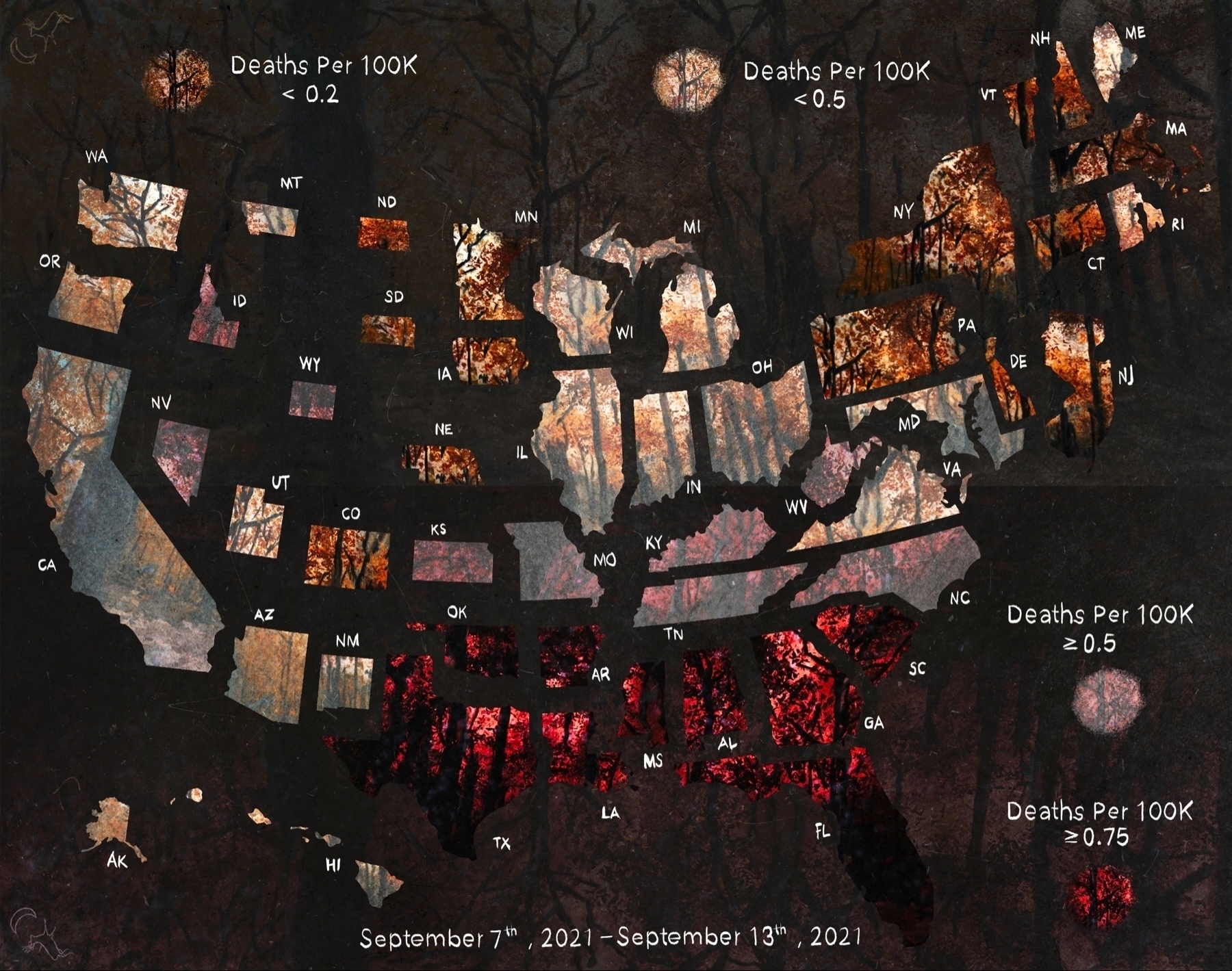
A few more views
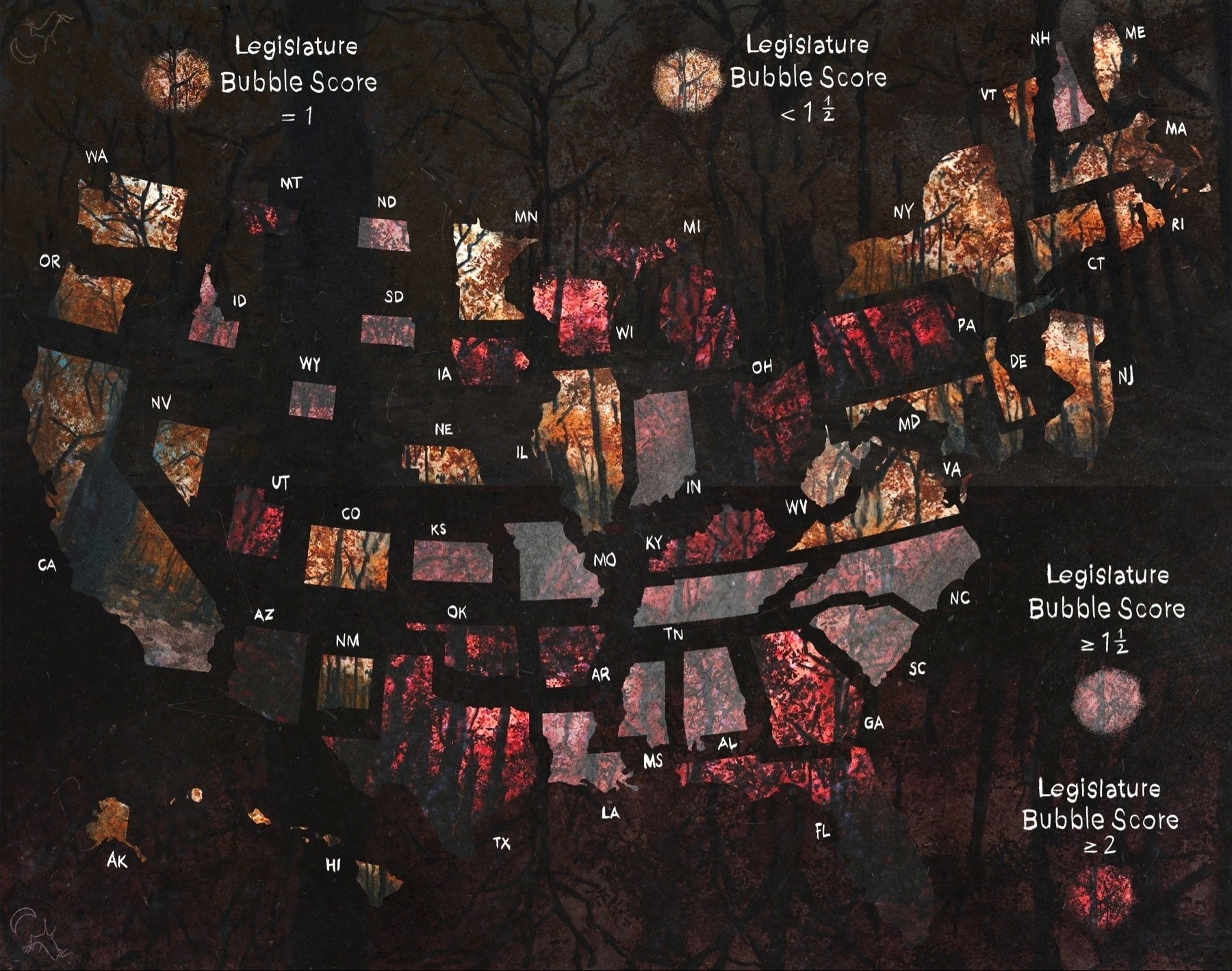
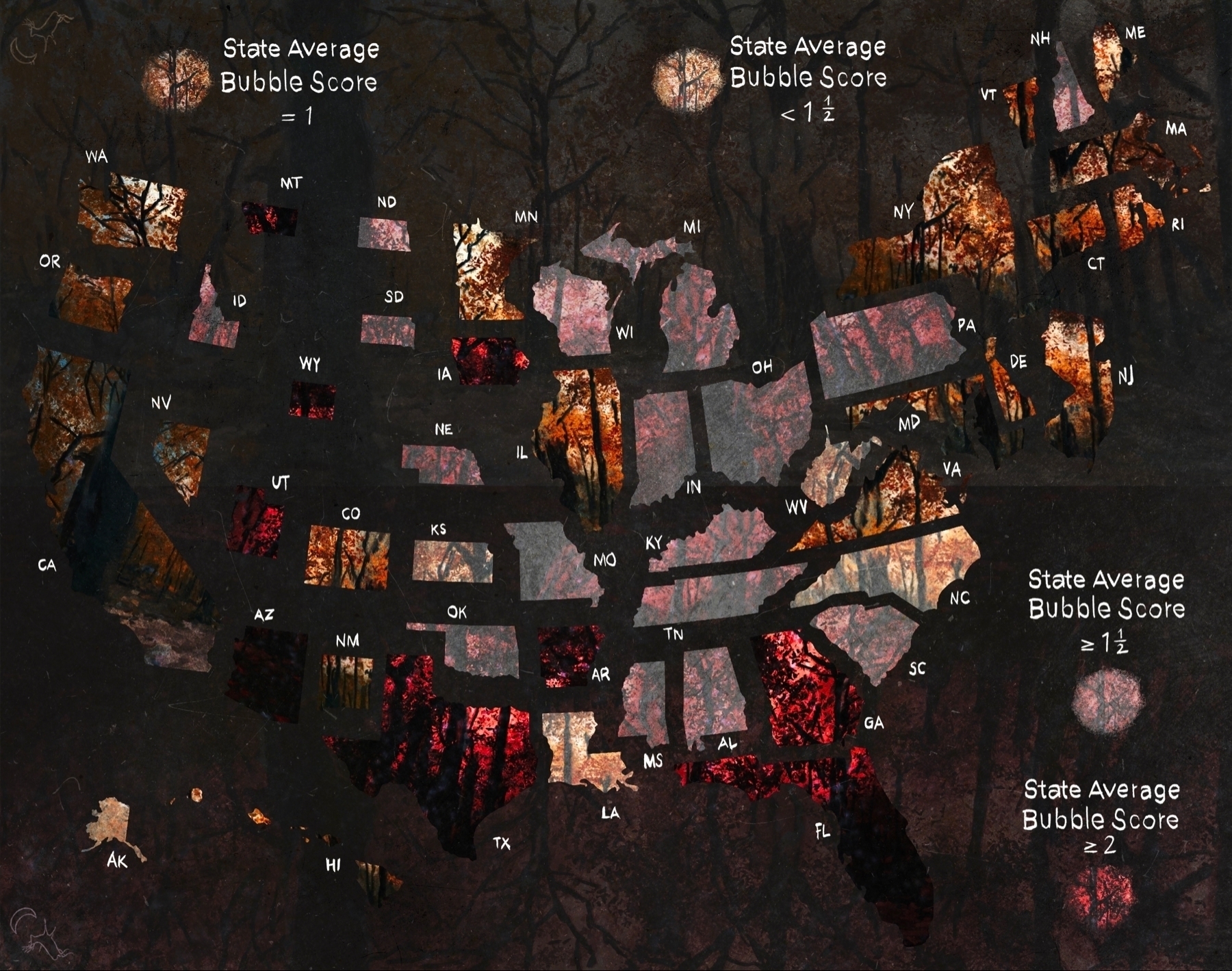
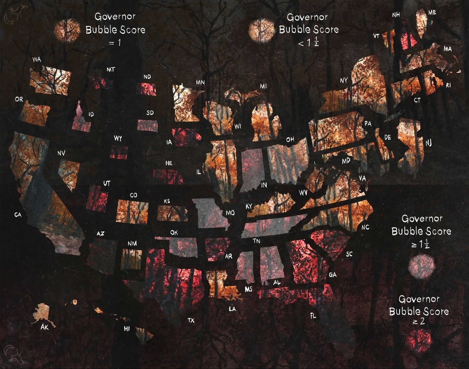
Aligned these as well. May or may not mess with data contrast.
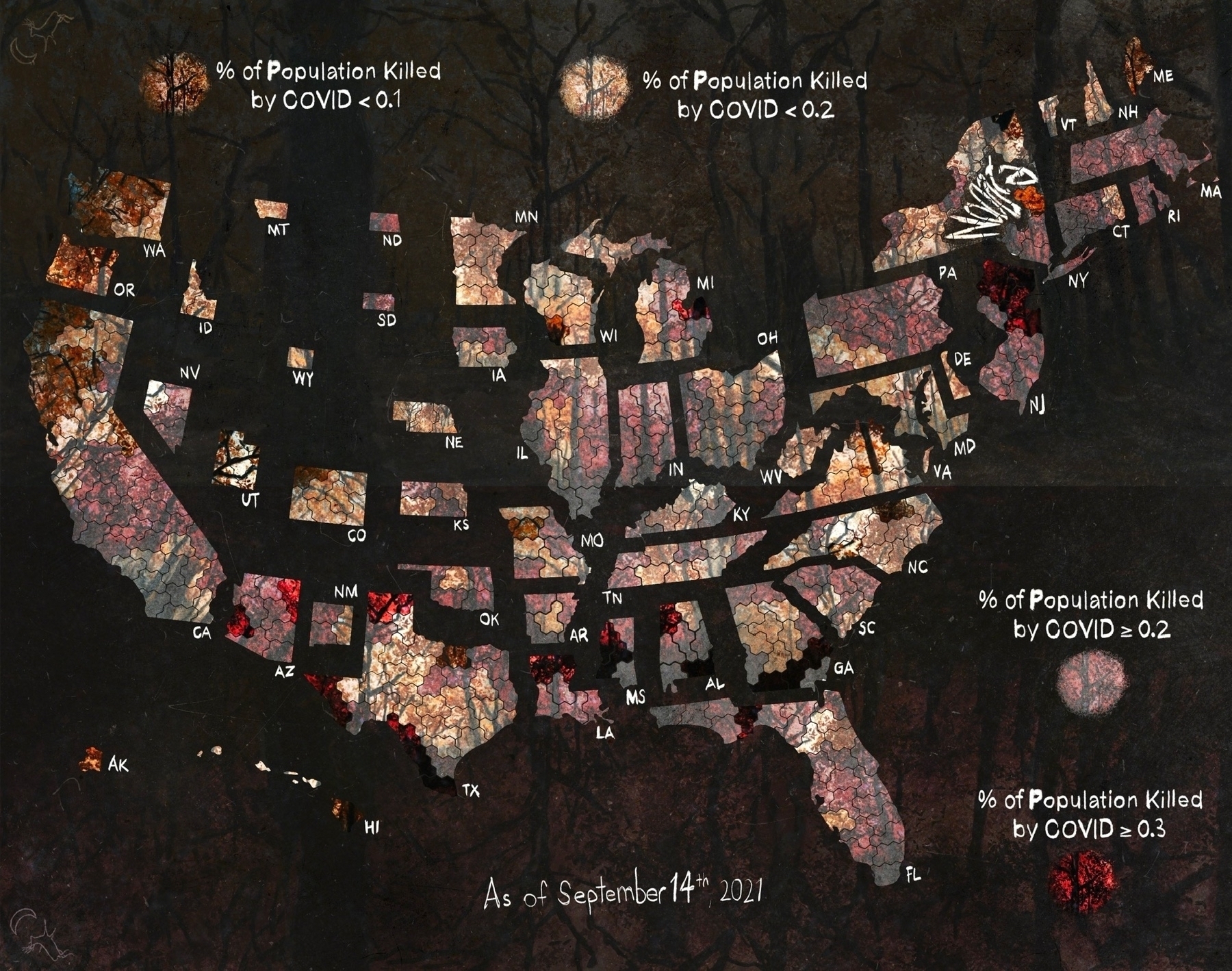
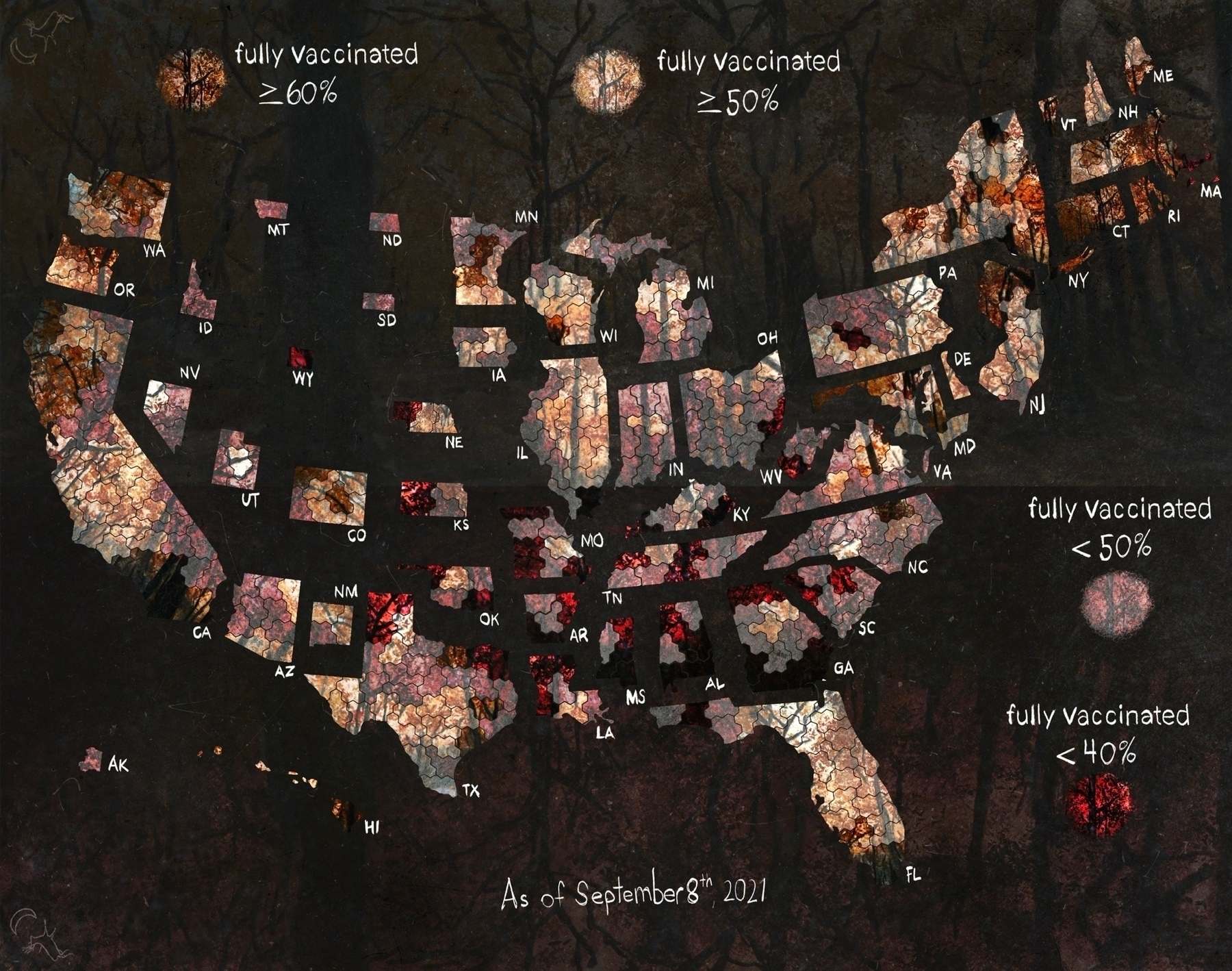
Aligned the Up and Down imagery.
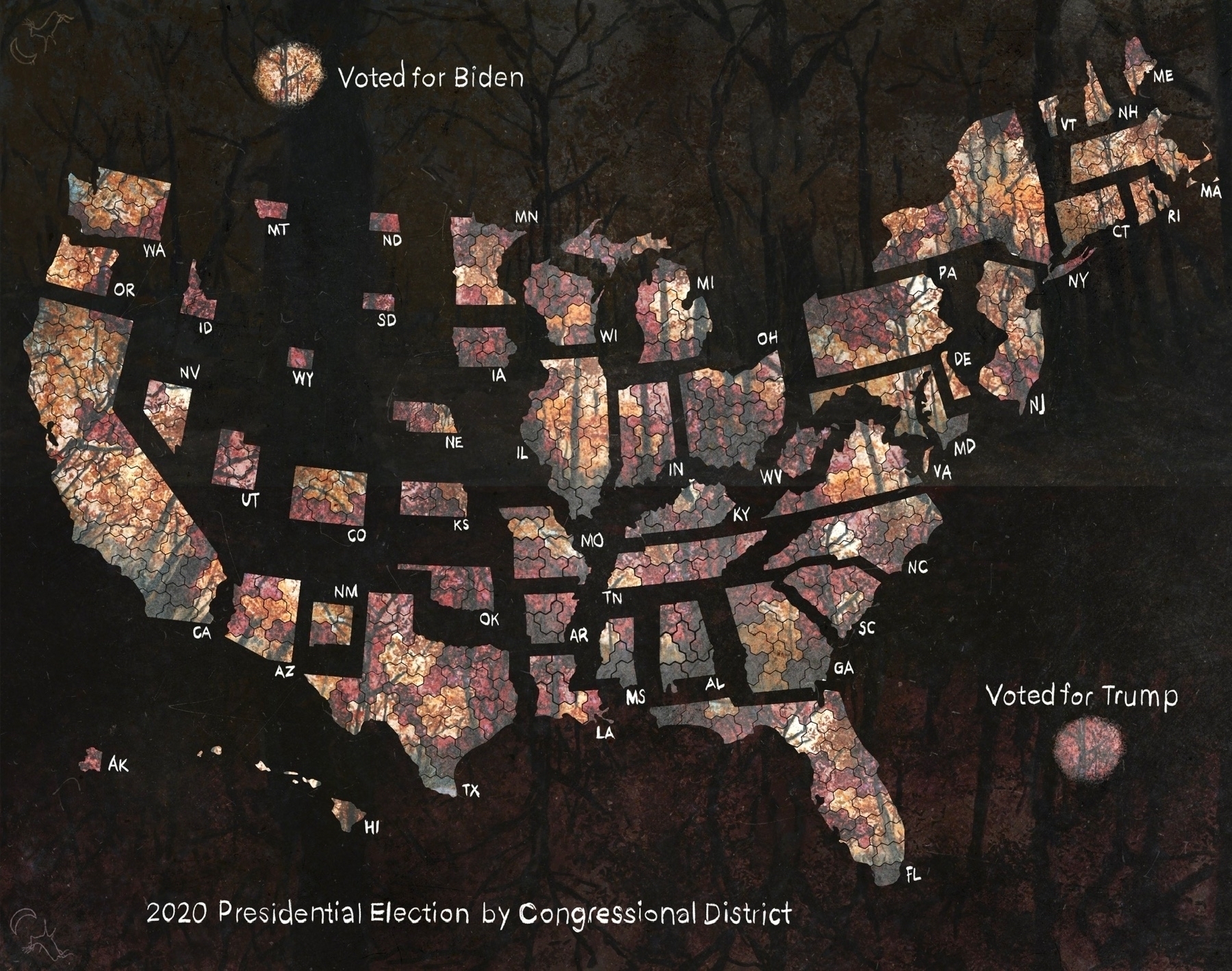
Results of the 2020 Presidential election by congressional district.
